Sisters together-critique requested :)

I did a shoot on Saturday with my 2 girls. They are aged 10 and 3--- and despite their age gap, they are best friends in the world. I wanted to capture their love for each other. Little daughter looks up to big daughter so much, and big daughter loves taking care of her special little person.
I did a few square crops ( I'm including both versions), but don't know if they work-I do love the square paper though. Anyway, I need input on processing also...thoughts on what to change or how to make these better. What works, what doesn't work. What you like, what you don't like, etc. I always find the critique here so invaluable.
I also did a few individ shots but I'll post those later. These are more than enough for now. I find it SO much easier to do indivduals than pairs or groups!
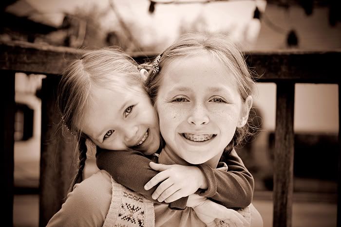
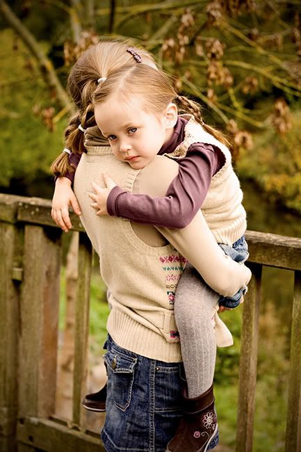
#4 and 7 (same shot) was with a white foam board as a reflector...My first time doing that and it made the photo look like it had direct flash. I do like their looks though. These were (as I recall) taken at 1/500 ISO 200 and f 2.8 with my prime 50 (all on M).
THANKS gang!
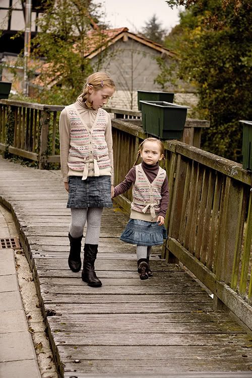
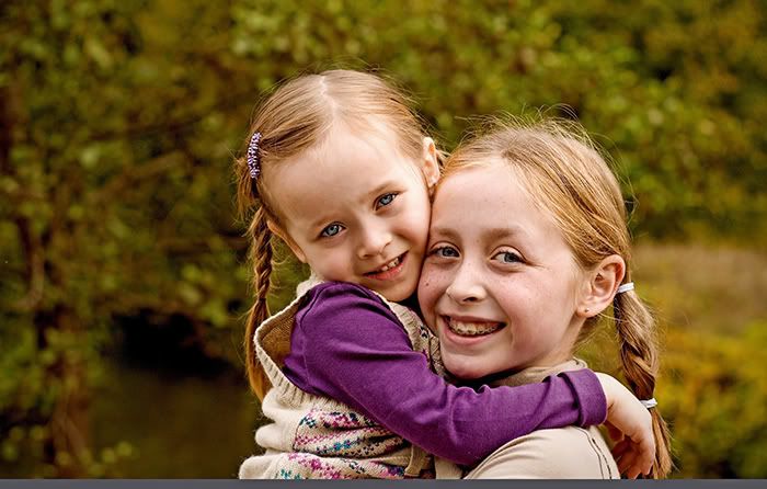
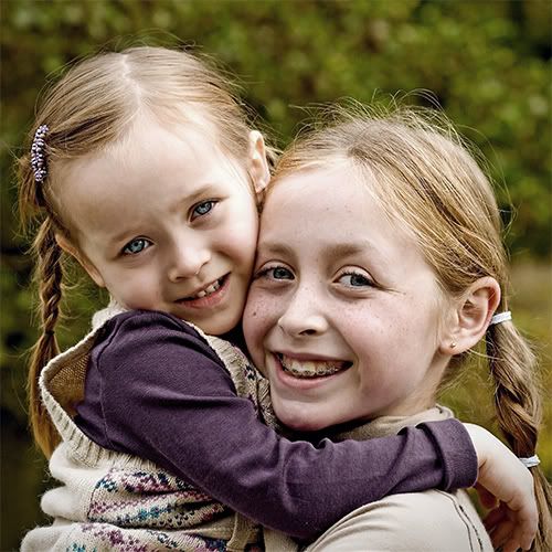
#1 Love the 2 heads in braids, LOL!
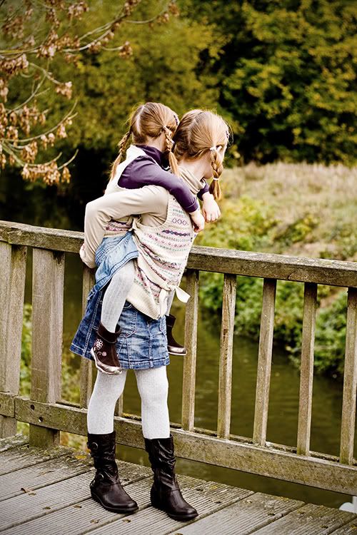
#2
#3
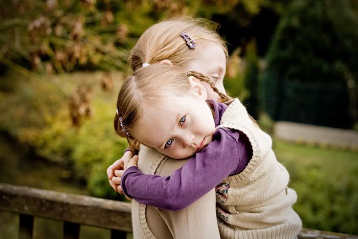
#4
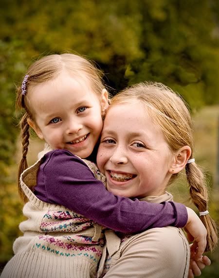
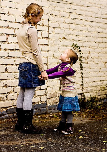
#5
#6
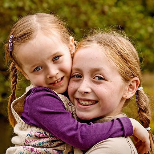
#7
#8 Look how the ivy frames little daughter's littleness.
#9
#10
#11
#12 And a toned down version of above...
#13 And a toned down version of the duo...Thoughts??
I did a few square crops ( I'm including both versions), but don't know if they work-I do love the square paper though. Anyway, I need input on processing also...thoughts on what to change or how to make these better. What works, what doesn't work. What you like, what you don't like, etc. I always find the critique here so invaluable.
I also did a few individ shots but I'll post those later. These are more than enough for now. I find it SO much easier to do indivduals than pairs or groups!
#4 and 7 (same shot) was with a white foam board as a reflector...My first time doing that and it made the photo look like it had direct flash. I do like their looks though. These were (as I recall) taken at 1/500 ISO 200 and f 2.8 with my prime 50 (all on M).
THANKS gang!
#1 Love the 2 heads in braids, LOL!
#2
#3
#4
#5
#6
#7
#8 Look how the ivy frames little daughter's littleness.
#9
#10
#11
#12 And a toned down version of above...
#13 And a toned down version of the duo...Thoughts??
__________________________
Kelly
My Photostream
http://www.flickr.com/photos/freezethemomentphotography/
http://www.kfsphotography.smugmug.com
Kelly
My Photostream
http://www.flickr.com/photos/freezethemomentphotography/
http://www.kfsphotography.smugmug.com
0
Comments
#1 & #5 pops right out,
i really like how the brownish layer gives a vintage feel and down the color.
unlike the more posed-shots (#6 - #7 - #10 etc) the sensation of something "real" in these two are quite lovely.
all the shots are sweet with nice composition, but 1 and 5 are just great!
I guess I should offer my amature-ish opinion. I like the bright coloured versions
Canon 40D, 28-135mm, 50mm f/1.8, 10-22mm, 70-300, 580 EXII, ST-E2, 500D Diopter
Who is wise? He who learns from everyone.
My SmugMug Site
Sam
I particularly like 1 and 4, and I love the processing in both - what are you using? Also, the reflected light in 4 is magical - really lovely shot.
these are great, thank you for sharing!
I think #4 is the best of the close-up shots. To me their pose in that shot looks more natural and spontaneous than they do in the other close-ups, and I like the slightly warm-toned B&W look.
#5 has good expressions. In a perfect world, maybe they would have been a few steps further along so that the little girl's head wouldn't be right next to that green planter (or whatever it is) on top of the fence, but you got the shot when their expressions were right, and that's the whole point, after all.
I like #8, but I find the strand of ivy kind of annoying because it distracts from the relationship between the two children.
#12 vs. #8 is six of one, half a dozen the other. I don't think toning down the colors adds anything, but if you like the "old faded photograph" look, it's okay. Both versions have one minor weakness, which is that the smaller girl's face blends into the wall too much. I might be inclined to try darkening the wall a bit (duplicate the image, darken the duplicate, use a layer mask to merge the children and the ground from the brighter image with the wall from the darker image) to make the kids stand out a bit more.
Got bored with digital and went back to film.
As for processing. For the downtoned ones (like 1 and 5)...I basically downed the general vibrance on my RAW software, upped slightly the blacks and then opened it in PSE. I did a hue saturation adjustment and selected only the blues and magentas and then downed those marginally. That brought down the extreme colors and left the rest with a natural feeling. I think I might have added about a 15% sepia filter (did it late and forgot my steps!)
For the shot I used the relecting board on (#4). I converted to b/w with standard conversion and then used hue/saturation to turn it into a sepia. I then went and adjusted the temperature to make it a very warm sepia and burned the edges using correct camera distortion filter. I was thinking it was really too bright with that reflecting board but I'm glad you liked it Divamum! I carry foam boards in my car now,
I'll post the individuals another day. Nothing that I am "ooohhh ahhh" about but a few keepers. I did a jumping shot Diva! You inspired me
Kelly
My Photostream
http://www.flickr.com/photos/freezethemomentphotography/
http://www.kfsphotography.smugmug.com
Kelly
Kelly
My Photostream
http://www.flickr.com/photos/freezethemomentphotography/
http://www.kfsphotography.smugmug.com