43...

rahmonsterrahmonster Registered Users Posts: 1,376 Major grins
edited July 16, 2005 in The Dgrin Challenges
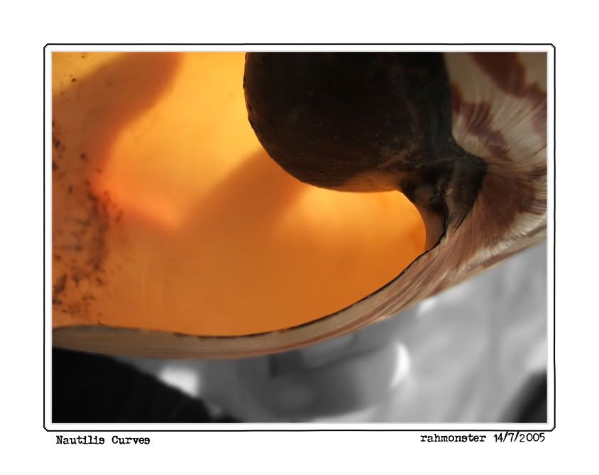
Good? Bad? Try something different?

Looking for critique on this one thanks in advance. Just an idea that jumped in my head quickly today.
14thjuly05036copy.jpg
www.tmitchell.smugmug.com

Art washes away from the soul the dust of everyday life...Picasso

Comments

  • photocatphotocat Registered Users Posts: 1,334 Major grins
    edited July 15, 2005
    I like it... Is it a shell? Love the warm color in the background to line off the curve. Great shot I say
  • BigAlBigAl Registered Users Posts: 2,294 Major grins
    edited July 15, 2005
    Nice idea, but the dead space at the bottom bugs me. Maybe twist the pic somewhat so that the horizontal line on the left of the pic becomes more diagonal and heads for the corner ne_nau.gif

    regards
    alan
  • rahmonsterrahmonster Registered Users Posts: 1,376 Major grins
    edited July 15, 2005
    Another try...The first shot isn't a crop by the way, I was discovering the macro functions of my camera...:D
    14thjuly05036copy2.jpg
    www.tmitchell.smugmug.com

    Art washes away from the soul the dust of everyday life...Picasso
  • photocatphotocat Registered Users Posts: 1,334 Major grins
    edited July 15, 2005
    looks great... it seems to be a lot bigger then my simple garden snale.
    Nice colors again, the soft orange touches a string...
    I love the macro function...
  • erich6erich6 Registered Users Posts: 1,638 Major grins
    edited July 16, 2005
    I like the second try much better. Nice geometric curves and color hues. You may want to try fiddling with saturation controls and see how it looks.

    Erich
Sign In or Register to comment.