Christmas Card struggle! Please Help me decide :)

Hi everybody!
Just struggling here with my Christmas Photo card! We live far away from family and friends in the States (in Europe), so making a nice photo card is very important to me to keep in touch. I'm going crazy this year because it is the first time I'm really trying to take better pictures.
I would very much appreciate any comments and critique on these shots, as well as on WHICH card you like (if any!).
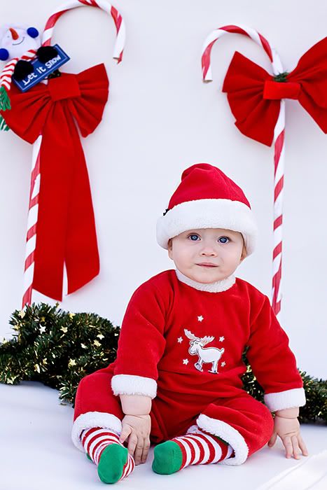
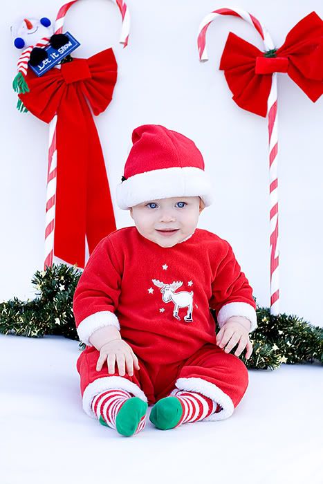
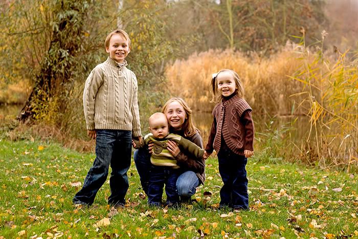
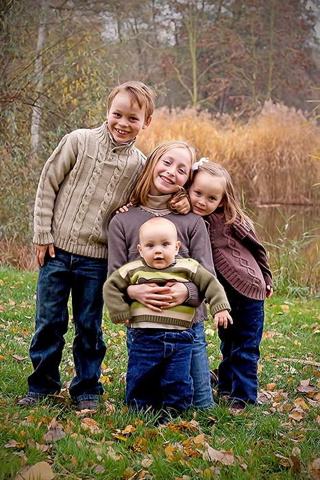
I have 4 kiddos and my idea for this card was individual shots of each on the front and a group shot on the back. I did 2 different shoots. The first was to get the group shot (which will be used on the back of the card--as well as individs of the big kids) and the 2nd was yesterday with just the baby (to get a Christmasy shot). This will be his first Christmas so I highlighted him on the main photo of the card.
I am including the original shots also so you can see them better for CC. I'm open to ANY ideas and suggestions. I'm planning on having these done at simplytoimpress. They have a double sided UV coated, ultra rigid card that is just gorgeous (and not too expensive). They also have interactive software so you can zoom and rotate, as well as see what your photos look like on different designs. I did work on a PSE template for the card but I think it will be tough to find the doubled sided, UV printing I like so much on that beautifully grand cardstock. So off to simplytoimpress for the good prices with envelopes included (and international shipping yay!)..
So without further ado, here are the various series..and sorry for the picture overload, I just wanted to share the various collections (indiv, group and baby xmas). THANK you so much for looking and I appreciate the CC VERY much")
Card options:
#0 (a new addition)
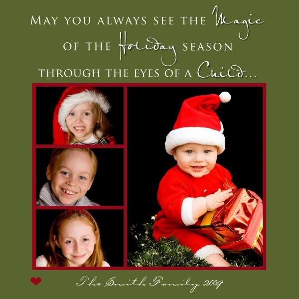
#1 Front of Card

Back of Card *this will be the same back design for options 2,3,4
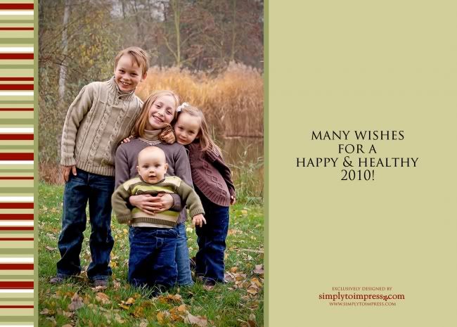
#2 Front

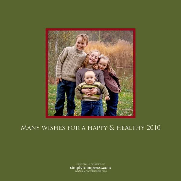
#3 Front

#4 Front

#5 Front of Card

Back of Card
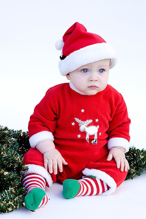
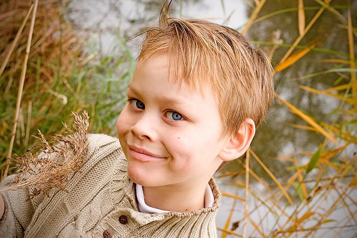
Individual Shots of Baby
#1
#2
#3

#4

#5
#6

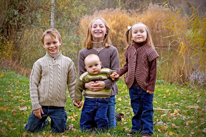
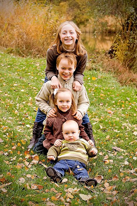
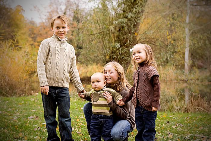
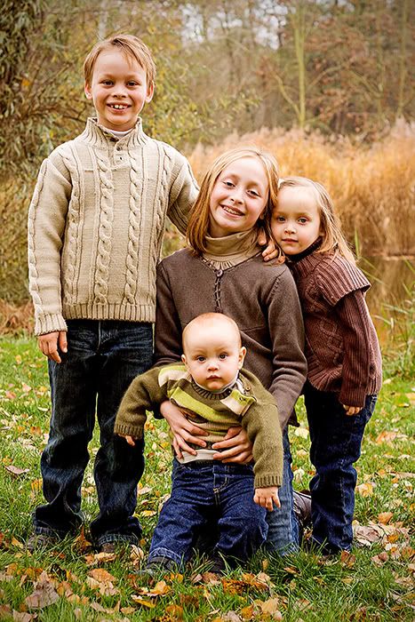
Group Shots of the Kids
#1
#2
#3
#4
#5
#6
Individual Shots of Big kids
#1

#2
#3

Just struggling here with my Christmas Photo card! We live far away from family and friends in the States (in Europe), so making a nice photo card is very important to me to keep in touch. I'm going crazy this year because it is the first time I'm really trying to take better pictures.
I would very much appreciate any comments and critique on these shots, as well as on WHICH card you like (if any!).
I have 4 kiddos and my idea for this card was individual shots of each on the front and a group shot on the back. I did 2 different shoots. The first was to get the group shot (which will be used on the back of the card--as well as individs of the big kids) and the 2nd was yesterday with just the baby (to get a Christmasy shot). This will be his first Christmas so I highlighted him on the main photo of the card.
I am including the original shots also so you can see them better for CC. I'm open to ANY ideas and suggestions. I'm planning on having these done at simplytoimpress. They have a double sided UV coated, ultra rigid card that is just gorgeous (and not too expensive). They also have interactive software so you can zoom and rotate, as well as see what your photos look like on different designs. I did work on a PSE template for the card but I think it will be tough to find the doubled sided, UV printing I like so much on that beautifully grand cardstock. So off to simplytoimpress for the good prices with envelopes included (and international shipping yay!)..
So without further ado, here are the various series..and sorry for the picture overload, I just wanted to share the various collections (indiv, group and baby xmas). THANK you so much for looking and I appreciate the CC VERY much
Card options:
#0 (a new addition)
#1 Front of Card
Back of Card *this will be the same back design for options 2,3,4
#2 Front
#3 Front
#4 Front
#5 Front of Card
Back of Card
Individual Shots of Baby
#1
#2
#3
#4
#5
#6
Group Shots of the Kids
#1
#2
#3
#4
#5
#6
Individual Shots of Big kids
#1
#2
#3
__________________________
Kelly
My Photostream
http://www.flickr.com/photos/freezethemomentphotography/
http://www.kfsphotography.smugmug.com
Kelly
My Photostream
http://www.flickr.com/photos/freezethemomentphotography/
http://www.kfsphotography.smugmug.com
0
Comments
Spread the love! Go comment on something!
Marjohn
Images of Him Photography
On their own, the baby shots are really cute.
Your card will be lovely this year!
Comments and constructive critique always welcome!
Elaine Heasley Photography
Your kids all have the same gorgeous eyes.
Sam
Otherwise...
Hmmm...one thing I am curious about though. In number 5, why did you go with the placement of the children where they are? Was it just to have girls on top and boys on the bottom? I'd be more tempted to do it chronologically either oldest to youngest or reversed.
Now looking at it again (I really need to be giving my own pictures this kind of attention). I'm guessing the placement was dictated by the position the children were in. Having them all facing towards the center of the card makes a nicer composition.
Ok...I'm done...really...I think.
Canon 40D, 28-135mm, 50mm f/1.8, 10-22mm, 70-300, 580 EXII, ST-E2, 500D Diopter
I'm guessing she just blanked out her family name there...such as "The Smith Family 2009".
Comments and constructive critique always welcome!
Elaine Heasley Photography
Canon 40D, 28-135mm, 50mm f/1.8, 10-22mm, 70-300, 580 EXII, ST-E2, 500D Diopter
Elaine you are SO right that it just didn't meld with the other fall colors. If I was going to go Christmasy I might as well make the entire set harmonize. The lone Santa just really stood out. THANK YOU for stretching me!! I see that now. As a result of your pointing that out I got a few more shots tonight that I was happy about. I thought I'd try out a Christmasier version with some new shots. I'd really appreciate the CC if you prefer it. THANKS!!:D Oh and I re cropped the back per your suggestion and warmed up the babe a bit. NOW I'll have a good Christmas/Holiday card, lol!
Cybersteak...Thanks too for pointing out about the centering down below. Elaine was right that I just blanked out the name...but I agree the centering of the family name and year will look better. You were correct in your assumption of why I layed out the kids that way. Their heads just seemed to fall best in those positions.
So now a competitor to #5 which I am moving to a new thread for new views,
Oh and thanks Sam for thinking about Mom and Dad! I'm enclosing family portraits in the envelope
Everyone will recieve the 1st photo in BW. They were taken in August but we haven't changed that much.
Kelly
My Photostream
http://www.flickr.com/photos/freezethemomentphotography/
http://www.kfsphotography.smugmug.com
eta: just saw your last post lol