Bar Harbor Maine
 zach30345
Registered Users Posts: 95 Big grins
zach30345
Registered Users Posts: 95 Big grins
Alright so here is a short set of photos from Maine, i am somewhat a beginner so any advice and criticism is appreciated. Thanks
1.

2.

3. Alright and this is the same picture but in black and white, im not sure what one I like better

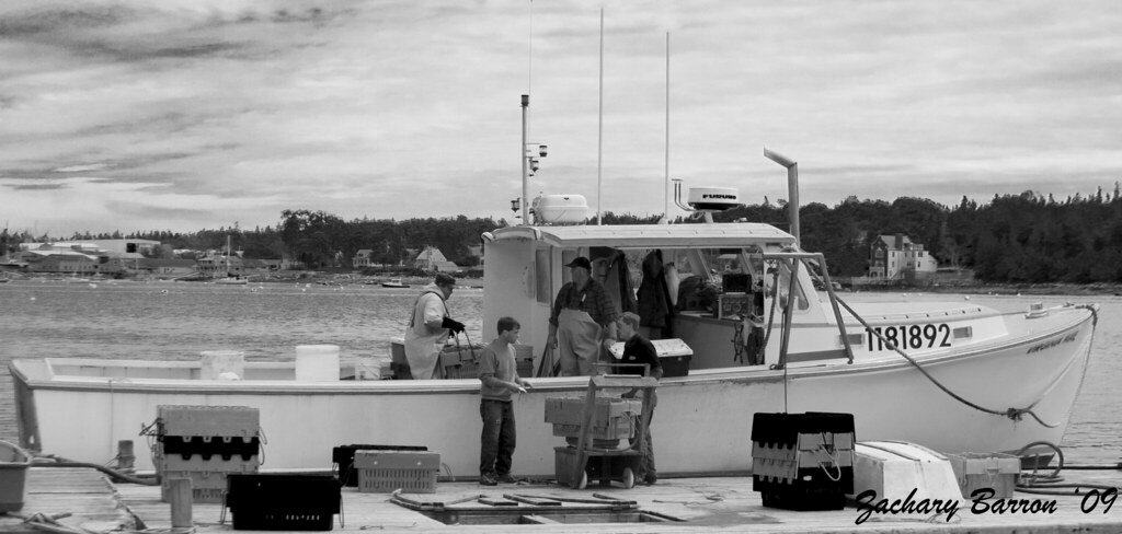
4. This last one was posted before in Streets and PJ but its part of this set.
1.
2.
3. Alright and this is the same picture but in black and white, im not sure what one I like better
4. This last one was posted before in Streets and PJ but its part of this set.
0
Comments
Lauren
Lauren Blackwell
www.redleashphoto.com
1. I like the colors and feel and the boat ramp in the foreground works nicely. The problem is the houses are falling backwards! I think it would be better if you rotated counter-clockwise a bit. This would get the houses vertical and get a steeper more dynamic angle on the foreground ramp. Obviously you'll lose some edges in the recropping but you've got both sky and foreground to give away. You might even change the aspect ratio and clip off the shoreline on the left and the one house that is separated from the others by the tree - I don't see what these elements add and the general rule is if it doesn't add the it detracts! Rotate, tighter crop and see what you think.
2 & 3. I'm not sure what to do with the vignette, but I want to change it somehow I think. Perhaps not as much feather and the mid-point a bit closer to the edge. But what do I know?
4. Neat! I'll offer a criticism to something you have no real control over but can be aware of at least. Eyelines are critical - that is where people are looking. We cue immediately to anthropomorphic forms in images and then immediately look where they are looking. In this shot you've got four closely spaced people with two staring left and two staring right (essentially at each other) all in the center in a tight box. This arrangement is an eye trap - you just can't get your eye to leave this spot and explore the rest of the image - and the rest of the image is wide so it leaves a bit of a weird feeling.
Anywho, nice shots and thanks for sharing!
Ken
alright here are the revisions and to be honest i really struggled with the houses one, i dont know but now i feel that the houses are falling forward? im not sure though but the crop looks better now, and one random question when im cropping should i be keeping the ratio the same or not because i didn't in the houses one and i feel that i should of because now its a weird size. And if so how would i do that?
1.
2.
3.
On the crop size actually things worked out nicely, it now has an almost perfect 4:5 aspect ratio which of course is a standard large format film aspect ratio and print size (8x10 prints). So no, I don't think it is a weird size at all, if Ansel Adams had visited Bar Harbor this is the aspect ratio his photos would have been.
If you wanted to preserve the original 2:3 aspect ratio you'd need to lose some foreground or sky. If you wanted to remain with a "digital" aspect ratio you could get to 3:4 real easy.
On the vignettes I'm sure it is really a matter of taste. I like your new edits but maybe you or others feel differently.
Ken
I like the rotated and cropped version much better. To me a main subject is the white house to the right and we see it larger and better now. I would really be nice if we could see the water's edge again on the left. maybe it could be better at high tide.
For the anchored boat shot I like the color version better with the reduced vignette compared to original. I am not really a fan adding this effect and have been trying to find a good place to use it and just haven't really found a place for it yet in my own shots. I would really prefer seeing more of the sky and water on the edges instead of the darkness. I am not sure what the goal with it is but it is a little like I am in a boat and looking out through a port hole or looking through a spyglass.
http://andygriffinphoto.com/
http://andygriffin.smugmug.com/
Canon 7D, 70-200mm L, 50 and 85 primes, Tamron 17-50, 28-135