Nashville e-shoot
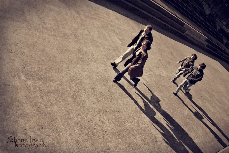
<TABLE id=HB_Mail_Container height="100%" cellSpacing=0 cellPadding=0 width="100%" border=0 UNSELECTABLE="on"><TBODY><TR height="100%" UNSELECTABLE="on" width="100%"><TD id=HB_Focus_Element vAlign=top width="100%" background="" height=250 UNSELECTABLE="off">This was my first ever e-shoot. We shot it saturday, this past weekend on a very cold day. The bride to be has two sons, and she wanted to include them on some shots, as a family group thing, so I'm tossing in a few of those in this post.
C&C certainly welcome. I'd be thrilled to hear what I did right, and what I did wrong.
The couple was very easy to work with once we got the stiffness out of the way, which took about 10 minutes. John (the man) is my gf's brother, and he's quite a hoot. Always a comedian at any given moment, and this helped.
We shot around downtown Nashville, and also at the Parthenon, at Centinial park.
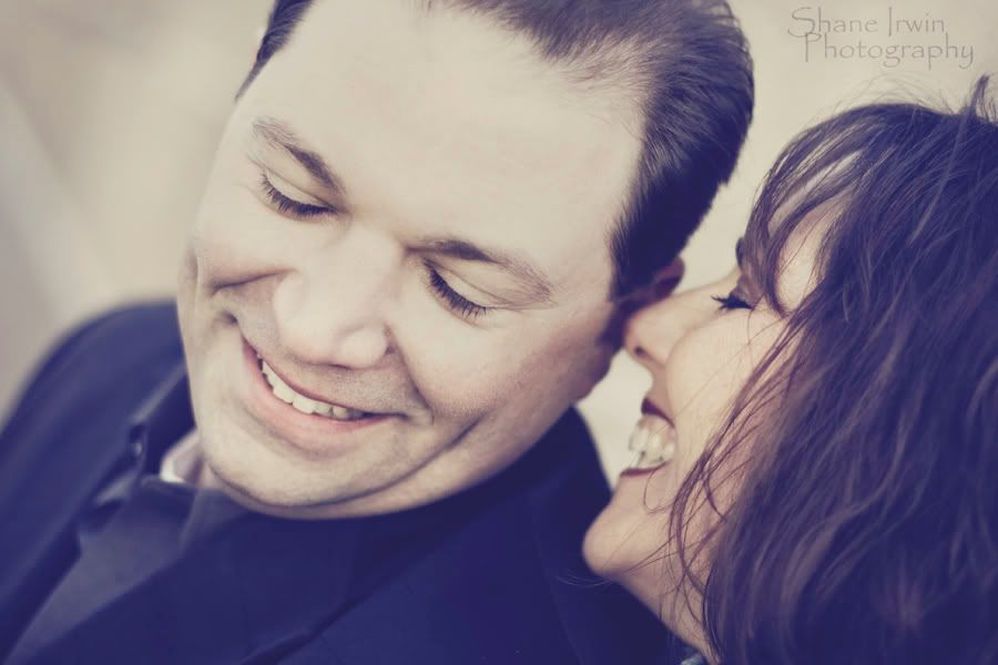
1.
2 (A &
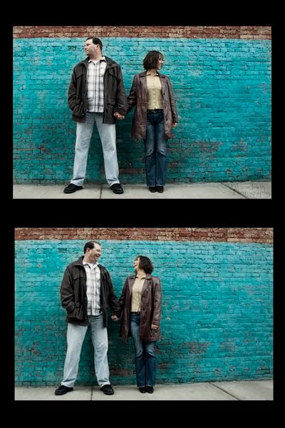
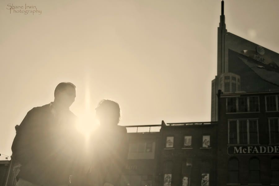
3.
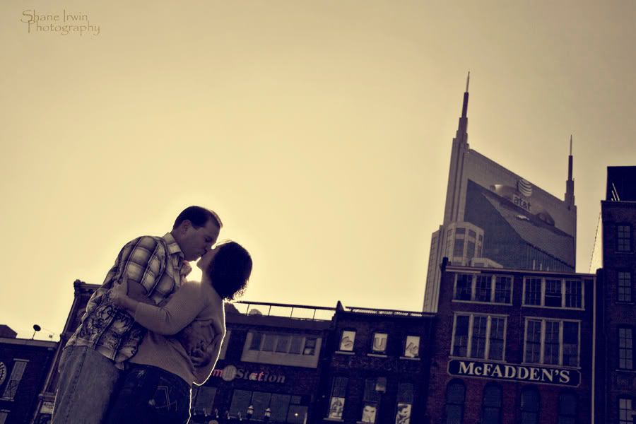
4.
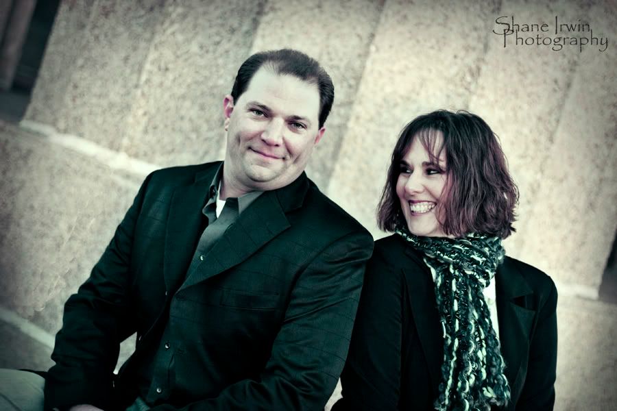
5.
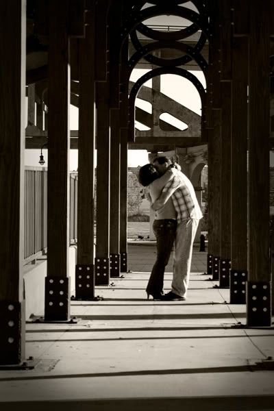
6.
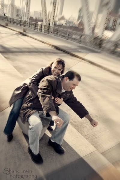
7.
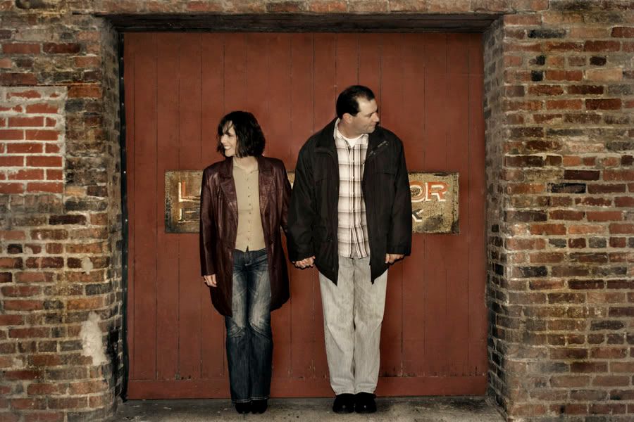
8.
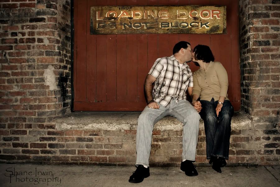
9.
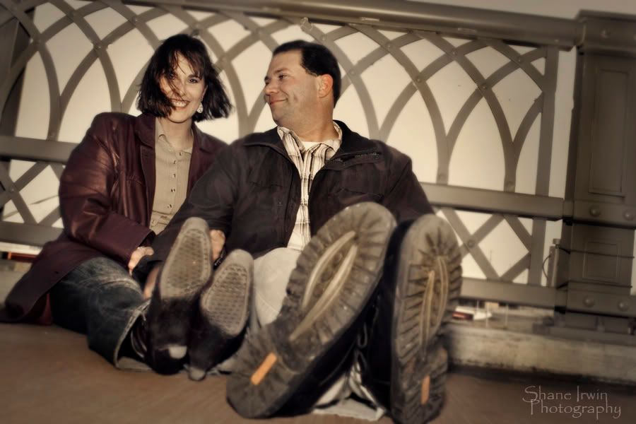
10.
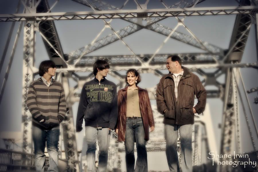
11.
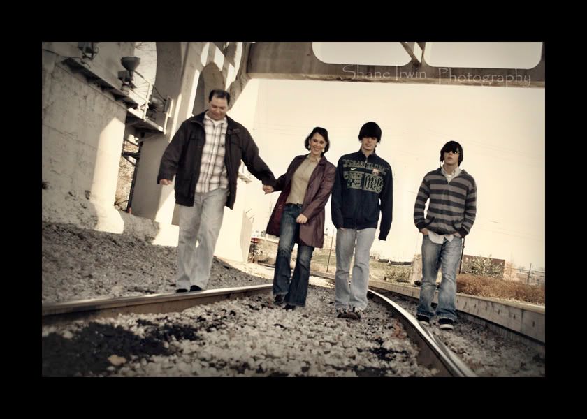
12.
13.
</TD></TR><TR UNSELECTABLE="on" hb_tag="1"><TD style="FONT-SIZE: 1pt" height=1 UNSELECTABLE="on">
</TD></TR></TBODY></TABLE>
C&C certainly welcome. I'd be thrilled to hear what I did right, and what I did wrong.
The couple was very easy to work with once we got the stiffness out of the way, which took about 10 minutes. John (the man) is my gf's brother, and he's quite a hoot. Always a comedian at any given moment, and this helped.
We shot around downtown Nashville, and also at the Parthenon, at Centinial park.
1.

2 (A &

3.

4.

5.

6.

7.

8.

9.

10.

11.

12.

13.

</TD></TR><TR UNSELECTABLE="on" hb_tag="1"><TD style="FONT-SIZE: 1pt" height=1 UNSELECTABLE="on">
</TD></TR></TBODY></TABLE>
Canon 5D MK IV | 24-70 2.8L USM | 50mm F1.4 USM | 70-200mm F2.8L | AB 800 light | 430EXII speedlight (x2) | Lowel iLight | Cybersync remotes | bag of trail mix |
My Weddings Website • Blog •
My Weddings Website • Blog •
0

Comments
Nice work brother! Brand new computer today and my new monitor doesn't look like it is going to cut it so, I'm not saying nothin about color or processing.
That being said, I REALLY like the first one. Great job getting in there and finding some real emotion. I'm sure they love that one!
6 is nice... great industrial feel to it.
7 is a fun shot but I don't care for the ps blur...
I like 7 better than 8 because they are blocking the sign in 7. Not a big fan of posing people in front of signs, but that is me.
11 I really don't like the ps blur. Do it with the lens or don't do it IMHO. Otherwise nice shot.
13 I'm thinking the kids will hate...
I guess that's it for me! Over all good stuff with the first one being dy-no-mite!
Matt
Bodies: Canon 5d mkII, 5d, 40d
Lenses: 24-70 f2.8L, 70-200 f4.0L, 135 f2L, 85 f1.8, 50 1.8, 100 f2.8 macro, Tamron 28-105 f2.8
Flash: 2x 580 exII, Canon ST-E2, 2x Pocket Wizard flexTT5, and some lower end studio strobes
I agree the PS blur aint so cool. I was just trying to make it a tad less busy, because I really like the shot on the bridge, but the beams were just a tad too much for me. Maybe they aren't so bad. I probably should have shot that one with my 70-210 to get some blur. I used my 18-55, and it's just a 4.0 kit lens.
I'd really like to hear from a few of you on the colors and processing, if possible. Thanks all.
My Weddings Website • Blog •
As for the blur... yes, if you want to de-emphasize your backgrounds use longer glass and step back to frame it or get some speedy normal-ish lenses and have your way with it from wherever! I sometimes do an edge blur in conjunction with a vignette which in my mind subtly draws the eye into the subject a bit more, but to simulate lens/aperture blur with ps just looks a little off. That bridge isn't so bad and maybe (I'm fairly certain I would think so) it would look best maintaining the depth of field that you shot.
Matt
Bodies: Canon 5d mkII, 5d, 40d
Lenses: 24-70 f2.8L, 70-200 f4.0L, 135 f2L, 85 f1.8, 50 1.8, 100 f2.8 macro, Tamron 28-105 f2.8
Flash: 2x 580 exII, Canon ST-E2, 2x Pocket Wizard flexTT5, and some lower end studio strobes
The only one that the color seems off is #5, and it is because of all that magenta around the nose and eyes / shadows of the skin. It is a great shot other than that, so I would definately take the time to fix it!