convincing or cheap?
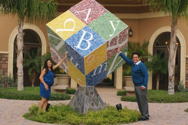
I had a photoshoot today w/ a couple who are going to have a baby in a few months. We went downtown to the art district and I saw this block. It had different letters on it (as you can see) however I took them out of the top and put in "b a b y" does it look convincing or does it look cheap?
TIA
Court
TIA
Court
Courtney
0
Comments
It's not what you look at that matters: Its what you see!
Nikon
http://www.time2smile.smugmug.com
Cute idea...
Who is wise? He who learns from everyone.
My SmugMug Site
thanks again!
Court
My Photographic Adventures
Nikon D7000 | 10-20 | 50 | 55-200
Disappointed with AF of Tamron 28-75 2.8, me less happy.
(BTW love your screen name lol)
Anyway, what I meant is that I'd use the warp function when placing text on the box so that the letters as slightly skewed. What I'm thinking of is when going in CS, pick warp text [T with the curved arrow under it] - style: rise; no horizontal distortion but a slight vertical distortion that makes the letter look more fitting in with the angle of the cube. Mainly the y gave me the sense of being 'slightly off'
Disappointed with AF of Tamron 28-75 2.8, me less happy.
I didn't get the word 'baby' at first, though, maybe because of the way the letters are positioned or something? or because of all the other letters? I'm not sure. I see it now of course, but if you wouldn't have said it, I may have looked passed it.
www.ivarborst.nl & smugmug
I took me a while to see that the letters say baby because of the order. It does look photoshoped, but you can fix that in post... the feet thing... good luck.
Kind regards.
Z.
davidmcpherson.smugmug.com
On the photoshop side I think you did an excellent job (it isn't obvious that it's photoshopped). As for the photo itself, I don't like the pose very much (I feel like it would look better perhaps from a lower angle with a wide-angle lens, and with the couple physically closer together). I think it's a good idea but you need to play with the execution and framing a bit for it to come out with more three-dimensionality.
Just my two cents
Daniel Chui