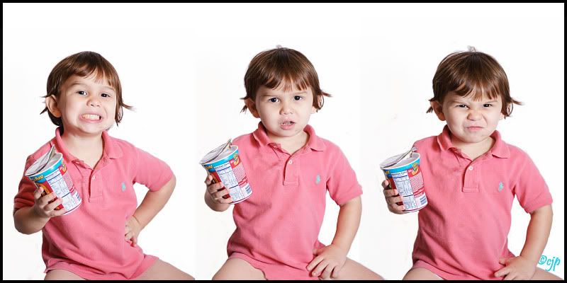
attempt at multiple images

goldilocksandmy3bearsgoldilocksandmy3bears Registered Users Posts: 423 Major grins
edited January 21, 2010 in People
Last week I posted a question under finishing school about how to put multiple images on one. Here is my try at it. I'm thinking I should go wider and add a few more next time ?? C&C welcome
3zac.jpg
Courtney

Comments

  • adbsgicomadbsgicom Registered Users Posts: 3,615 Major grins
    edited January 20, 2010
    I'm not expert at this, but the number of images seems fine. 3 is a really good number.
    The whites in the bg are off by just a hair, so you can see the stitching, so you might want to re-balance the color, or do some blending between the panes.

    Overall nice job in putting them together.
    - Andrew

    Who is wise? He who learns from everyone.
    My SmugMug Site
  • goldilocksandmy3bearsgoldilocksandmy3bears Registered Users Posts: 423 Major grins
    edited January 20, 2010
    adbsgicom wrote:
    I'm not expert at this, but the number of images seems fine. 3 is a really good number.
    The whites in the bg are off by just a hair, so you can see the stitching, so you might want to re-balance the color, or do some blending between the panes.

    Overall nice job in putting them together.
    Thanks!!
    Courtney
  • CyberSteakCyberSteak Registered Users Posts: 280 Major grins
    edited January 20, 2010
    Is the little guy pantless? Silly question I guess but it seems to be a bit of a distraction. Maybe a tighter crop?
    http://www.betterphoto.com/Premium/Default.aspx?id=329340&mp=V1

    Canon 40D, 28-135mm, 50mm f/1.8, 10-22mm, 70-300, 580 EXII, ST-E2, 500D Diopter
  • goldilocksandmy3bearsgoldilocksandmy3bears Registered Users Posts: 423 Major grins
    edited January 20, 2010
    CyberSteak wrote:
    Is the little guy pantless? Silly question I guess but it seems to be a bit of a distraction. Maybe a tighter crop?
    rolleyes1.gif yes he is.
    Courtney
  • D'BuggsD'Buggs Registered Users Posts: 958 Major grins
    edited January 20, 2010
    rolleyes1.gif yes he is.

    I too would also say go tighter and perhaps also try to remove some of the dead space from the top... I'm on my crap screen now, but me thinks the job of putting it together, looks pretty darn good! clap.gif
  • goldilocksandmy3bearsgoldilocksandmy3bears Registered Users Posts: 423 Major grins
    edited January 20, 2010
    D'Buggs wrote:
    I too would also say go tighter and perhaps also try to remove some of the dead space from the top... I'm on my crap screen now, but me thinks the job of putting it together, looks pretty darn good! clap.gif
    Thank you! :D
    Courtney
  • D'BuggsD'Buggs Registered Users Posts: 958 Major grins
    edited January 20, 2010
    Thank you! :D

    Goldi;

    I've looked at 'em again and from every different angle possible (still on POS screen).... I think you might be disappointed when it comes to print time :cry. I'm almost sure that I see different shades of BG now.

    Not sure the best way do fix it.... Select out the subjects and paste them on a new canvas??? I dunno, it be experimental for me. It's still a cool concept though!
  • goldilocksandmy3bearsgoldilocksandmy3bears Registered Users Posts: 423 Major grins
    edited January 20, 2010
    D'Buggs wrote:
    Goldi;

    I've looked at 'em again and from every different angle possible (still on POS screen).... I think you might be disappointed when it comes to print time :cry. I'm almost sure that I see different shades of BG now.

    Not sure the best way do fix it.... Select out the subjects and paste them on a new canvas??? I dunno, it be experimental for me. It's still a cool concept though!
    Actually I don't think there is any way you could see different shades of background because the way I composed this wouldn't make it possiable. I took 3 different pictures croped them as close to the subject as I could then dragged them over to a white 10x12 doc. in CS4 - added a layer masked then used the brush tool around the subject to get rid of anything left over from the previous image. (make sense??ne_nau.gif ). Therefore w/ that being said all of the images are dragged over to the white doc. Unless there is something I'm missing. Thanks for your C&C
    Courtney
  • adbsgicomadbsgicom Registered Users Posts: 3,615 Major grins
    edited January 20, 2010
    Between the first two, here is a blow-up from PS for the image you posted (excuse the color shift in the reds, the snip tool from MS loses the profile).


    snip.JPG
    - Andrew

    Who is wise? He who learns from everyone.
    My SmugMug Site
  • D'BuggsD'Buggs Registered Users Posts: 958 Major grins
    edited January 21, 2010
    Actually I don't think there is any way you could see different shades of background because the way I composed this wouldn't make it possiable.

    Don't know what to tell ya... I'm on GOOD TV right now and it's very clear. headscratch.gif

    - Image 1 has a perfect vertical "line" that starts off right at the little boys knee.
    - Image 2 has another, perfect vertical line that starts off mid thigh and clips off part of his elbow (weird place for this "line", cutting through the subject like that).
    - Without measuring myself, I'd believe adbsgicom's #'s to be true, based only visuals.


    Sorry....... But sumthin' clearly went wrong. ne_nau.gif
    I'll bet a dozen doughnuts that this will show in print. Perhaps try running off a small one at the local store. thumb.gif


    Only trying to help.
  • CyberSteakCyberSteak Registered Users Posts: 280 Major grins
    edited January 21, 2010
    Yeah I see it too. Seen it yesterday but didnt get around to mentioning it. Almost looks like a faint gradient going from dark on the left, to lighter on the right. And I see it exactly where D'Buggs has pointed out.
    http://www.betterphoto.com/Premium/Default.aspx?id=329340&mp=V1

    Canon 40D, 28-135mm, 50mm f/1.8, 10-22mm, 70-300, 580 EXII, ST-E2, 500D Diopter
  • 0bscura0bscura Registered Users Posts: 18 Big grins
    edited January 21, 2010
    Always trust the numbers. :-)
  • l.k.madisonl.k.madison Registered Users Posts: 542 Major grins
    edited January 21, 2010
    Sorry, I'm with them.
    I showed it to my husband and without hesitating, he said he saw it.

    I do, too now that I look at it in a well lit room.

    What about isolating the boy off the background and making one BIG background then putting him on top (four layers, one that's solid white and one of him three times).

    Great idea, but yes, there's a line.

    Also, I don't like the crop at the bottom, part of legs just don't look right to me.

    Cute kid, adorable shots! A little bit more tweaking and it would be stunning.
  • Nikonic1Nikonic1 Registered Users Posts: 684 Major grins
    edited January 21, 2010
    The only other tiny thing (might not be worth mentioning) that I noticed is that from left to right, the top of his head is a bit lower in each. Tends to make it look like the whole shot is leaning. (Again, could be just my eyes). Since you're doing all the post work, it might be worth trying to line up the top of his head if you desired. Just MHO.

    Cool idea though and cute kid!!!


    EDIT: After looking again, I think it's just the far right image that is lower. It could be just from his posture but might be worth aligningne_nau.gif
  • goldilocksandmy3bearsgoldilocksandmy3bears Registered Users Posts: 423 Major grins
    edited January 21, 2010
    D'Buggs wrote:
    Don't know what to tell ya... I'm on GOOD TV right now and it's very clear. headscratch.gif

    - Image 1 has a perfect vertical "line" that starts off right at the little boys knee.
    - Image 2 has another, perfect vertical line that starts off mid thigh and clips off part of his elbow (weird place for this "line", cutting through the subject like that).
    - Without measuring myself, I'd believe adbsgicom's #'s to be true, based only visuals.


    Sorry....... But sumthin' clearly went wrong. ne_nau.gif
    I'll bet a dozen doughnuts that this will show in print. Perhaps try running off a small one at the local store. thumb.gif


    Only trying to help.
    Man its to bad I'm so hungry right now.. and doughnuts sound really good because I see now what you are saying.. perhaps I didn't go over that part w/ my brush??
    Thanks for really checking that out for me!bowdown.gif I will try again and this time go over EVERYTHING.
    Thanks again!
    Court
    Courtney
  • goldilocksandmy3bearsgoldilocksandmy3bears Registered Users Posts: 423 Major grins
    edited January 21, 2010
    Nikonic1 wrote:
    The only other tiny thing (might not be worth mentioning) that I noticed is that from left to right, the top of his head is a bit lower in each. Tends to make it look like the whole shot is leaning. (Again, could be just my eyes). Since you're doing all the post work, it might be worth trying to line up the top of his head if you desired. Just MHO.

    Cool idea though and cute kid!!!


    EDIT: After looking again, I think it's just the far right image that is lower. It could be just from his posture but might be worth aligningne_nau.gif
    Thanks! I'll fix that up!thumb.gif
    Courtney
  • goldilocksandmy3bearsgoldilocksandmy3bears Registered Users Posts: 423 Major grins
    edited January 21, 2010
    I showed it to my husband and without hesitating, he said he saw it.

    I do, too now that I look at it in a well lit room.

    What about isolating the boy off the background and making one BIG background then putting him on top (four layers, one that's solid white and one of him three times).

    Great idea, but yes, there's a line.

    Also, I don't like the crop at the bottom, part of legs just don't look right to me.

    Cute kid, adorable shots! A little bit more tweaking and it would be stunning.
    Thank you! perhaps putting some pants on him will help as well rolleyes1.gif
    Courtney
  • goldilocksandmy3bearsgoldilocksandmy3bears Registered Users Posts: 423 Major grins
    edited January 21, 2010
    adbsgicom wrote:
    Between the first two, here is a blow-up from PS for the image you posted (excuse the color shift in the reds, the snip tool from MS loses the profile).


    snip.JPG
    Thanks Andrew!! I think what happend here was I didn't go over those parts with my brush? ne_nau.gif
    Can I take off my last comment because now i really feel like an idiot :flush ??
    Courtney
  • adbsgicomadbsgicom Registered Users Posts: 3,615 Major grins
    edited January 21, 2010
    Thanks Andrew!! I think what happend here was I didn't go over those parts with my brush? ne_nau.gif
    Can I take off my last comment because now i really feel like an idiot :flush ??
    I can delete my reply if you want. I never noticed that little emoticon. Love it.
    I generally find things become apparent after you hit send....
    - Andrew

    Who is wise? He who learns from everyone.
    My SmugMug Site
  • goldilocksandmy3bearsgoldilocksandmy3bears Registered Users Posts: 423 Major grins
    edited January 21, 2010
    adbsgicom wrote:
    I can delete my reply if you want. I never noticed that little emoticon. Love it.
    I generally find things become apparent after you hit send....
    Yea.. that always seems to happen to me.rolleyes1.gif
    Courtney
Sign In or Register to comment.