Picking Flowers

cab.in.bostoncab.in.boston Registered Users Posts: 634 Major grins
edited January 28, 2010 in People
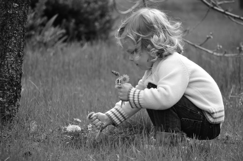
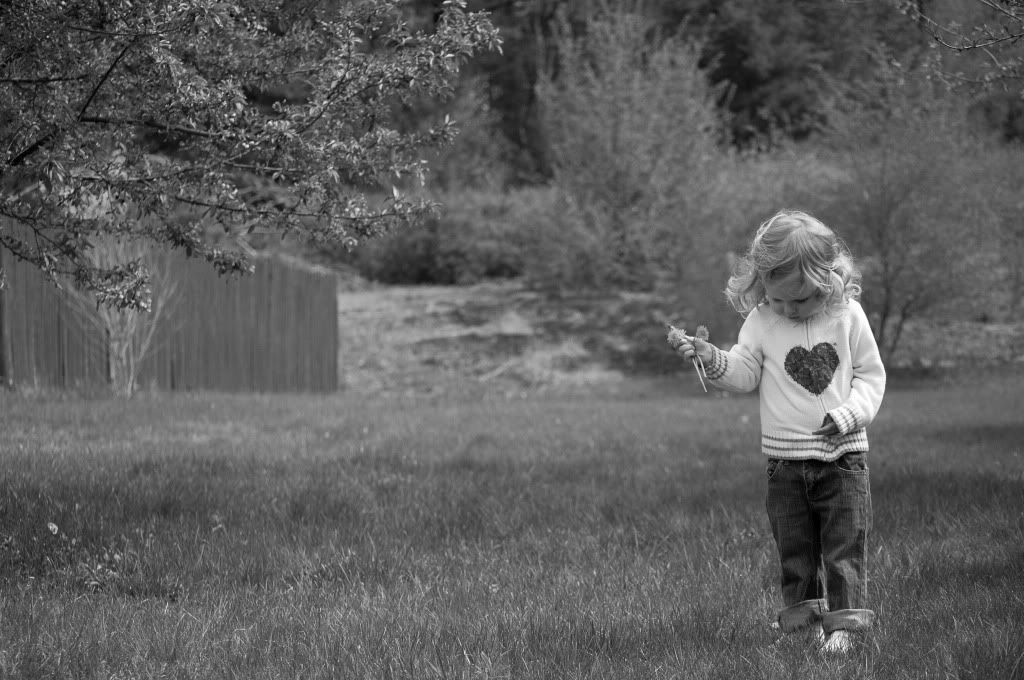
So I've been around long enough looking at everyone else's pictures, I figured I should at least post up a couple of mine. These were taken with my D90 and Nikkor 55-200 VR last May when my then 2y3m daughter was in the yard picking flowers (weeds). First pic was converted to B&W in camera. The second was done in LR3 Beta because I had to clone out a very distracting white support post on the fence in the background. I would like to learn more about B&W conversions...

Any comments and/or suggestions are welcome. I'll try not to get my feelings hurt. :D

DSC_1144_05-02-2009_10-29-38_BW.jpg

PostRemoved-1149.jpg
Father, husband, dog lover, engineer, Nikon shooter
My site 365 Project

Comments

  • jeffreaux2jeffreaux2 Registered Users Posts: 4,762 Major grins
    edited January 26, 2010
  • QarikQarik Registered Users Posts: 4,959 Major grins
    edited January 26, 2010
    nice pictures..but I think they need more contrast. I think BW in general screams for more contrast. Your eye can easily distinguish the components in a scene in color because of..well.. the changes in color! in BW different colors may share the same tonality and so your eye needs something else to easily distinguish the components in a shot imo. That means contrast contrast contrast! deep blacks, whiter whites, etc.
    D700, D600
    14-24 24-70 70-200mm (vr2)
    85 and 50 1.4
    45 PC and sb910 x2
    http://www.danielkimphotography.com
  • cab.in.bostoncab.in.boston Registered Users Posts: 634 Major grins
    edited January 26, 2010
    Qarik wrote:
    nice pictures..but I think they need more contrast. I think BW in general screams for more contrast. Your eye can easily distinguish the components in a scene in color because of..well.. the changes in color! in BW different colors may share the same tonality and so your eye needs something else to easily distinguish the components in a shot imo. That means contrast contrast contrast! deep blacks, whiter whites, etc.

    Thanks. I'm a noob with photography in general, but even more so with post. I need to do some reading on BW techniques, and then play around with these in LR.

    jeffreaux2 - not sure why you didn't see photos... They're on photobucket (I don't have a smug-mug account), and a while back my photobucket acct was being ridiculously slow, so maybe they were having issues. Hopefully it's working now, since Qarik was able to see them.
    Father, husband, dog lover, engineer, Nikon shooter
    My site 365 Project
  • Darren Troy CDarren Troy C Registered Users Posts: 1,927 Major grins
    edited January 26, 2010
    Love 'em! What a cutie! thumb.gif
  • lilmommalilmomma Registered Users Posts: 1,060 Major grins
    edited January 26, 2010
    I really love these, but agree that they are a little gray. Play around with them some more, and post the results!
  • The_Fat_ZebraThe_Fat_Zebra Registered Users Posts: 120 Major grins
    edited January 26, 2010
    Nice pictures with cute model. Any where she's looking at the camera?
    Street & Portrait because of the people. Landscape because it's pretty.
    Disappointed with AF of Tamron 28-75 2.8, me less happy.
  • cab.in.bostoncab.in.boston Registered Users Posts: 634 Major grins
    edited January 26, 2010
    Nice pictures with cute model. Any where she's looking at the camera?
    Thanks. Oh sure, we've got a million... The focus isn't perfect, but I like this one:

    DSC_1135_05-01-2009_17-09-18.jpg

    This was when she discovered Play-Doh:

    DSC_1324_11-15-2009_13-59-57.jpg
    Father, husband, dog lover, engineer, Nikon shooter
    My site 365 Project
  • lilmommalilmomma Registered Users Posts: 1,060 Major grins
    edited January 26, 2010
    hope you don't mind, i played with the one. I'll take it down if you want. I really think these are adorable. I'm not a b&w conversion expert, but play with the contrast, blacks, brightness, etc until you get a good distinguished range of blacks and whites, while also being careful not to blow out the whites.


    774263420_gspUu-L.jpg
  • cab.in.bostoncab.in.boston Registered Users Posts: 634 Major grins
    edited January 26, 2010
    lilmomma wrote:
    hope you don't mind, i played with the one. I'll take it down if you want. I really think these are adorable. I'm not a b&w conversion expert, but play with the contrast, blacks, brightness, etc until you get a good distinguished range of blacks and whites, while also being careful not to blow out the whites.

    No worries... I went and fiddled around with the photo on photobucket as well, but I decided that I'd wait until I was home and could play with the RAW file in LR.

    To me, I like the version I posted better... not really sure why, maybe it's just because I've seen that particular image so much that I'm used to it. The more harsh contrast seems a bit jarring to me. I think I need to play with it more and see if I can pull more contrast out and still retain the best qualities of the shot that I like so much. (Those first two I posted were by far my favorite shots I took last year, so much so that I had them framed and gave them to my wife for Xmas. But if I can learn how to improve them, all the better. :D )
    Father, husband, dog lover, engineer, Nikon shooter
    My site 365 Project
  • QarikQarik Registered Users Posts: 4,959 Major grins
    edited January 26, 2010
    I like mellissa's better then the original but just a touch too contrasty to my taste. Dial it back like 10% and it's perfect.
    D700, D600
    14-24 24-70 70-200mm (vr2)
    85 and 50 1.4
    45 PC and sb910 x2
    http://www.danielkimphotography.com
  • lilmommalilmomma Registered Users Posts: 1,060 Major grins
    edited January 26, 2010
    Qarik wrote:
    I like mellissa's better then the original but just a touch too contrasty to my taste. Dial it back like 10% and it's perfect.

    yeah i went a little overboard, but it was a quickie.
  • cab.in.bostoncab.in.boston Registered Users Posts: 634 Major grins
    edited January 27, 2010
    Changed the contrast a little and did some selective coloring. Good/bad/indifferent? Does the BW portion look any better, irrespective to the added color? (And this was just done quickly with Photobucket's tools, not in LR, so I know I can do better when I get a chance to play with the original file at home.)

    DSC_1144_05-02-2009_10-29-38-1.jpg
    Father, husband, dog lover, engineer, Nikon shooter
    My site 365 Project
  • adbsgicomadbsgicom Registered Users Posts: 3,615 Major grins
    edited January 27, 2010
    Sorry, really not liking the selective color. If you decide you want to go that route, you need to work on the masking a lot. There is too much of a green halo around the dandelions.
    - Andrew

    Who is wise? He who learns from everyone.
    My SmugMug Site
  • cab.in.bostoncab.in.boston Registered Users Posts: 634 Major grins
    edited January 27, 2010
    adbsgicom wrote:
    Sorry, really not liking the selective color. If you decide you want to go that route, you need to work on the masking a lot. There is too much of a green halo around the dandelions.

    No need to be sorry. Personally, I think it's pretty cool, but it's my daughter, so I'm a little biased. It's also the first time I've ever tried anything like this at all, so I'm not expecting it to compete with some of the stuff I've seen posted here!

    As for masking... I have no idea what that is. :D I did this in about 3 minutes using an edit tool on Photobucket. I was playing around a little with the contrast and saw the option to selectively color, so I played with that, too.

    Does the BW look any better than the original, IYO? Or is the color too distracting to try and evaluate that by itself?
    Father, husband, dog lover, engineer, Nikon shooter
    My site 365 Project
  • jeffreaux2jeffreaux2 Registered Users Posts: 4,762 Major grins
    edited January 27, 2010
    No need to be sorry. Personally, I think it's pretty cool, but it's my daughter, so I'm a little biased. It's also the first time I've ever tried anything like this at all, so I'm not expecting it to compete with some of the stuff I've seen posted here!

    As for masking... I have no idea what that is. :D I did this in about 3 minutes using an edit tool on Photobucket. I was playing around a little with the contrast and saw the option to selectively color, so I played with that, too.

    Does the BW look any better than the original, IYO? Or is the color too distracting to try and evaluate that by itself?

    If I were you.....I'd stop myself about now and pose the question(s).....

    -What is the story here?
    -What is the subject?
    -When others view the photograph do I want them to say "oooh what a beautiful child"?.....or....."photoshop!!!"?

    I guess that makes it obvious that I am NOT a fan of selective coloring in portraits. I feel that more often than not it steals attention from the subject rather than enhancing.....the image ought to be about the subject...and NOT the processing.

    Just my $.02 worth....which is about a dollar forty-eight shy of a cup of coffee.
  • cab.in.bostoncab.in.boston Registered Users Posts: 634 Major grins
    edited January 27, 2010
    jeffreaux2 wrote:
    I guess that makes it obvious that I am NOT a fan of selective coloring in portraits. I feel that more often than not it steals attention from the subject rather than enhancing.....the image ought to be about the subject...and NOT the processing.

    Just my $.02 worth....which is about a dollar forty-eight shy of a cup of coffee.

    Fair enough. In general I tend to agree, but sometimes I see a photo with selective coloring and think it looks neat. I'm no art critic, and certainly no artist. I am having fun and most of the photos we take are of the snapshot variety (although I do want to improve beyond that), so I'm working on learning how to use as many tools as I can so I can make images that I enjoy and that will be memories when my kids are older.

    I appreciate the comments!
    Father, husband, dog lover, engineer, Nikon shooter
    My site 365 Project
  • adbsgicomadbsgicom Registered Users Posts: 3,615 Major grins
    edited January 27, 2010
    Does the BW look any better than the original, IYO? Or is the color too distracting to try and evaluate that by itself?

    I had to put them up side by side, but yes, the b/w conversion is much improved. I think you could have perhaps bumped the contrast a bit more, but I didn't bring it into the PS to back up that theory....
    - Andrew

    Who is wise? He who learns from everyone.
    My SmugMug Site
  • Dancer72Dancer72 Registered Users Posts: 90 Big grins
    edited January 28, 2010
    Changed the contrast a little and did some selective coloring. Good/bad/indifferent? Does the BW portion look any better, irrespective to the added color? (And this was just done quickly with Photobucket's tools, not in LR, so I know I can do better when I get a chance to play with the original file at home.)

    I like the 2nd version of your bw shot better as well, but again not really loving the selective color (personal preference). One minor thing, I think I might go back and check the levels and contrast again so your blacks and whites really pop from the gray (especially since there's so much grass around her with the gray hue). Also, at 1st glance, I think I may have cloned out the tree branch near her head...the back part looks like it's growing out of her head (but again this is personal preference - obviously, what looks best to you is most important).

    Thanks for sharing these shots - she is a cutie!
    Caroline Brogen

    Member: PPA, PPAM
    Gallery: http://photos.brogen.com/Public-Gallery/Carolines-Gallery
Sign In or Register to comment.