#43 Just an example

MrsCueMrsCue Registered Users Posts: 412 Major grins
edited January 27, 2010 in The Dgrin Challenges
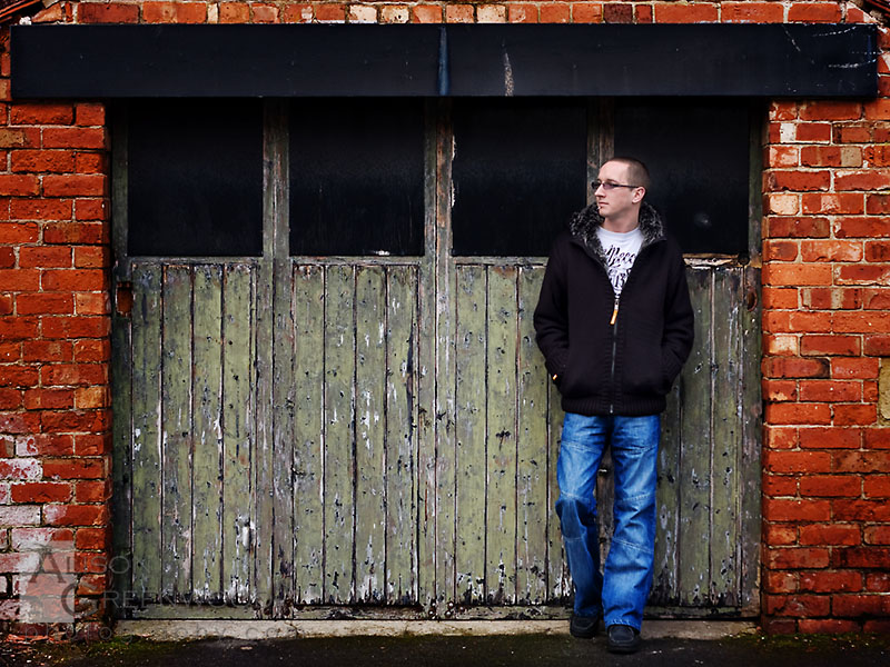
Not sure if this is going to be my final choice yet. I rather like it. I'd love to know what everyone else thinks.
4307136167_fcf80c4089_o.jpg
Canon EOS 40D, Canon EOS 350D, 50mm 1.8 MKII prime lens, 17-40mm f/4 L lens, 70-200mm f/2.8 L IS lens, 430 EX speedlite, Tungsten Continuous studio light, Pocket Wizards, Gary Fong Lightsphere, Stofen Omni bounce diffuser, 5in1 reflector

Comments

  • nightpixelsnightpixels Registered Users Posts: 536 Major grins
    edited January 26, 2010
    Hi Alison,

    It is an interesting picture. I like the composition, but the saturation of the red bricks needs to drop a little, (as well as the whole picture) because it is drawing a bit too much attention and remember, the theme is "door" or "window", not "red bricks". I am also bothered by that one row of the bricks on top of the image a little bit but that is just my opinion. Have you used "multiply" to process the picture like this or some pre-set action script?
    Allen Parseghian

    Los Angeles dance photographer

    Website: http://www.allenparseghian.com
  • MrsCueMrsCue Registered Users Posts: 412 Major grins
    edited January 26, 2010
    Ahhh that would be the 50% soft light I added.

    Yeah, I thought that about the shoe challenge. I wasn't sure there was enough emphasis on the shoes in my entry and look what happened with that! lol.

    Who knows? Not me that's for sure rolleyes1.gif

    Thank you for the CC thumb.gif

    I still have some time to see if I can get something else but I very much doubt it. We'll see.
    Canon EOS 40D, Canon EOS 350D, 50mm 1.8 MKII prime lens, 17-40mm f/4 L lens, 70-200mm f/2.8 L IS lens, 430 EX speedlite, Tungsten Continuous studio light, Pocket Wizards, Gary Fong Lightsphere, Stofen Omni bounce diffuser, 5in1 reflector

  • nightpixelsnightpixels Registered Users Posts: 536 Major grins
    edited January 26, 2010
    Oh and regarding the shoe challenge, remember, you have won a challenge now, so people will start judging you a little differently from now on! So anything less than an A+ will be unacceptable.

    edit: I just looked at your picture on my home Apple Cinema monitor and the colors looks A LOT more pleasing that they did on my work dell monitor.
    Allen Parseghian

    Los Angeles dance photographer

    Website: http://www.allenparseghian.com
  • Aspecto5Aspecto5 Registered Users Posts: 311 Major grins
    edited January 27, 2010
    I think Allen has pretty much covered everything. In my opinion, the brick and the gentleman are distracting me away from this image saying 'door'. Having a person in the photo, I'm thinking maybe there might be a need for some interaction with the door. And last but not least, it seems that a lot of threads for this challenge have shot straight at the door. No interesting angles and perspectives. Just my thoughts from first impressions. :D
    Canon 7D Shooter

    Nelson Lehner
    Dreamin' of a resolution!:D
  • MrsCueMrsCue Registered Users Posts: 412 Major grins
    edited January 27, 2010
    nightpixels - yeah thanks for the reminder. That's exactly what I was afraid of lol :hang

    Thanks for the cc Aspecto thumb.gif
    Canon EOS 40D, Canon EOS 350D, 50mm 1.8 MKII prime lens, 17-40mm f/4 L lens, 70-200mm f/2.8 L IS lens, 430 EX speedlite, Tungsten Continuous studio light, Pocket Wizards, Gary Fong Lightsphere, Stofen Omni bounce diffuser, 5in1 reflector

  • VisualXpressionsVisualXpressions Registered Users Posts: 860 Major grins
    edited January 27, 2010
    I actually like it quite a bit... but I'm on judge this round :D Aspecto5 might be right about the person detracting from the door ne_nau.gif I like the idea of a person in the shot though... maybe an interactive shot with someone opening or closing or walking in or out, that might be pretty cool... thumb.gif good luck with it...

    Winston
  • dlscott56dlscott56 Registered Users Posts: 1,324 Major grins
    edited January 27, 2010
    I like this one. I think the person adds an interesting element to the shot.
  • DeeCajunDeeCajun Registered Users Posts: 515 Major grins
    edited January 27, 2010
    I do like this shot!
Sign In or Register to comment.