DSS43 - Ecclesiastical Architecture
Went exploring all the various churches and chapels in Princeton. Let me know what you think =c)
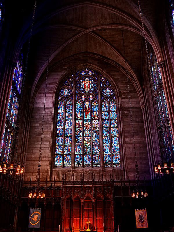
HDR, not sure if the effect is too much, i can take a regular one and rework it with regular processing
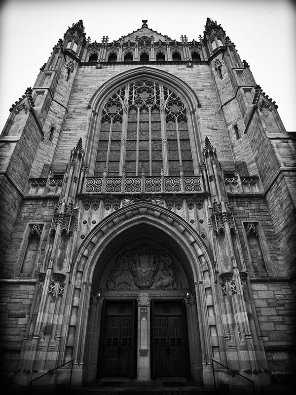
Same Church, from outside.
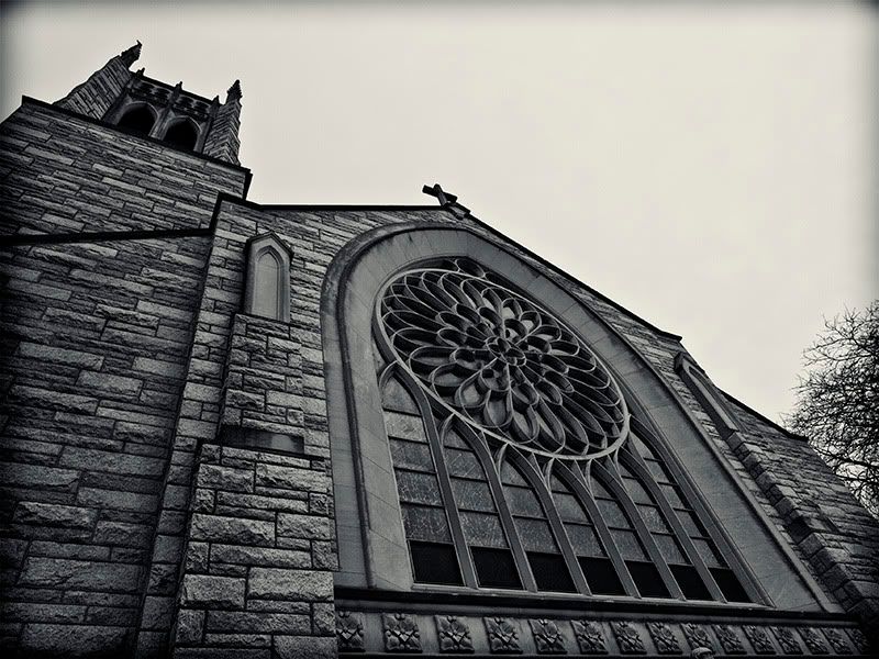
Different Church on Nassau St.
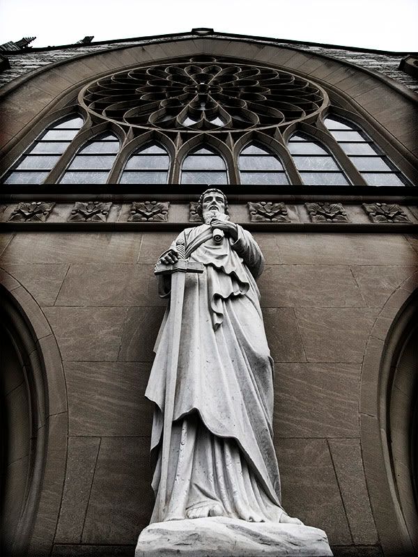
I think this one is my favorite, both subject wise and processing wise. I'll probably call it The Guardian.
HDR, not sure if the effect is too much, i can take a regular one and rework it with regular processing

Same Church, from outside.

Different Church on Nassau St.

I think this one is my favorite, both subject wise and processing wise. I'll probably call it The Guardian.

0
Comments
www.bf2015.smugmug.com
http://lrichters.smugmug.com
I'd go with #1... I like the saturated color...
www.rteest42.com
www.aliaslaceygreen.com
http://www.etsy.com/shop/rteest42
I really like the stained glass on #1-wish it was a little tighter is all, concentrating on the middle panels instead of the three.
I like your other shots too, especially the last one, but I get "window" from the first and statue from the last.
_________
Thanks all for comments. I love the guardian one, and think it'll be OK based on the topic description "If you're looking for a window of opportunity, just remember that when one door closes, another opens. Open or closed, your photo this round must include at least one door or window in the frame.", but i get what you guys are saying about it not being strong enough on the theme. I'll decide Sunday night =c) Meanwhile let me know what you think about this one.
Couldn't come in tighter, it loses a lot when the ceiling and columns are gone, but here is another version, non HDR.
5a
or square crop
5b
pyroPrints.com/5819572 The Photo Section
www.andmanphotography.com
Facebook Fan Page
"Landscape photography is the supreme test of the photographer - and often the supreme disappointment." Ansel Adams