#44 - My first Challenge.. advice needed!

DeeCajunDeeCajun Registered Users Posts: 515 Major grins
edited February 15, 2010 in The Dgrin Challenges
Not sure if these will make it but thought I would try, drove down a mountain to get these today

Thoughts please!
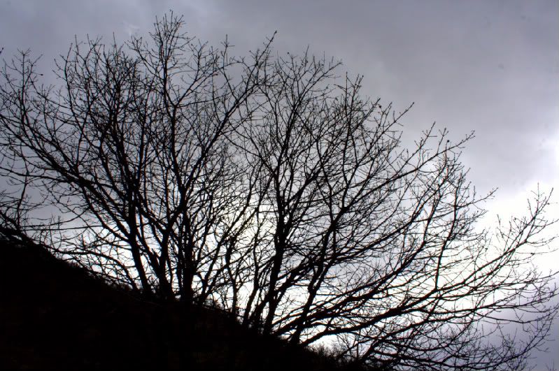
1.
sil3-1.jpg
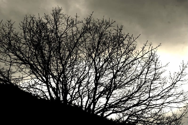
2.
sil2-1.jpg
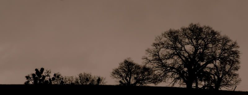
3.

_MG_7393-1.jpg
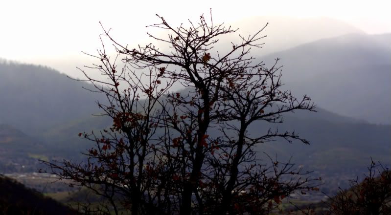
4.
sil5-1.jpg

Comments

  • liflanderliflander Registered Users Posts: 339 Major grins
    edited February 13, 2010
    HI! Congrats for jumping into the challenges!
    I like the last shot the best. It somehow captures a nice silhouette and mood. I like its simplicity. The others don't grab me. I think its the simple 2-tone aspect (and the aspect ratio that is unusual) that you have there.
    Cheers,
    Mark
  • DeeCajunDeeCajun Registered Users Posts: 515 Major grins
    edited February 13, 2010
    Thank you!

    Mistletoe trees look so amazing as a silhouette.. I wish I could capture it

    Thank you!
  • tinamarie52tinamarie52 Registered Users Posts: 954 Major grins
    edited February 13, 2010
    Welcome to the challenges! Please remember that we all have our opinions and are willing to help. You'll get a mixture of technical and artistic suggestions. You need to sieve through and use what suits your style!!

    Having said that.....:D .... I love #4. I'd look at the crop. Perhaps straightening the larger tree on the right would make it look more upright.

    Because of the descending size of the trees, my eye wandered over to the tree on the left with the major mistletoe clumps. Very interesting.

    Chris
    http://chrisadamczyk.smugmug.com

    When you come to a door... walk through it.
    If it's locked... find an open window.
  • JAGJAG Super Moderators Posts: 9,088 moderator
    edited February 13, 2010
    Welcome to the challenges. #3 has good potential. I agree that a little straightening might be in order. You might concider brightening the sky just a tad too.
  • lizzard_nyclizzard_nyc Registered Users Posts: 4,056 Major grins
    edited February 13, 2010
    Love #4! Especially the trees to the right and that you used the pano aspect.
    Liz A.
    _________
  • DeeCajunDeeCajun Registered Users Posts: 515 Major grins
    edited February 14, 2010
    thanks everyone...

    Trees grow out of the side of mountains here... hard to tell what to straighten or not but I will work on these suggestions.. thank you !!!
  • DeeCajunDeeCajun Registered Users Posts: 515 Major grins
    edited February 14, 2010
    #4 straightened...


    _MG_7416-1.jpg
  • FlyingginaFlyinggina Registered Users Posts: 2,639 Major grins
    edited February 14, 2010
    I like the straightened version of #4 a lot - especially since you cropped off some of the dead space on the left.

    Still thinking I like #3 better. Maybe brighten the background a bit as someone else suggested. The tree is beautiful - at least to me. But then, I love pictures of trees.

    I think either one would be a solid entry.

    Virginia
    _______________________________________________
    "A photograph is a secret about a secret. The more it tells you, the less you know." Diane Arbus

    Email
  • meandirenemeandirene Registered Users Posts: 23 Big grins
    edited February 14, 2010
    As tinamarie52 mentioned, we all have our opinions...some technical, some artistic...this is neither. ;)

    #4 Straightened looks great, but personally I prefer it flipped horizontally. Just the way my eye travels from left to right, major subject first and then softens to the secondaries on the right. Try it and see what you like best...that's what's important.
  • AndManAndMan Registered Users Posts: 1,252 Major grins
    edited February 14, 2010
    For me the straightened version of #4 is the strongest.
    Peter

    www.andmanphotography.com

    Facebook Fan Page

    "Landscape photography is the supreme test of the photographer - and often the supreme disappointment." Ansel Adams
  • DsrtVWDsrtVW Registered Users Posts: 1,991 Major grins
    edited February 14, 2010
    15524779-Ti.gif 4
    Chris K. NANPA Member
    http://kadvantage.smugmug.com/
  • DeeCajunDeeCajun Registered Users Posts: 515 Major grins
    edited February 14, 2010
    Thank you!

    I tended to wanted to leave them *unstraightened* because thats how they are naturally here but when you take them off of the side of the mountain they just look crooked..

    Still want to play with #3 because I do like that tree !
  • DeeCajunDeeCajun Registered Users Posts: 515 Major grins
    edited February 14, 2010
    #3 lightened...


    3-1.jpg
  • travelwaystravelways Registered Users Posts: 7,854 Major grins
    edited February 14, 2010
    Welcome to the challenges. I like #4 straightened...
    Tatiana - Seeing the world through my camera
    TravelwaysPhotos.com ...... Facebook
    VegasGreatAttractions.com
    Travelways.com
  • DeeCajunDeeCajun Registered Users Posts: 515 Major grins
    edited February 14, 2010
    thank you...
  • WhatSheSawWhatSheSaw Registered Users Posts: 2,221 Major grins
    edited February 14, 2010
    I, too, like #4 straightened. thumb.gif

    Could just be my old eyes, but #3 looks a bit fuzzy to me. mwink.gif
  • DeeCajunDeeCajun Registered Users Posts: 515 Major grins
    edited February 14, 2010
    thanks.. my eyes are awful so who knows...

    Thank you!

  • nightpixelsnightpixels Registered Users Posts: 536 Major grins
    edited February 15, 2010
    I also like #4 but I would sharpen it just a little.
    Allen Parseghian

    Los Angeles dance photographer

    Website: http://www.allenparseghian.com
Sign In or Register to comment.