#44 ... another candidate.. C & C please...

DeeCajunDeeCajun Registered Users Posts: 515 Major grins
edited February 21, 2010 in The Dgrin Challenges
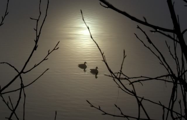
The sun broke thru the fog and the geese were enjoying it..

I have only cropped... is this a decent entry?

44-1-1.jpg

Comments

  • richterslrichtersl Registered Users Posts: 3,322 Major grins
    edited February 16, 2010
    :cry I wish those branches were not in the way because the combination of the reflected sunlight and the silhouetted ducks is very pretty and serene. How good are you with a clone tool or patch tool? You may want to try removing just enough of those branches to get a nice vertical crop.
  • DeeCajunDeeCajun Registered Users Posts: 515 Major grins
    edited February 16, 2010
    richtersl wrote:
    :cry I wish those branches were not in the way because the combination of the reflected sunlight and the silhouetted ducks is very pretty and serene. How good are you with a clone tool or patch tool? You may want to try removing just enough of those branches to get a nice vertical crop.


    Clone? Patch?
    headscratch.gif

    Well I have never used those! Lemme see what I can do with what I have.. I too didnt like the branches in the sun reflection
  • ic4uic4u Registered Users Posts: 1,455 Major grins
    edited February 16, 2010
    It's a very peaceful shot! I think Linda has some great suggestions, let's see what you can dothumb.gif
    Karin


    "Dance like no one is watching. Sing like no one is listening. Love like you've never been hurt and live like it's heaven on Earth." — Mark Twain
  • DeeCajunDeeCajun Registered Users Posts: 515 Major grins
    edited February 16, 2010
    Ok I did some magic and cropped it down (terrible job! )

    also here are some more from this morning..

    May not be challenge worthy but I did love taking them... I do photocards for tourists of the lake I live on.. always looking for something that would work. Always looking for opinions!

    44-6-1.jpg


    44-2-1.jpg


    44-4-1.jpg

    44-7-1.jpg
  • richterslrichtersl Registered Users Posts: 3,322 Major grins
    edited February 16, 2010
    Holy mackerel! Those last three shots are gorgeous! You were holding out on us! rolleyes1.gifroflrolleyes1.gif

    Of the new ones, I really like #1 and #2. #2 could benefit from just a slight curves adjustment.

    I like the composition with the crop and if you are determined to pursue the clone idea, here's a tutorial that Kerry did on cloning hair, which is not unlike cloning water ripplets. I remembered this tutorial because that's my niece in the photo and I was the one she helped with that: http://dgrin.smugmug.com/gallery/7988424_vbU75
  • DeeCajunDeeCajun Registered Users Posts: 515 Major grins
    edited February 16, 2010
    Why THANK you!!

    That made my day.. I took about 100 pics this morning, but I won't bore you..:D

    I have a Mac and have never used PS and just learning Aperture.. I will check the tutorial..

    I have no idea what you mean by *curves* :cry

    Thank you!
  • richterslrichtersl Registered Users Posts: 3,322 Major grins
    edited February 16, 2010
    OK. Curves are a way of fine tuning contrast in a photo. Photoshop and some other editors use them. Unfortunately that feature is not available in Aperture. Instead Aperture uses something called Levels for fine tuning contrast and I just happened to have found a tutorial for you:

    http://www.apertureprofessional.com/showthread.php?t=12060
  • DeeCajunDeeCajun Registered Users Posts: 515 Major grins
    edited February 16, 2010
    why thank you!!

    I am colored blind.. but will give it my best shot.
  • DeeCajunDeeCajun Registered Users Posts: 515 Major grins
    edited February 16, 2010
    Ok ... moved a slider that said it was contrast... Didn't even know one existed!

    new44-1.jpg
  • richterslrichtersl Registered Users Posts: 3,322 Major grins
    edited February 16, 2010
    Try playing with it so that the bright area remains relatively constant and the area where the ducks are gets a bit brighter so we can see their silhouettes more clearly. mwink.gif
  • DsrtVWDsrtVW Registered Users Posts: 1,991 Major grins
    edited February 16, 2010
    I like the first one if that center branch could be pruned back the extra contrast definitely helps. Linda is a good coach to have.
    Chris K. NANPA Member
    http://kadvantage.smugmug.com/
  • DeeCajunDeeCajun Registered Users Posts: 515 Major grins
    edited February 16, 2010
    Yes she is..I appreciate it because all I have done so far is crop photos. I want to create a nice photo..

    I am learning much about contrast etc in doing this..

    I can't seem to lighten the geese without lightening the whole photo.. it was foggy and it picks up on that..(like the original posting)

    *Going back to practice my tweak*
  • pyroPrints.compyroPrints.com Registered Users Posts: 1,383 Major grins
    edited February 16, 2010
    I don't suppose you have any shots where the sun reflection is lined up with the birds?
    pyroPrints.com (my little t-shirt shop)
    pyroPrints.com/5819572 The Photo Section
  • DeeCajunDeeCajun Registered Users Posts: 515 Major grins
    edited February 17, 2010
    I don't suppose you have any shots where the sun reflection is lined up with the birds?

    Just the one where the branches are cropped out...
  • DeeCajunDeeCajun Registered Users Posts: 515 Major grins
    edited February 17, 2010
    I am sure this won't be worthy of the challenge but having fun trying to learn about contrast... I can't seem to achieve getting the geese darker without darkening that whole area... headscratch.gif

    442-1.jpg
  • rainbowrainbow Registered Users Posts: 2,765 Major grins
    edited February 17, 2010
    untitled.jpg

    After you bump the contrast up to get the geese dark, then go back to your brightness slider and make the scene brighter until you get the mix you want (I played with it quickly to give you an idea of one result you can get).
  • richterslrichtersl Registered Users Posts: 3,322 Major grins
    edited February 17, 2010
    "Less is more" with adjusting levels. For starters, you can try moving the sliders so that they touch the histogram. Or, if the contrast is too great, move only the middle slider just a little teenie bit.

    Once you get the background to where you like it, you can use the Burn tool to darken the ducks by just brushing over them.

    And, if you're still hankering to learn more about the clone tool, I found this for you: http://www.apertureprofessional.com/showthread.php?t=11874

    And if the sun winds up being too bright, play with crops. Where a horizontal crop at an 8x10 ratio doesn't look right, you can always try a panoramic crop at an 10x5 or 10x4 ratio. ;)
  • DeeCajunDeeCajun Registered Users Posts: 515 Major grins
    edited February 17, 2010
    this is a great help.. I am learning quite a bit just on this one challenge. The tutorials are GREAT and I already know of several photos that could benefit from the techniques. THANK You !


    How can I tell if my photo has all the exif info that is being discussed on another thread?
  • DeeCajunDeeCajun Registered Users Posts: 515 Major grins
    edited February 17, 2010
    Ok this is what my Aperture screen looks like.. I am not even sure I am adjusting the right thing here. What is meant by *touch the historgram*.. I am sorry to be so dense but I have never used a PP program before.. wow there is much to learn, but I want to.. I found the burn etc and that was exciting.. lots can be done for sure.


    Screenshot2010-02-17at82928AM.png
  • DeeCajunDeeCajun Registered Users Posts: 515 Major grins
    edited February 17, 2010
    My first attempt at *burn*..

    what a learning experience this challenge is turning out to be.


    geese44-1-1.jpg
  • richterslrichtersl Registered Users Posts: 3,322 Major grins
    edited February 17, 2010
    This is shaping up very nicely! thumb.gif

    Now you have another decision to make.

    You have a little piece of a branch sticking up from bottom of the frame on the left. You can either crop your photo to remove it, or you can try to remove it using the clone tool. mwink.gif

    The ideal scenario would have been to have the ducks silhouetted against the sun. But things don't always work out like that. But what's interesting about this shot is that the ducks are looking toward the light and swimming over to it. So to me, this composition works.

    Now, how about trying the clone tool again on your original shot? Once you get that shot where you're happy with it, you'll have another option to choose from.
  • DeeCajunDeeCajun Registered Users Posts: 515 Major grins
    edited February 17, 2010
    richtersl wrote:
    This is shaping up very nicely! thumb.gif

    Now you have another decision to make.

    You have a little piece of a branch sticking up from bottom of the frame on the left. You can either crop your photo to remove it, or you can try to remove it using the clone tool. mwink.gif

    The ideal scenario would have been to have the ducks silhouetted against the sun. But things don't always work out like that. But what's interesting about this shot is that the ducks are looking toward the light and swimming over to it. So to me, this composition works.

    Now, how about trying the clone tool again on your original shot? Once you get that shot where you're happy with it, you'll have another option to choose from.


    yes yes I originally wanted that cropped out and the branches coming from that corner..so cropping will do (notice me dodging the clone option)

    I need to train the geese to behave better for this.


    Edited to add.. i replaced with the cropped photo.
  • jeffgrovesjeffgroves Registered Users Posts: 106 Major grins
    edited February 17, 2010
    this last post is beautiful.
    Very nice work!
  • DeeCajunDeeCajun Registered Users Posts: 515 Major grins
    edited February 17, 2010
    Thank you !!!!! :D
  • red_zonered_zone Registered Users Posts: 533 Major grins
    edited February 18, 2010
    wow... I really like that last one. The 'burn' really worked well to darken the geese. I like the dew on the branches under the sun streak on the water, too.

    just a very nicely captured moment.
    ________________________________________________
    Jake
  • DeeCajunDeeCajun Registered Users Posts: 515 Major grins
    edited February 18, 2010
    thank you and actually those drops were the reason the branches are in the photo...I loved them!

    Thank you
  • AndManAndMan Registered Users Posts: 1,252 Major grins
    edited February 21, 2010
    jeffgroves wrote:
    this last post is beautiful.
    Very nice work!
    15524779-Ti.gif
    Peter

    www.andmanphotography.com

    Facebook Fan Page

    "Landscape photography is the supreme test of the photographer - and often the supreme disappointment." Ansel Adams
Sign In or Register to comment.