Child Headshots - Help Needed

I was just asked to do headshots for my niece. She is in a play and the actors need headshots for the program. My niece is 8. I really have no idea what I'm doing so I thought I'd reach out for help.
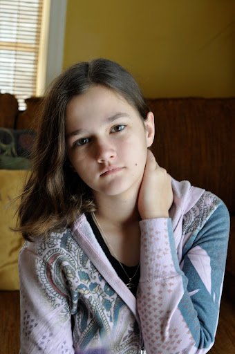
Here is my practice run using my daughter as a model, she is 13 and was just wearing what she had on this morning. I am going to post the before and the edited version so I can get C&C on the editing as well. I am also very new to photoshop elements. I may be in over my head with this whole project but it is either me or my brother with his point and shoot. They cannot afford professional photos.
Shot with the Nikon D90, 50mm lens and natural light from a window. I do have a flash but I thought it would wash her out. ISO 640, Shutter 1/60, Aperture 5.6. I was really totally guessing with the settings so any advice would be helpful. Portrait mode on the camera might have been better.
The focus is soft on all the photos I took. I still had the camera in Continuous autofucus / center point from a basketball game. I can change that.
So ... all C&C is welcome.
Unedited version:
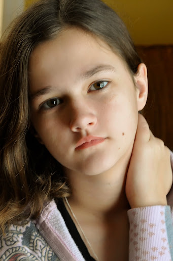
After Edits
HELP!!!
Here is my practice run using my daughter as a model, she is 13 and was just wearing what she had on this morning. I am going to post the before and the edited version so I can get C&C on the editing as well. I am also very new to photoshop elements. I may be in over my head with this whole project but it is either me or my brother with his point and shoot. They cannot afford professional photos.
Shot with the Nikon D90, 50mm lens and natural light from a window. I do have a flash but I thought it would wash her out. ISO 640, Shutter 1/60, Aperture 5.6. I was really totally guessing with the settings so any advice would be helpful. Portrait mode on the camera might have been better.
The focus is soft on all the photos I took. I still had the camera in Continuous autofucus / center point from a basketball game. I can change that.
So ... all C&C is welcome.
Unedited version:
After Edits
HELP!!!
0
Comments
1) set the focus point on single and move it to her eye in the frame
2) set the aperture to some something like 2.0 to render some bokeh and isolate her from the background (sdjust shutter speed and iso accordingly)
3) select a clean simpler background (of course you were naturally going to do this right!)
4) put some kind of reflectlor on the other side of her face for just TOUCH of fill
14-24 24-70 70-200mm (vr2)
85 and 50 1.4
45 PC and sb910 x2
http://www.danielkimphotography.com
1. Got it.
2. Great idea I can do that also.
3. I wouldn't make any assumptions.
4. OMG I really don't have a clue.
Forgot to mention this is my first DSLR camera and I've had it for less than a month. I'm totally new. I've been working on sports so far.
I've done some quick head shot of co-workers using this setup:
- a chair about 30cm from a clean wall, in my case a nice green hallway wall. Place it closer to the wall and you'll get ugly shadows.
- place the chair at an slight angle, that way they have to turn their head a little bit.
- bounce the flash from the ceiling if possible. Otherwise use a somewhat slower shutter speed and turn down the SB-600. You could also try it with the wide-flash adaptor (page 74).
However, as you are working with actors, you might want to have some creative head shots. In that case, don't use a chair ;-) Bouncing is still important.
If you use the 50mm@2.0 only a small part of the head will be in focus, so make sure you have the focus point on the eye closest to you.
www.warris.nl/blog
- simplify the background - either find a plainer situation, OR open up your lens so you completely blur it out. Shallow depth of field shots are all the rage right now, so you'll be right in line with current trends (just make sure the eyes are tack sharp)
- natural light is FINE for the current fashion in headshots - window light is great if you don't have flash or aren't comfortable using it.
- Keep her eyes alive and get her to show some personality - an actor's headshot is all about connecting with the viewer. Since this is a program shot rather than a submission shot (ie the kind you send out when responding to casting calls) that's less of a big deal, but you may as well aim high
- light-handed retouching is fine, but it shouldn't look overdone. Removing blemishes, lightly softening skin, and selectively sharpening/brightening eyes is probably enough.
Don't get TOO "creative" with them - it can be less conservative than the typical corporate mugshot, but it still needs to be representative, not drifting into fantasy or fashion styling.
As per always, I recommend a look through the directories linked from www.reproductions.com - you'll find LOTS of examples to copy in style if you look through those (follow that link, enter a zip to get you into either the NY or LA listings, and then you'll find links to lots of of 'togs specialising in headshots, and thus to lots of galleries).
Have fun!
ETA: shoot with enough room to crop to 8x10, which is still entertainment industry standard for photos.
In your edited version, her hand *looks* as if another is reaching up and grabbing her (read; scary). Sticking w/ a simple H&S shot will eliminate the additional dynamics of adding *more* info to the shot.... And it will still look, absolutely just fine.
Turn the body ~slightly~ away from camera, have the person look back into the lens (vary the amount of turn on the head and be careful not to have the nose 'break' the far cheek). A slight tilt of the head can do wonders for this style of photo too. Try shooting with the lens at the same height as the top of her forehead (or so) and have her look up into the lens by only moving her eyes - This makes the bottom eye-whites enlarged, yielding a calm and pleasant picture (aka; "canoes").
Good luck!
Beauty is in the eye of the beer holder.
Kinky Friedman
Great advice. The copy of my camera's manual is filled with notes but I never read the manual that came with the flash. Thanks it was very helpful with the camera settings.
Wow, I can't believe what a difference this made. What a simple tip but it made her eyes look much larger and prettier. Thanks.
I've gotten so much great info from you folks. Thank you all so much.
Here is round 2 with your suggestions implemented (or as much of them as I could remember). I used a tripod, the flash with a diffuser pointed toward the ceiling.
1. Still a bit underexposed I think. Couldn't really fix it in Photoshop.
2. I was trying for a tough look.
3. I told this one to show me the look he would give someone right before he crushed them. This is what I got. He is in the 4th grade and weighs 50 pounds - he doesn't really crush anyone. It ended up being my favorite photo of the day.
Here are all the rest of them:
http://picasaweb.google.com/Headshots
I would love some C&C on this batch.
That last shot hahaha. what a goof ball!
14-24 24-70 70-200mm (vr2)
85 and 50 1.4
45 PC and sb910 x2
http://www.danielkimphotography.com
The last one is really excellent!
www.warris.nl/blog
The BG colour choice and her attire aren't doin' much for me either but that might change if ya can get some 'pop' outta the shot.
Also, try turning here bod just a little more (still looks pretty square-on) and get her framed closer to center.
Overall, though, this shot is MUCH improved!
#2. Not getting any chills from this. Perhaps try shooting lower and have him place his hands on hip, holding his elbows out WIDE. That *should* raise and square his shoulders nicely while allowing the camera angle to give 'em a "Larger than Life", sneering looking appearance (kinda opposite of what we did for the young lady...). Keep him 'square-on' with the camera.
#3. ABSOLUTELY HILARIOUS!!!!!
Cheers!
Great advice all around. I am a total photoshop noob also but I'll try your suggestions. I thought they were a bit washed out also.
As for the freckle face boy... too funny. It's hard to get a marshmallow to look like a tiger. I will try your suggestions, who know we may get him looking fierce yet.
Hey, it's all trial and error. The trick is remembering what worked and why it did so, thus becoming able to repeat it.
You've got some of the best gears available - Have fun with it!
Nikon D50, 18mm-55mm, 55mm-200mm, 50mm f/1.8, SB800, LowePro Slingshot 200AW and other bits!
Be sure to give yourself plenty of time before the scheduled time to set up and have your camera on a trypod and the person on a chair...that way you have some continuity on the images sizes and focus. Have someone sit in for you before the shoot and adjust all your stuff ahead of time so that when the actors get there you just shoot and go. I am now to the point that one click per person does it. Very few do I have to take a second shot (the occasional blink or weird expression).
I use a muslin fabric that I bought for 50 cents a yard and stiched it together to make it wide enough to go on a long pole that I have the clip type shower curtain rings on. Then I use some old lighting stands as my base. My shoots are usually done at night because that is when they rehearse. I have a 3 light set up...but a single flash (off camera) with a reflector can work also.
Here is an example of the latest images for the upcoming play....
http://jagcreations.smugmug.com/Theater/Inherit-the-Wind/11137173_QvEka#780462005_nJLoe
And here is one that was with kids....
babes in toyland
I lighten my prints and add a vinette because the printer they use is horrible and the paper is no better than thick typing paper. So the images may look somewhat on the light side...but they print fantastic for what I have to work with. I sell all the images on discs that the cast members always want a copy of. So it works out pretty good for my time.
Thanks for sharing your photos they are great!
She is coming over tomorrow in the am. I have everything set up from the mug shots of my kids.
I have the program from last year. All photos are in black and white and the photos are very small and all are closely cropped. Usually not even their full heads are showing. This is for a really small local children's theater. Some of the shots in last year's program were the kids school photos or snaps their parents took outside. It's really not that big a deal. I just want to try to do the best I can.
I'll post the results tomorrow and ask for advice with the editing. I am a needy one
1.
2.
3.
What do you guys think??? I'd love some C&C.
I didn't do any editing. Just cropped them and turned them black and white.
Here are the rest of the half way decent ones. Anyone think one of the others is better. Suggestions for editing?
http://picasaweb.google.com/yohenrys/Tara#
Nikon D50, 18mm-55mm, 55mm-200mm, 50mm f/1.8, SB800, LowePro Slingshot 200AW and other bits!
Who is wise? He who learns from everyone.
My SmugMug Site
I posted them in reverse order from the way they were taken. I did it in 3 little sittings of about 35 photos in each then after each session I dumped them on my computer so I could see how to improve them. It's good to know I was going in the right direction!
I can also try to even out the color of the teeth in photoshop. I don't know which one she and her parents like yet.
I'm just so happy - I feel like I've learned so much from my first test shots in the beginning of the thread. I just
For the program, #2 for sure. BUT you need to crop it to 8x10 first (standard ratio for actor headshots). I'd take it off the top and from the lhside so that her leading eye is at the "rule of 3rds" intersection - you'll lose the background on the image's left, but that will draw attention to all that pretty shiny hair and her lovely eyes.
YOu might also want to clone or "powder" out the shine on the tip of her nose.
Are you sure they need to be bw? A lot of places are printing in colour now - just check with the auspices to see what they need so you can provide either as appropriate.
Great job!!
1.
2.
3.
Good Goin'!