boats water and people
Hi all,
would like to benefit from some DGRIN expertise on the following shots and
would really enjoy hearing why you do, or do not like a particular shot/s
the ballpark EXIF of this set of photos:
F/3.2
1/500
ISO 64
it was an overcast/with a slight fog morning
Thank you for your input..
would like to benefit from some DGRIN expertise on the following shots and
would really enjoy hearing why you do, or do not like a particular shot/s
the ballpark EXIF of this set of photos:
F/3.2
1/500
ISO 64
it was an overcast/with a slight fog morning
Thank you for your input..


0
Comments
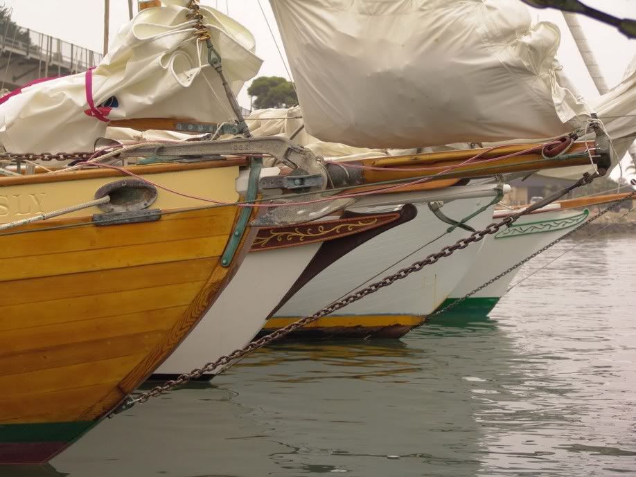
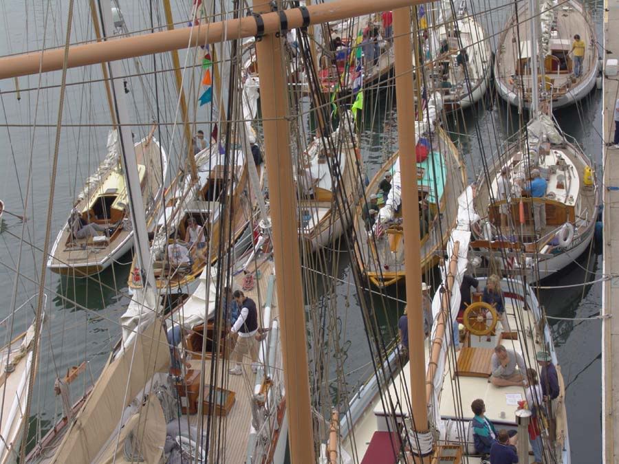
I begin to see something interesting in the first shot with all the prows jutting in from the left. But then I see the 'messy' bag full of sail on one of the boats. Thus ends the symitry of that shot.
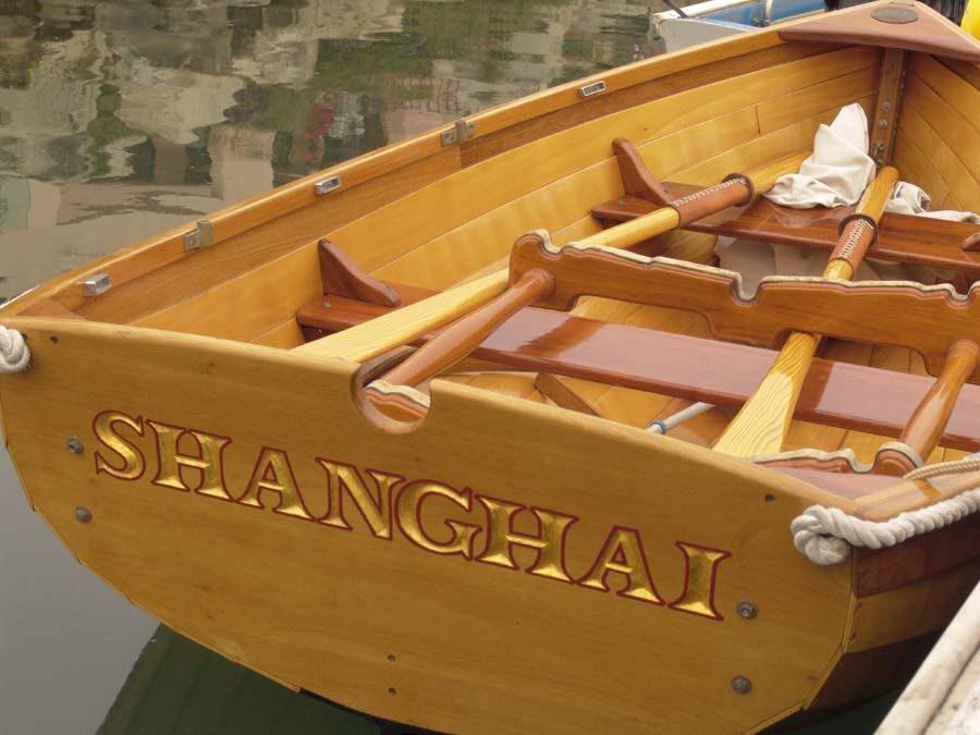
The one of the dinghy caught my eye but it's just too crisp. I guess I wanted to see fog and muted light or maybe a paint chip somewhere. There is no composition there.
The others are too jumbled or just snapshots.
My problem is this is sort of an establishe genre. Boats and harbors and all that. Everything in your shots is new and modern. There's no romance.
S,
Thanks for your comments..
Pic #1 "end of symitry",
I really did not see it until you pointed it out and you are so right!...
Mmm, leads me to believe that this 4 hull photo was doomed from the start,because of the 'bag full of sail'?
Pic#2 the dinghy caught my eye just for that reason (NO CHIPS :cool), it stuck out so much compared to ANYTHING near bye..it was a virtual museum piece...
no surprise it belonged to one of the wooden schooners who had a recent gazzillion $ refit ...they do actually use this dinghy..it was a misty morning, but not thick enough to give it that early morning calm, still look...however,
because the dinghy was so extraordinary, a knowledgeable photographer would have figured out the right capture, for this particular dinghy screamed a photo shooot in its own right....I am still not sure how I should have approached it, to do it justice under that particular setting?
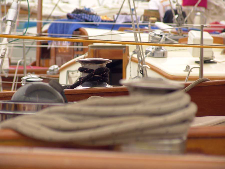
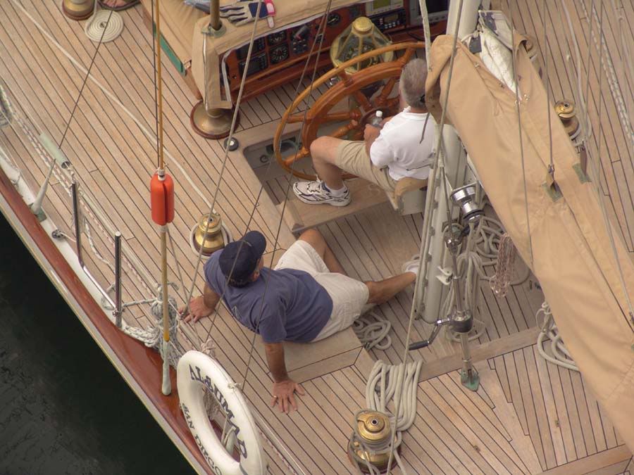
Pic #2 & #3,"The others are too jumbled or just snapshots"
I was doing what I thought was my best to keep them clean and yet capture the atmosphere, on the third shot, I focused on the floor boards, as it screamed pristine workmanship... the two men were somewhat soft as I thought of them as props in this shot...I have looked over this shot numerous times since your comment and again am not sure how I could have pulled this of and as for the masts photo...no clue at this point, as to how to capture a group picture and yet give it that non-snapshot look?
S, regarding your statement of "everything is new and modern", this is one point I can not agree with you on, as a matter of fact it is just the opposite. These particular boats (Schooners -old) have all been brought back to their original condition, which represented a huge amount of elbow grease ... no different than your great, great grandmothers buffet found in the dinning room, after multiple sandings and coats of varnish...the only difference with these particular pieces, is that they are able to float on the water along with the ubiquitous fiberglass hulls
Your comments lead me to a great question I need to dig into!
...what seperates a quality photo from just another snapshot?
are there basic rules of thumb on this subject?..what are they?
such as..
"Hopefully you haven't been laboring under the impression that your camera could smell, but the idea is that you are compressing an entire universe of sensory perception into the tiny little funnel of a photograph. Small wonder, then, that your snapshot of the Grand Canyon fails to evoke an equivalent sense of awe and reverence. Lost are the smell of the pine trees, the feel of the breeze on your face, the sound of birds and other visitors, and the vague taste of Arizona dust in your mouth. At best your picture captures a tiny fraction of what your eyes take in, and the advantage of stereo vision is lost. Also lost are the cumulative impact of a series of impressions you had leading up to the moment you took the picture. (And unless you bought a really big print, you've lost the scale as well!)
The photograph can't directly capture what you feel, and it is critically important to become aware of the distinction between what shows up in your viewfinder and how you feel at the moment you take the picture. Does that tiny slice of reality include enough clues for the viewer to recreate the balance of perceptions? Most photos are sufficient to remind you of what you felt at the time, but only well crafted Art allows others to experience the feeling as well!" http://www.captivelight.com/photo_tips.html
S, thanks for your input.
The one I find most interesting is this one.
It's because of the unusual angle of a commonplace scene. You've brought something special to what might be ordinary.
Your first shot almost works, perhaps a bit too tight on the bows? The idea is good, the symmetry is interesting.
Third shot could use some of the unusual angle treatment you brought to my favorite of your images - right now nothing makes it special for the eye to look at.
The last image is my least favorite. It's a bit of a jumble, there's nothing designed to attract my eye first, no pattern that makes it work.
One thing is true of all the shots - they would all benefit from more interesting/flattering lighting, early/late day sun for example. Easy to say, hard to get, I know!
Thanks for moving your shots over here, Anson.
Catapultam habeo. Nisi pecuniam omnem mihi dabis, ad caput tuum saxum immane mittam
http://www.mcneel.com/users/jb/foghorn/ill_shut_up.au
Thanks for your input!
...mastering the non-snapshot, is clearly going to take some time!
heck, I am still at the stage of attempting to achieve a consistantly well composed, sharp exposure from the camera.
re: multiple posts on 'whipping post'
my initial thinking was that there was no Dgrin forum which allowed for multiple photos... I don't know why I thought this, as I have in recent past visited other dgrin forums that in fact had multiple photos...in hindsight, I was drawn to whipping post, for I thought this the best place to get specific photo input ...and between you and me, I have always been one to push the envelope to the edge....
...well now I know. other forums for multiple photos...
it is clear to see that this is well run ship/forum (pun intended), as any shenanigans, are jumped on asap ..by the DGRIN gang
regards,
http://www.dgrin.com/showthread.php?t=6985&highlight=photograph+snapshot
Iconic Creative
http://iconiccreative.smugmug.com
"To be creative means the ability to remain thirsty and to want more, never be content...you keep on seeing, discovering and understanding the joy of creativity"
Raghu Rai
Very nice
Thanks
Fred
http://www.facebook.com/Riverbendphotos
Just my $.02 worth, YMMV, "don't take no wooden nickles" and all other disclaimers apply.
My Photos
Thoughts on photographing a wedding, How to post a picture, AF Microadjustments?, Light Scoop
Equipment List - Check my profile