E-shoot in Nashville. Travel theme
Just wanted to get some opinions on my shoot from yesterday. I haven't calibrated this monitor still, so I hope my color shifting isn't too wacked or offensive. It looks good from my screen. All other general C&C is quite welcome.
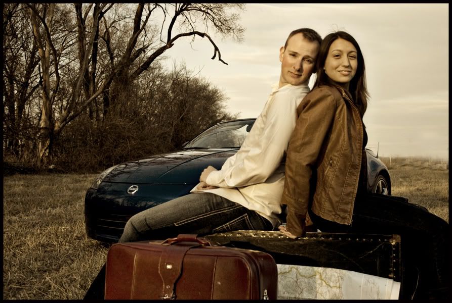
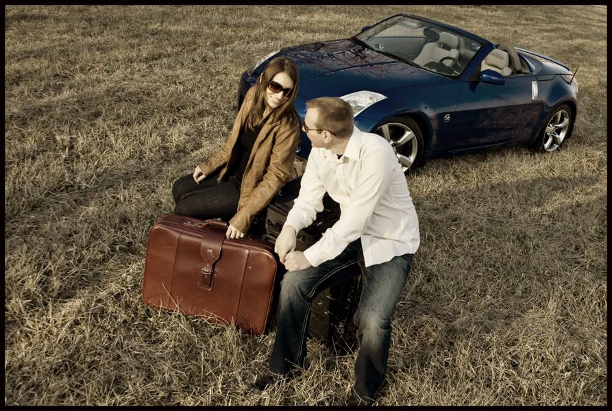
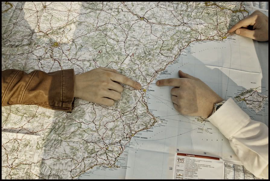
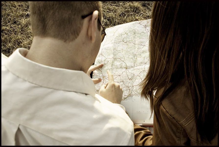
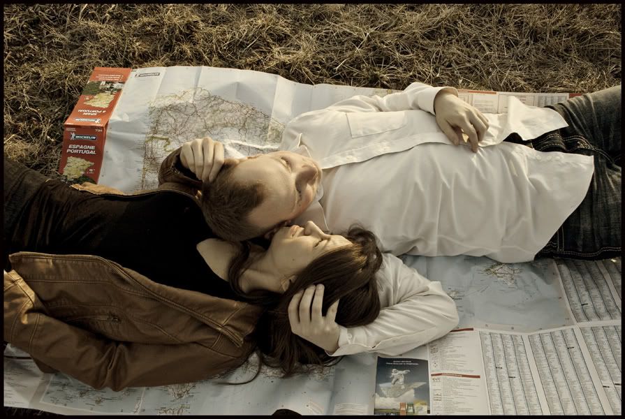
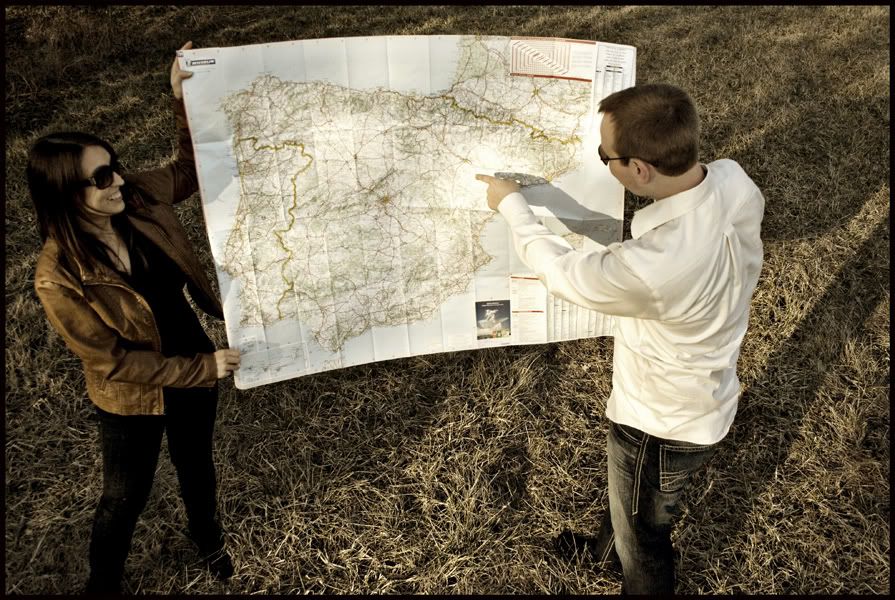
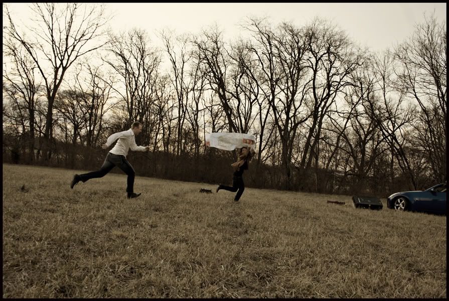
This was a sorta "Spain theme". We brought some luggage and a huge map of Spain. They were a great couple to work with. I'm glad all she could find was a HUGE map of Spain, as the size of it turned out to be an asset.
1)
2)
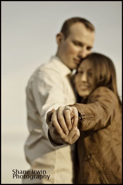
3)
4)
5)
6)
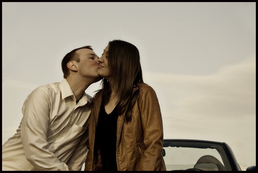
7)
8)
9)
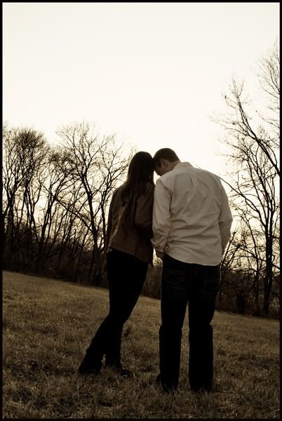
10)
This was a sorta "Spain theme". We brought some luggage and a huge map of Spain. They were a great couple to work with. I'm glad all she could find was a HUGE map of Spain, as the size of it turned out to be an asset.
1)

2)

3)

4)

5)

6)

7)

8)

9)

10)

Canon 5D MK IV | 24-70 2.8L USM | 50mm F1.4 USM | 70-200mm F2.8L | AB 800 light | 430EXII speedlight (x2) | Lowel iLight | Cybersync remotes | bag of trail mix |
My Weddings Website • Blog •
My Weddings Website • Blog •
0

Comments
My Weddings Website • Blog •
I like the toning you have used - gives a nice period feel to the images. The shots with the luggage and the maps are a great touch - honeymoon, new horizons and such. I think the couple will look back on these images with pride and happiness.
Those suitcases are super cool! I wish #1 & #2 didn't have the car in the background since it doesn't really match either the suitcases or the Spain thing. #1 would have been a very strong image without the car, or with the car and without the suitcases.
#9, crop out the car and straighten (maybe a 5/10 pano?) and you got a pretty good one with those interesting trees. Tilts are fun sometimes, but they have to be just the right angle to make them look intentional. This looks like an accidental tilt, but you have plenty of room to fix it.
#7, you did a good job not blowing out the sky... but that teensy bit of the car showing kind of wrecks it. It should be a prominent part of the photo, or none at all. But you could fairly easily clone it out. What would have been the easiest would have been to lower your camera angle to show less sky and more car and couple when taking the photo.
#9 is my favorite of the set. I love the body language and even the blown sky could be a boon with the right processing.
Anyway, they could use some work, but are not by any means terrible. You have your focus right on in all of them, and it looks like you guys had a really fun time! They seem very comfortable with you and that goes a long way to making a successful shoot.
It's funny, most of the things you said were already on my mind. As for the props becoming more of the focus than the couple, it's probably more my choice of style for this shoot, and my selection of photos for this post, but point is well received. I do have to admit, I'm quite a big fan now of a certain wedding blog, where they feature some super cool e-shoots (and all things wedding), and many of the featured e-shoots are very prop-heavy. http://greenweddingshoes.blogspot.com/search/label/engagement%20photos (the recent ones on top of the page are kinda lame, so scroll down)
I've already straightened out and cropped the #9 photo you mentioned. It does look better. The rest, I'll see what I can do. Thanks Heather.
Thanks also to any future comments here. I'm a bit new at all this, but I learn very fast, and I improve vastly with each shoot.
My Weddings Website • Blog •