CH:Dry 1st time entry~advice.
First time I've had a go at one of these challenges, came up with this idea, any advice, its not Quite right yet, subject, advice?
Dry cork
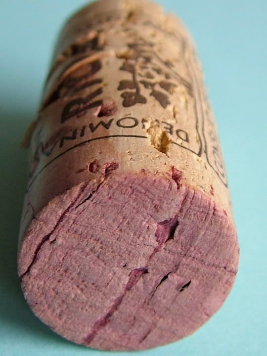
Dry cork
0
Comments
1) colors, the redish/purple of the wineside of the cork and the blue back ground don't do it for me.
2) Composition/Crop the cork doesn;t have enough room in the 'frame' plus is very central, w/o being symetric
3) Zoom/Detail level, it is too big for it to be a regular picture yet not quite close enough for it to be a macro.
I like the idea tho, but maybe zooming out a hair, leave some room around the cork and perhpas some dramatic side lighting hat would create a long shadow.
FWIW,
XO,
Mark Twain
Some times I get lucky and when that happens I show the results here: http://www.xo-studios.com
I have to agree. It is a cool idea. The blue background kind of throws off the balance of the pic. Maybe a plain white would better emphasize the highlights of the cork.
http://www.desertshadowphoto.com
http://aero-nut.smugmug.com
I have still a few ideas to try, any better I wonder?
XO,
ps. hope you are not offended by what I did.
Mark Twain
Some times I get lucky and when that happens I show the results here: http://www.xo-studios.com
Not at all, I'm very grateful for your input. I tried a similar shot but I felt it didn't Quite carry the 'DRY' message as you have suggested.
I like the colour that you have put onto the background but unfortunately I can not play around with the image yet as I don't have enough RAM in the laptop to get Photoshop up and running as yet. So what I am stuck with what i get from the original shot.
Your second shot is better than the first. You have a good idea going:):. It says more corky than dry to me, but it's a large step in the right direction from the first. No suggestions at this point, just my .02.
Good Luck,
Chris
A picture is but words to the eyes.
Comments are always welcome.
www.pbase.com/Higgmeister
With 2 shots in mind I went looking today for a replacement for the cork. Hunting for hay bails and peoples washing lines weren't too fruitful. So I managed to snatch these few shots. Opinions please, stick with the cork? Or move on to one of these? Whilst I have (no chance) & no expectations of winning the challenge, my aim is to have a worthy contribution.
(dry on dry)
(a thirsty tree) My fav!
(..)
(dry on dry2)
(dry tree stump)
You have some very nice shots in there. The pinecones don't work DRY for me so I prefer the cork the those. I really like the dry tree shot, wonderfully dramatic lighting (I tend to gravitate to those). A little fill would also help here (I think, but not sure). I like this shot all the way around:D. The dry tree stump is also an interesting picture. I like the textures and forms created by the dry trunk. It needs some PP to pop or even a B&W treatment to bring out the textures and forms. This one says dry more than any of the others, though the dry tree I like the best as a photo.
So, to summarize, I think the dry tree trunk is the most dry out of all your shots.
Nice shots overall, thanks for sharing,
Chris
A picture is but words to the eyes.
Comments are always welcome.
www.pbase.com/Higgmeister
I'm leaning towards the dramatic thirsty tree.
The tree was dead, so dry as a bone. I liked this feature, looks to me like the tree has a face with a dry open mouth, thirsting for a drink, cobwebs adding to effect. However, the stump looks good & dry in B&W.
Opinions please..........
Chris
A picture is but words to the eyes.
Comments are always welcome.
www.pbase.com/Higgmeister
Thanks for your comments Chris. I've gone with the tree, better pic IMO.