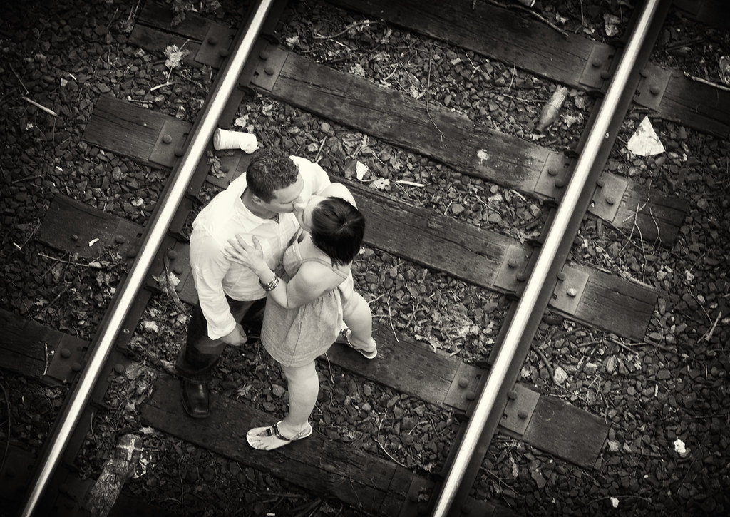
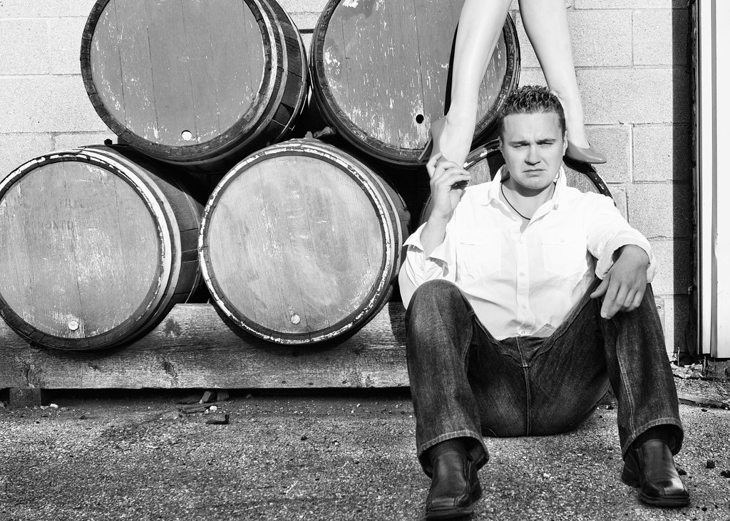
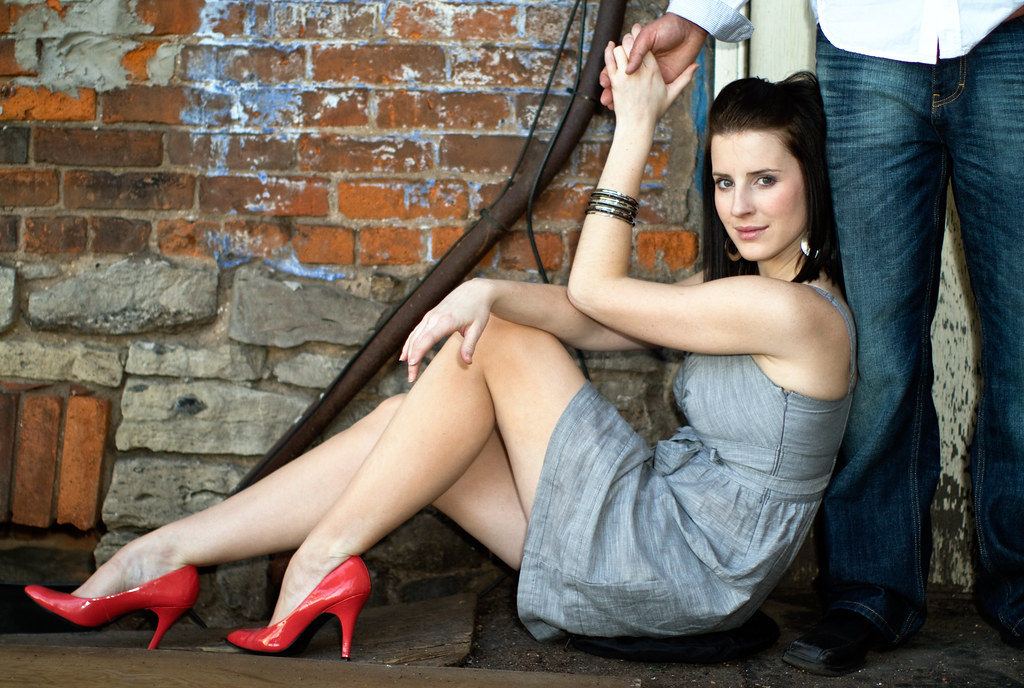
I really like the fresh perspective on the railroad track <- great idea! The last one is super sexy. I think the barrel shot would be better if she was not standing directly above him, but a bit to one side. He is also squinting in the sun - this is a great place for sunglasses.
I really like the last one too. Might be worth trying to get rid of the pad she's sitting on and the harsh shadow from her thumb on the leg. I too like the one on the tracks. Nice set.
I see you use your 5-in-1 reflector/diffuser for a cushion too. I would have probably cloned out the empty cup in #4. Not real crazy about #7. He looks like he is in pain. Good set, though.
I really like the fresh perspective on the railroad track <- great idea! The last one is super sexy. I think the barrel shot would be better if she was not standing directly above him, but a bit to one side. He is also squinting in the sun - this is a great place for sunglasses.
Thx for the critique! Yes, I really should have done something about the squint. Great idea about the sunglasses: I will remember that for next time. Cheers.
I really like the last one too. Might be worth trying to get rid of the pad she's sitting on and the harsh shadow from her thumb on the leg. I too like the one on the tracks. Nice set.
Great suggestions. I will try and clone out the areas that you have mentioned. Thx very much!
I see you use your 5-in-1 reflector/diffuser for a cushion too. I would have probably cloned out the empty cup in #4. Not real crazy about #7. He looks like he is in pain. Good set, though.
Ha ha, good eye. It was indeed my reflector, lol. I probably should remove #7 from the set and consider that a lesson learned. Great tip about the cup. Thx much!
Sammy,
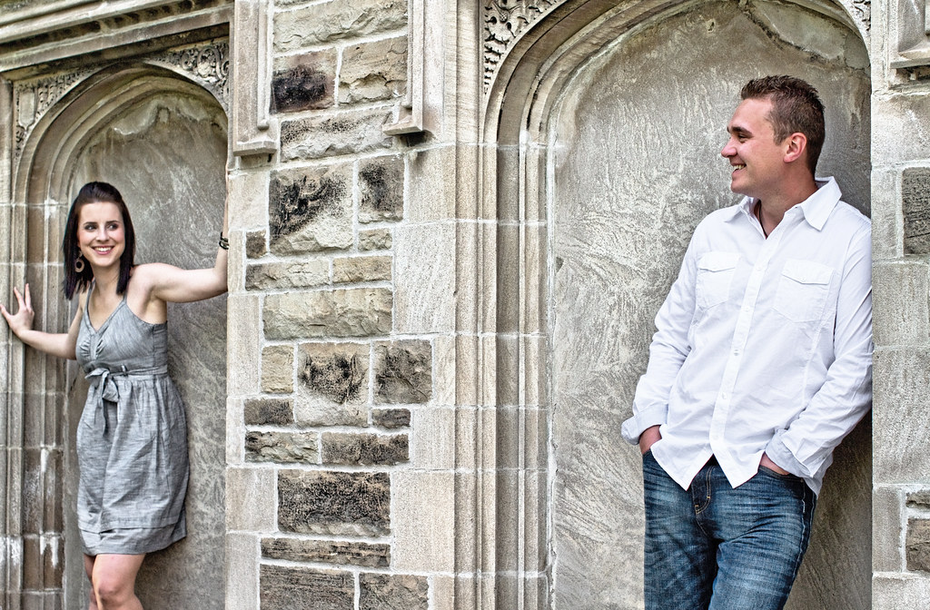
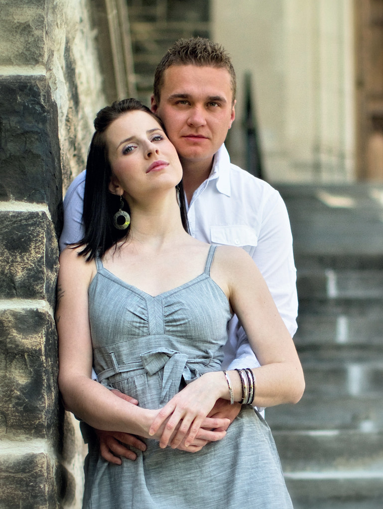
I think you did a very good job in this set. I think you or they pick the right outfit to wear which doesn't overwhelm the rest setting. The man does look a bit tense and the woman is more relax. I also prefer the B&W over the color. Did you do some burning on her dress in #6. Her dress look much darker than the overhead shot. In #1, her knee is a bit dirty with you can clean that out easily. #2, you can clone out the like dark triangle grow from the man's left shoulder. #4 other already mentioned about the coffee cup. #6, the woman's dress seems a bit too dark, may be due to burning? There is also look like some over spill of darkness in her breast and the left arm. #7 is good composed..not sure if you like her shoes a bit darker...that will stand out more. #8 great pose again, just has to hide the cushion.
Thats all I can spot but really just minor things that can easily fixed. Thanks for posting.
Sammy,
I think you did a very good job in this set. I think you or they pick the right outfit to wear which doesn't overwhelm the rest setting. The man does look a bit tense and the woman is more relax. I also prefer the B&W over the color. Did you do some burning on her dress in #6. Her dress look much darker than the overhead shot. In #1, her knee is a bit dirty with you can clean that out easily. #2, you can clone out the like dark triangle grow from the man's left shoulder. #4 other already mentioned about the coffee cup. #6, the woman's dress seems a bit too dark, may be due to burning? There is also look like some over spill of darkness in her breast and the left arm. #7 is good composed..not sure if you like her shoes a bit darker...that will stand out more. #8 great pose again, just has to hide the cushion.
Thats all I can spot but really just minor things that can easily fixed. Thanks for posting.
Eddie, these are awesome observations! All valid points, that I missed. #6 was a high contrast conversion using Nik Silver Efex. I need to fix that up now. Thanks very much!
4 5 6 7 8 are all hit out of the park. Love them.
There is some tonal contrast or hdr going on in a few of these, that I don't really love......but having said that these shots are some of the best I have seen in a while.
In fact I wish they were mine......I don't say that very often.
1 is cropped a wee bit tight on the left, take out the cup on the tracks shot, other than that don't touch these they are perfect.
4 7 8 ..the poses and setup in those are really top notch work.
Sexy couple...doing their thing.
Kudos to you!
It's probably my adjustment in DR coupled with a slight increment in vibrance that might show up like HDR. It was a very bright day with a lot harsh shadows. In fact, the bottom 1/2 of the barrel shot was almost black.
You are quite right about the tight crop on #1. Unfortunately, this is the way I framed it In the properly framed ones of the same sequence, the couple's expressions weren't that great. My bad.
Thanks very much for the critique! I appreciate it. Cheers.
Comments
http://nikonic1.smugmug.com/
Don't worry. I can fix you in photoshop.
Great suggestions. I will try and clone out the areas that you have mentioned. Thx very much!
Ha ha, good eye. It was indeed my reflector, lol. I probably should remove #7 from the set and consider that a lesson learned. Great tip about the cup. Thx much!
I think you did a very good job in this set. I think you or they pick the right outfit to wear which doesn't overwhelm the rest setting. The man does look a bit tense and the woman is more relax. I also prefer the B&W over the color. Did you do some burning on her dress in #6. Her dress look much darker than the overhead shot. In #1, her knee is a bit dirty with you can clean that out easily. #2, you can clone out the like dark triangle grow from the man's left shoulder. #4 other already mentioned about the coffee cup. #6, the woman's dress seems a bit too dark, may be due to burning? There is also look like some over spill of darkness in her breast and the left arm. #7 is good composed..not sure if you like her shoes a bit darker...that will stand out more. #8 great pose again, just has to hide the cushion.
Thats all I can spot but really just minor things that can easily fixed. Thanks for posting.
There is some tonal contrast or hdr going on in a few of these, that I don't really love......but having said that these shots are some of the best I have seen in a while.
In fact I wish they were mine......I don't say that very often.
1 is cropped a wee bit tight on the left, take out the cup on the tracks shot, other than that don't touch these they are perfect.
4 7 8 ..the poses and setup in those are really top notch work.
Sexy couple...doing their thing.
Kudos to you!
http://www.flickr.com/photos/21695902@N06/
http://500px.com/Shockey
alloutdoor.smugmug.com
http://aoboudoirboise.smugmug.com/
You are quite right about the tight crop on #1. Unfortunately, this is the way I framed it
Thanks very much for the critique! I appreciate it. Cheers.