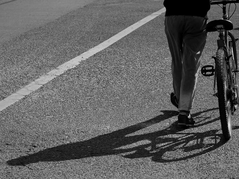
Old man and the bike
Hi there everyone, my name is Ed and new to this forum. I really enjoy the photos and comments from all of you. I have been shooting since I was a kid. Then on and off for the last 30 years With the digital era, my hobby just re-surfacing again in the last couple year. I look forward to learn a lot from you guys and enjoy my stay here.
I shot this yesterday when I walked to the library. An old man pushing his bike across the road. I hardly found this in the city anymore as majority of the riders don't bother getting off when they are suppose to push. Anyway. C&C are always welcome. Thanks.

I shot this yesterday when I walked to the library. An old man pushing his bike across the road. I hardly found this in the city anymore as majority of the riders don't bother getting off when they are suppose to push. Anyway. C&C are always welcome. Thanks.

Ed
0
Comments
Nice "artsy" shot with the shadows and textures of the road and tire.
I do hope you get bolder and get close-up shots with people's faces while keeping enough of the scene to give it context.
Rainbow: That will be my challenge to get up close and personal. The only way I can do it is to use a shorter lens which gives me no choice than face my object :-) Thanks for the comment.
Welcome aboard! I like this shot quit a bit. IMHO, it would be perfect if you include a little more of the bike on the right side.
Cheers,
Sammy.
I did some cropping to the original. The original has a bit more distraction of shadow and other part of the road. I do think the cropping on the right side a bit tight too. I post the origianl here so anyone feel free to show me their ideal cropping. Thanks and have fun with it.
I see what you mean about the shadow distraction on the right side. However, it's natural and to be expected on the street, and adds realism, IMHO.
What do you think of this crop? (I've tried to maintain a standard aspect ratio here):
Cheers,
Sammy.
I like your 1st crop of the shot. I like the prominence of the shadow and the feet.
... I'm still peeling potatoes.
patti hinton photography