Which fly is better
 Higgmeister
Registered Users Posts: 909 Major grins
Higgmeister
Registered Users Posts: 909 Major grins
Hi All,
I'm going to put one of these flys into the STF challenge for things that fly. After making both of these, I can't decide which to use. I prefer the patterns in the first and the colors in the second. Any comments?
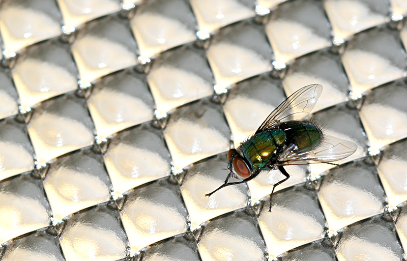
Fly One:
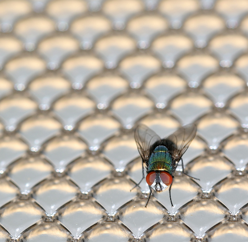
Or Fly Two:
Now, I could enter both but think they are too similar and would appear redundant.
Thanks for your comments,
Chris
I'm going to put one of these flys into the STF challenge for things that fly. After making both of these, I can't decide which to use. I prefer the patterns in the first and the colors in the second. Any comments?
Fly One:
Or Fly Two:
Now, I could enter both but think they are too similar and would appear redundant.
Thanks for your comments,
Chris
A picture is but words to the eyes.
Comments are always welcome.
www.pbase.com/Higgmeister
0
Comments
http://www.flickr.com/photos/lordv/
http://www.lordv.smugmug.com/
I like the rounded-ness of the second picture. I might like it cropped a little bit also...
http://www.twitter.com/deegolden
gubbs.smugmug.com
I like #2 best - it's a great shot! I love the crispiness of the fly! Outstanding!
AJ
regards
alan
Bugs
Spiders
Flowers
Just a little info on the shot:
The shot has been rotated 180 degrees. The fly had landed on the lighting fixture cover (upside down), hence the patterns. When I saw the fly there, I thought the repeating patterns would work on the level that fly's eyes are also a repeating pattern. Hence, the larger than normal background to show. I'd love to get a closer up of the eye on a smaller background to really show the relationship between the two. I like the in-your-face type of macros, but I didn't shoot this as macro.
Thanks again for the comments,
Chris
A picture is but words to the eyes.
Comments are always welcome.
www.pbase.com/Higgmeister
I perfer the second--here you have it all--also pattern, interesting DOF , great color and better composition.
Michal
Nick
SmugMug Technical Account Manager
Travel = good. Woo, shooting!
nickwphoto
I agree with the being more background than needed to a macro of a fly on a pattern. I actually wanted more pattern with that fly size to really accentuate the repeating pattern. The only way to achieve that would be to get a bigger fly (no thanks) or have a smaller pattern, which I had no control over. Originally, the scene was larger but I lost too much detail in the fly. The reason for the scale is to give a sense of a fly on a fly's eye, hence the title "A Fly's Eye".
Thanks for the suggestion as you are right for a fly macro,
Chris
A picture is but words to the eyes.
Comments are always welcome.
www.pbase.com/Higgmeister
TML Photography
tmlphoto.com