CH:46 Opposite opinions
Early day's I know, but with little time left as we are off on a holiday in 4 days I have to apply the grey matter to this challenge Quite soon.
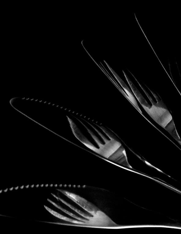
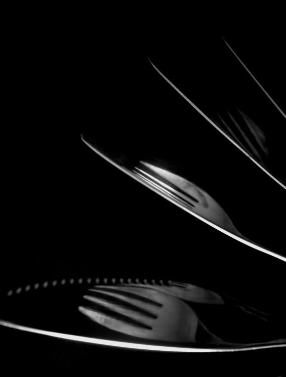
Came up with this idea, based on the opposites knives & forks. Needs some work and I have a few ideas to implement, but what does anyone think of the direction with the idea?


Came up with this idea, based on the opposites knives & forks. Needs some work and I have a few ideas to implement, but what does anyone think of the direction with the idea?


0
Comments
Thanks for your feedback. I have edited the original post with updated and entry valid shots. With only very limited time left till holiday I would welcome any feedback from anyone. Good or bad, lay it on...
Most of the shots are coming out grainy, lots of noise. I'm hand holding these shots as no tripod. Suspending the knives over the forks (which isn't easy!!) on a dark background with natural lighting. Do you think it detracts from them or do you think it compliments these kind of shots. No matter what I seem to try I get this.
Dimm, thank you for your kind comment. Really appreciated.
Advice taken.
I think it's a great idea for opposites. I'm liking #3. Love the contrast and the fading image sequence. If it was my entry, I would rotate it clockwise 90 degrees making the left edge prominent and drawing the eye down into the right corner; this diagonal movement being the most powerful (for people who read left to right and down). Then, as a bonus, the viewer's eye retraces the path back to the brighter left edge. This is my own feeling about its presentation. I think your image has impact and stands on its own no matter which way it is oriented.
Alkhemist
www.alkhemist.smugmug.com
"Photography is a medium of formidable contradictions. It is ridiculously easy and almost impossibly difficult." Edward Steichen