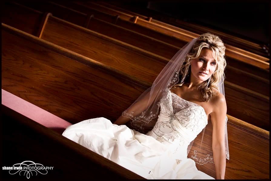
One bridal portrait. Need opinions...

This photo is so close to what I wanted it to be, but the shadows on her face blew it I guess. I was loving the natural light at the moment, and I failed to get enough of it on her face. I did try various poses, even with her looking farther left, and me shooting from near the window. None of those compositions are as good as this one is (in my mind)
I should have had my 2nd shooter grab my iLight (video light) and shine it down to light her up better. (flash in this photo would not be my thing)
With all that said, do you think the photo is ruined as far as me using as a portfolio type shot, or is the shadowing ok? Certainly, she will be getting this shot in her final images, but to what degree should I use it?
Other misc advice is very welcome.
Canon 5D MK IV | 24-70 2.8L USM | 50mm F1.4 USM | 70-200mm F2.8L | AB 800 light | 430EXII speedlight (x2) | Lowel iLight | Cybersync remotes | bag of trail mix |
My Weddings Website • Blog •
My Weddings Website • Blog •
0
Comments
Why not use a reflector to fill shadows?
LiflanderPhotography.com
LiflanderPhotography.com
Working with what you've got, I think you could lighten up shadows with an adjustment layer in photoshop....
LiflanderPhotography.com
LiflanderPhotography.com
Take all this with grain of salt , however, since I'm not a wedding photographer........... :hide
It has such potential, I would hate to not use it.
(Seriously, I spent about 3 seconds on a patch job. You could do much better with a bit of finessing and a full res file) Let me know if you want my hack job of an edit removed.
D3, and other Nikon goodies
Shilliday Photography
Blog
Facebook
All other advice is well received as well. I'll play with this image to make it work....hopefully.
Any more advice is still welcome.
Thanks
My Weddings Website • Blog •
14-24 24-70 70-200mm (vr2)
85 and 50 1.4
45 PC and sb910 x2
http://www.danielkimphotography.com
facebook
photoblog
Quarks are one of the two basic constituents of matter in the Standard Model of particle physics.
It implies sitting in a pew at an old church in the countryside. Just some late afternoon sun coming through the window. I would not try to make it something it is not
http://flickr.com/jamesbautista
Next time, less flash more ambient, watch the composition. The tilt does not add to this shot.
http://www.flickr.com/photos/21695902@N06/
http://500px.com/Shockey
alloutdoor.smugmug.com
http://aoboudoirboise.smugmug.com/
My Weddings Website • Blog •
Yes, the tilt is probably a touch too much, but it's the best composition of the bunch that I shot. I think it ads to the shot. Straight would be a tad boring I think.
Just my knee jerk response.
My Weddings Website • Blog •