DSS 55 - How You Doin'?

pyroPrints.compyroPrints.com Registered Users Posts: 1,383 Major grins
edited July 18, 2010 in The Dgrin Challenges
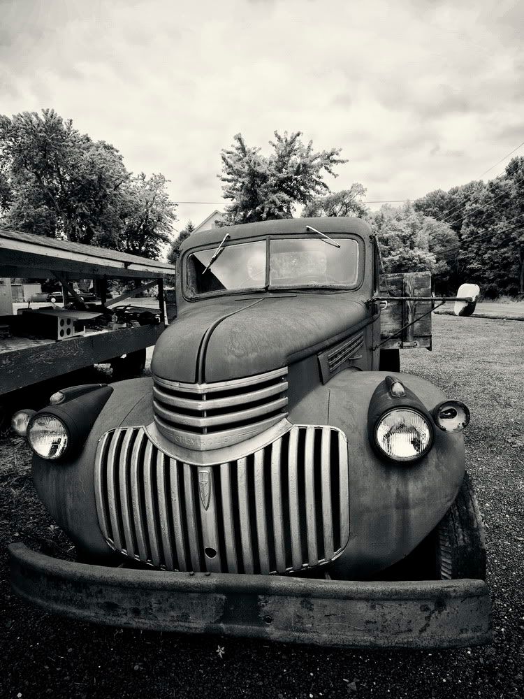
I have other ideas, but I couldn't resist this cute little guy. Had to pull over and do a little photo shoot.

So, yay or nay on stripes?
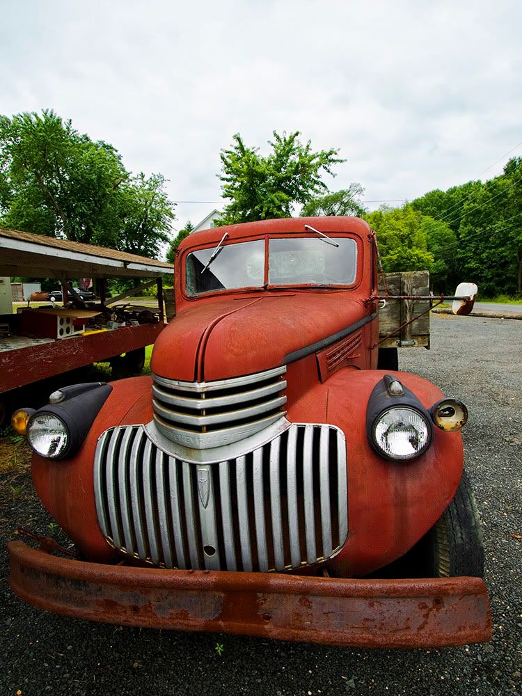
1_color.jpg

2_bw_resize.jpg
pyroPrints.com (my little t-shirt shop)
pyroPrints.com/5819572 The Photo Section

Comments

  • liflanderliflander Registered Users Posts: 339 Major grins
    edited July 16, 2010
    yay on the subject, but i don't think you're there yet. it doesn't say stripes as the subject overall. if you got in closer and filled a lot more of the frame with the striped grille, then i think the first thing a viewer would see/think is stripes.
  • DonRicklinDonRicklin Registered Users Posts: 5,551 Major grins
    edited July 16, 2010
    DSS 55 - How You Doin'?
    liflander wrote: »
    yay on the subject, but i don't think you're there yet. it doesn't say stripes as the subject overall. if you got in closer and filled a lot more of the frame with the striped grille, then i think the first thing a viewer would see/think is stripes.
    15524779-Ti.gif

    You need to crop into seeing mostly the grill. With enough to remind one what it really is, though that is not strictly necessary.

    thumb.gif

    Don
    Don Ricklin - Gear: Canon EOS 5D Mark III, was Pentax K7
    'I was older then, I'm younger than that now' ....
    My Blog | Q+ | Moderator, Lightroom Forums | My Amateur Smugmug Stuff | My Blurb book Rust and Whimsy. More Rust , FaceBook
    .
  • SeascapeSSeascapeS Registered Users Posts: 814 Major grins
    edited July 16, 2010
    I definitely like the BW better - nice contrast and textures you got there.
    SandiZ
    If I could tell the story in words, I wouldn't need to lug around a camera. ~Lewis Hine
    http://sandizphotos-seascapes.smugmug.com/
  • The Curious CamelThe Curious Camel Registered Users Posts: 943 Major grins
    edited July 16, 2010
    great idea and I agree with the others.

    peace, gail
  • JennJenn Registered Users Posts: 1,009 Major grins
    edited July 17, 2010
    If you cropped it close to the front of the car it would look like it was almost human wearing a striped tuxedo.
    Jenn (from Oklahoma)
    Panasonic Lumix 10x DMC-TZ3 :photo
    Leica Mega O.I.S./28mm WIDE :smile6
  • dlscott56dlscott56 Registered Users Posts: 1,324 Major grins
    edited July 17, 2010
    liflander wrote: »
    yay on the subject, but i don't think you're there yet. it doesn't say stripes as the subject overall. if you got in closer and filled a lot more of the frame with the striped grille, then i think the first thing a viewer would see/think is stripes.
    +1 for that. Definitely a good possibility for the challenge.
  • TLVoDraTLVoDra Registered Users Posts: 171 Major grins
    edited July 17, 2010
    Do you have any straight on front shots of this? Cropped close, the grille woud be more prominent and the symmetry is interesting. Nice find!
    Tammy~
    "In every job that must be done, there is an element of fun..." Mary Poppins
  • travelwaystravelways Registered Users Posts: 7,854 Major grins
    edited July 17, 2010
    Beautiful photo - I like both versions a lot!

    For the contest however, I agree with the crop.
    Tatiana - Seeing the world through my camera
    TravelwaysPhotos.com ...... Facebook
    VegasGreatAttractions.com
    Travelways.com
  • dniednie Users Awaiting Email Confirmation Posts: 1,351 Major grins
    edited July 17, 2010
    Jenn wrote: »
    If you cropped it close to the front of the car it would look like it was almost human wearing a striped tuxedo.

    rolleyes1.gif I didn't see that until you said it. That is cool!
  • pyroPrints.compyroPrints.com Registered Users Posts: 1,383 Major grins
    edited July 17, 2010
    Square Crop (i didn't want to go in closer)
    sq_bw.jpg

    sq_color.jpg
    pyroPrints.com (my little t-shirt shop)
    pyroPrints.com/5819572 The Photo Section
  • dlscott56dlscott56 Registered Users Posts: 1,324 Major grins
    edited July 17, 2010
    Love both of the b&w ones. I wonder how a little more drama in the sky of the first would look? IMO the second helps with the theme. How about a subtle vignette to draw attention even more into the striped area? Not sure. Looks good like it is though.
  • JennJenn Registered Users Posts: 1,009 Major grins
    edited July 18, 2010
    Square Crop (i didn't want to go in closer)

    Just my opinion .. but if you cropped out the top of the truck you'd see the front and side stripes better.
    Jenn (from Oklahoma)
    Panasonic Lumix 10x DMC-TZ3 :photo
    Leica Mega O.I.S./28mm WIDE :smile6
  • pyroPrints.compyroPrints.com Registered Users Posts: 1,383 Major grins
    edited July 18, 2010
    Jenn wrote: »
    Just my opinion .. but if you cropped out the top of the truck you'd see the front and side stripes better.

    I hear you, but I feel like it loses character and context. I'll keep it at square for now. Plus i got other ideas going on.
    pyroPrints.com (my little t-shirt shop)
    pyroPrints.com/5819572 The Photo Section
  • AndManAndMan Registered Users Posts: 1,252 Major grins
    edited July 18, 2010
    I prefer the square crops & can understand why you don't want to crop closer. 2 real nice versions which both have different merits.
    Peter

    www.andmanphotography.com

    Facebook Fan Page

    "Landscape photography is the supreme test of the photographer - and often the supreme disappointment." Ansel Adams
Sign In or Register to comment.