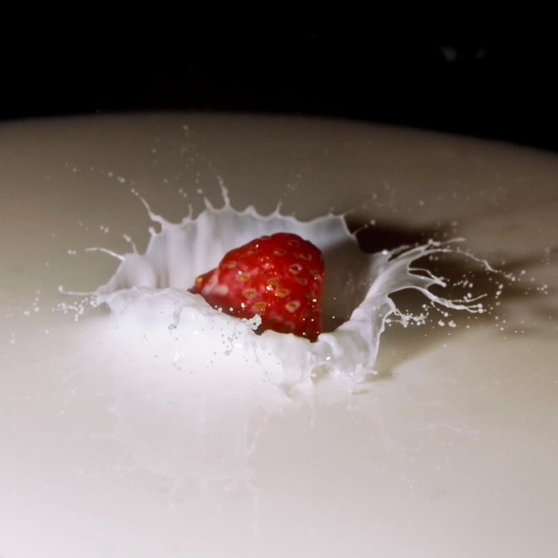
DSS57 - Strawberry Crown

pyroPrints.compyroPrints.com Registered Users Posts: 1,383 Major grins
edited August 17, 2010 in The Dgrin Challenges
I realize that there are already a few "splash" photos, but then again the theme is milk, that's to be expected ;)

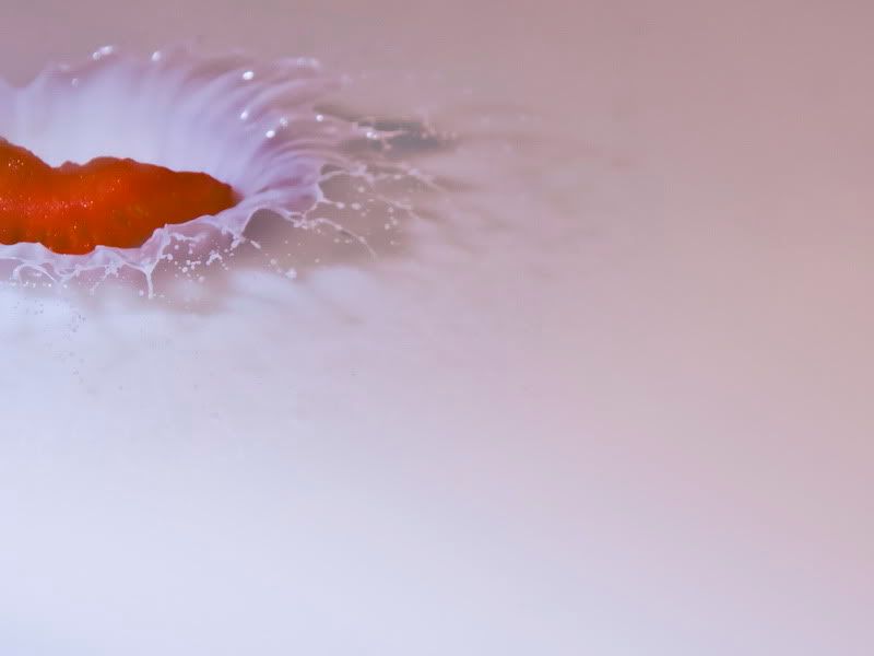
1 This one is "artistic" :wink
2_resize.jpg

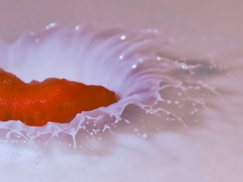
2 Tighter Crop
1_resize.jpg

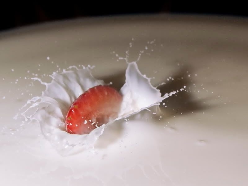
3
3_resize.jpg

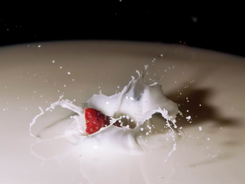
4
5_resize.jpg

5
6_resize.jpg

I also caught a bunch of cool looking crowns w/out the strawberry visible, but I think the strawberry adds some pizzaz =c)
pyroPrints.com (my little t-shirt shop)
pyroPrints.com/5819572 The Photo Section

Comments

  • tinamarie52tinamarie52 Registered Users Posts: 954 Major grins
    edited August 15, 2010
    I'd like 1 and 2 better if the berry was in focus.
    #3 is my favorite.
    #4 is awesome and would be my choice, except that the way the berry wedge appears, it looks like it's launching our of the milk instead of dropping into it. The splash and exposure on this one are great.

    4 & 5 don't ring my chimes.

    If you are shooting again, try a whole straberry. I think it might look better.

    chris
    http://chrisadamczyk.smugmug.com

    When you come to a door... walk through it.
    If it's locked... find an open window.
  • The Curious CamelThe Curious Camel Registered Users Posts: 943 Major grins
    edited August 15, 2010
    I really like 3 and 5. I know how hard these but I'll make a suggestion anyway...can you soft that shadow?
    I like the first two but like Chris said the strawberry isn't in focus.
    I really love the big splashes because they are different.

    peace, gail
  • ilbcnuilbcnu Registered Users Posts: 311 Major grins
    edited August 15, 2010
    I like the idea of 3,4,5 - I like to see the strawberry "skin" as it is more of a contrast with the milk and maybe the milk brighter like 1 & 2
    Great idea for a different splash!
    Amanda
    It is never to late to become what you might have been.
    www.behindthezoom.com
  • travelwaystravelways Registered Users Posts: 7,854 Major grins
    edited August 16, 2010
    Very nice :) I think #5 is the best!
    Tatiana - Seeing the world through my camera
    TravelwaysPhotos.com ...... Facebook
    VegasGreatAttractions.com
    Travelways.com
  • red_zonered_zone Registered Users Posts: 533 Major grins
    edited August 16, 2010
    I like the splash in #4, but in all of them the light seems pretty harsh. There's what looks like blown out sections in the front of the splash, and it fades to shadow really fast. I'd try a diffuser on the foreground flash and try different bg lighting.
    ________________________________________________
    Jake
  • kidzmomkidzmom Registered Users Posts: 828 Major grins
    edited August 16, 2010
    Fun! For mine I shot off camera flash ETTL w/ shoot thru umbrella...I think that would help you with the harsh flash shadows :)
  • silvereyesilvereye Registered Users Posts: 195 Major grins
    edited August 16, 2010
    Not to sound harsh as I try to be honest in any C/C... I think the idea is fine..As for the images themselves.. I think the lighting, croping and overall execution is lacking.. The 1st 2 images are the best of the bunch but still, IMHO not very pleasing to the eye. The rest of the images are lacking proper color and contain harsh shadows and hot highlights.. I would totally re-shoot it like I said its a good idea..
  • indiegirlindiegirl Registered Users Posts: 930 Major grins
    edited August 17, 2010
    Hey, you! Long time....

    Strawberries and cream makes me think of light, fun, yummy and soft. These pictures don't speak to me that way. The crop, composition and overall je nais se quoi don't jive.

    Strawberries + cream = yes

    These shots don't quite capture it. Keep shootin!
Sign In or Register to comment.