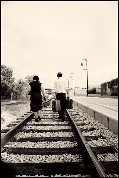
Vintage E-shoot in Nashville

WeiselWeisel Registered Users Posts: 235 Major grins
edited August 19, 2010 in Weddings
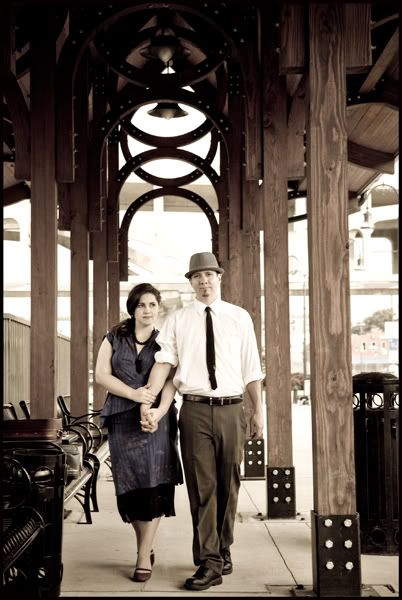
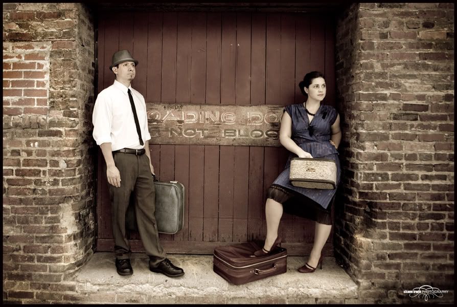
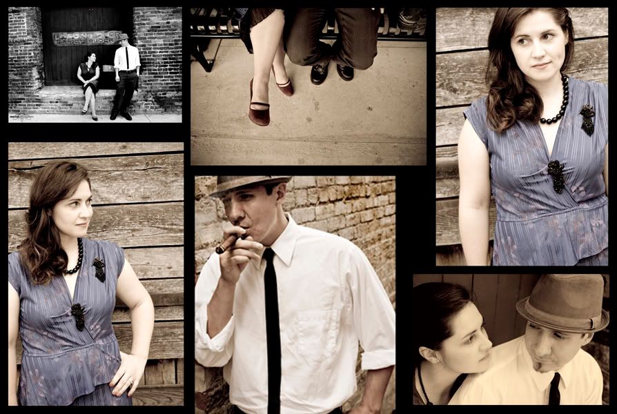
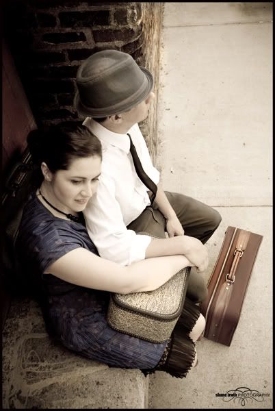
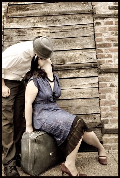
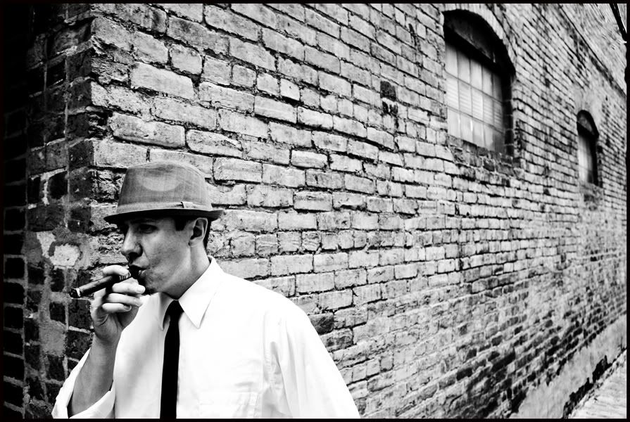
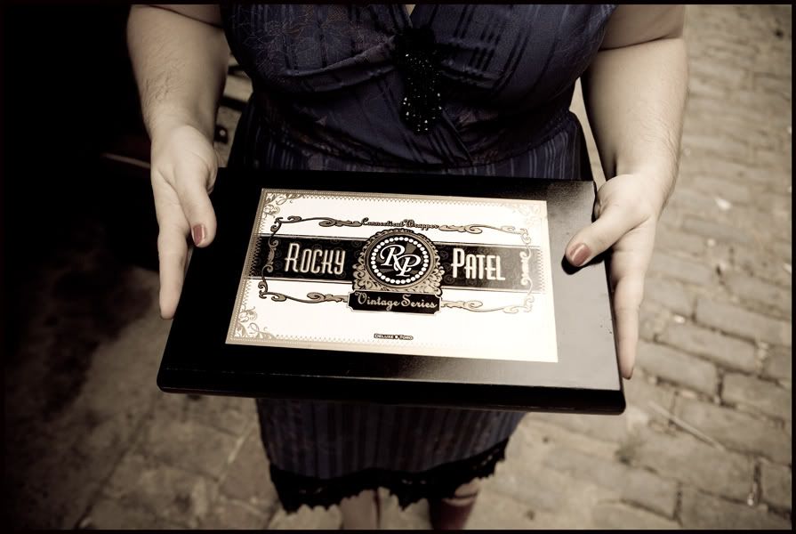
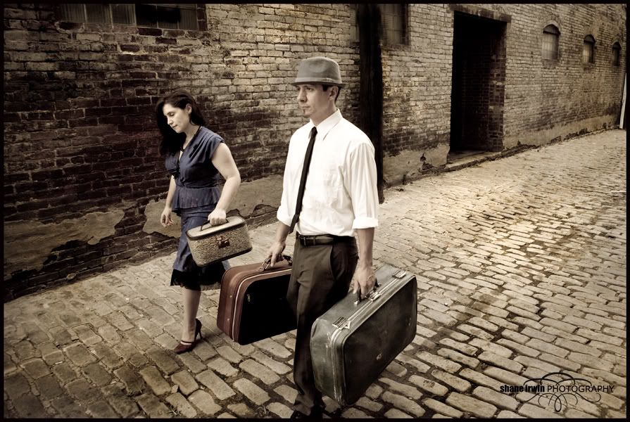
I've been dying to do a vintage style e-shoot for some time now, and finally the right couple came along. They were awesome to work with, and brought along good props and clothing. I was blessed with a nice cloudy day, so the lighting was even all over for most of the shoot. ( I used the 24-70 2.8L)

This is possibly my best ever e-shoot, but still, I'm all about hearing ways to improve my work. This was shot in downtown Nashville. Tell me the good and the bad.
For the record, this type of shoot was more about a theme, and fun, rather than about the standard "showcasing their love for each other", which is usually my goal, don't get me wrong. Anyway-here ya go!


1)IMG_8894z-1.jpg
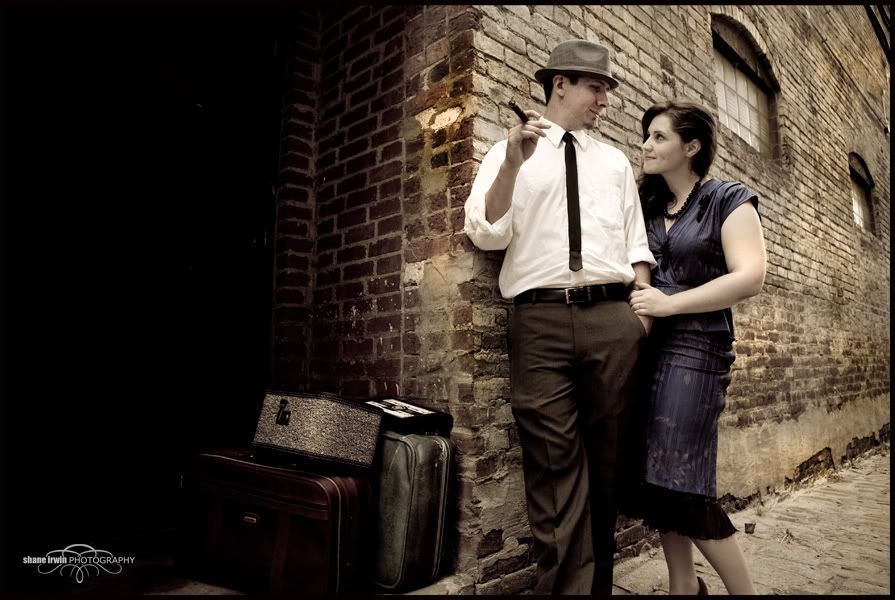
2)IMG_8974z.jpg
3)IMG_8816z.jpg
4)CheyCollage.jpg
5)IMG_8834z.jpg
6)IMG_8867z.jpg
7)IMG_8877z.jpg
8)IMG_8872z.jpg
9)IMG_8956z.jpg
10)IMG_9003z.jpg
Canon 5D MK IV | 24-70 2.8L USM | 50mm F1.4 USM | 70-200mm F2.8L | AB 800 light | 430EXII speedlight (x2) | Lowel iLight | Cybersync remotes | bag of trail mix |
My Weddings WebsiteBlog

Comments

  • mpauliempaulie Registered Users Posts: 303 Major grins
    edited August 18, 2010
    Very cool!! Props. clothing, environment and processing all come together in a cohesive theme that is really well done. I love that there are no newer cars or anything that would cause a conflict with the theme anywhere in the shots. Are you sure you didn't find these in an old shoebox and restore them??? :D I don't see anything I could tell you that could be improved, well done!
  • heatherfeatherheatherfeather Registered Users Posts: 2,738 Major grins
    edited August 18, 2010
    Fun! These are pretty great! One thing that you could easily do to to improve these is a little PP on her arms... Shrink them down just a scosh esp in #1. Sleeveless seems to always make them seem bigger than they are, and it seems especially bad when she is clenching them to herself. It is a simple fix, really. If you want a "how would you go about that", let me know. But I bet she would love these even more with a quick fix.
  • KA0TVOKA0TVO Registered Users Posts: 164 Major grins
    edited August 18, 2010
    I really like these. Their wedding should be fun. :D
    Bob
  • WeiselWeisel Registered Users Posts: 235 Major grins
    edited August 18, 2010
    Fun! These are pretty great! One thing that you could easily do to to improve these is a little PP on her arms... Shrink them down just a scosh esp in #1. Sleeveless seems to always make them seem bigger than they are, and it seems especially bad when she is clenching them to herself. It is a simple fix, really. If you want a "how would you go about that", let me know. But I bet she would love these even more with a quick fix.

    Sure Heather, give me some knowledge on fixing upper arms. I was very mindful of her arms in most shots, and even did a lot of creative cropping in some shots to help out(some of those shots aren't posted here).

    As for shrinking them, sure, some advice would work here. I mean, I use the "Liquify" screen in CS4 often, but not for complete upper arms so much. What else is there? I guess you can post it here, for other's benefit as well, unless you want to email me or something. Thanks el mucho. ear.gif
    Canon 5D MK IV | 24-70 2.8L USM | 50mm F1.4 USM | 70-200mm F2.8L | AB 800 light | 430EXII speedlight (x2) | Lowel iLight | Cybersync remotes | bag of trail mix |
    My Weddings WebsiteBlog
  • mpauliempaulie Registered Users Posts: 303 Major grins
    edited August 19, 2010
    I'd be interested as well if you have a link to a good tutorial.
  • Darren Troy CDarren Troy C Registered Users Posts: 1,927 Major grins
    edited August 19, 2010
    Nice set. Really like #5.
Sign In or Register to comment.