Rockies (Stitched shots, C&C wanted)
I'm more looking for opinions on brightness, black levels, saturation etc. My monitor is the same, but I had to move it and the viewing angle is a bit different (higher) and it can't tilt up and down.
C&C on the composition etc is fine too!
From Prince George to in and around Jasper, a few were taken at non optimal lighting times, but I could only be at one place at a time, so I worked with what I could!
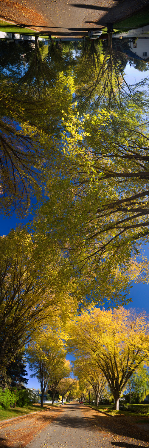
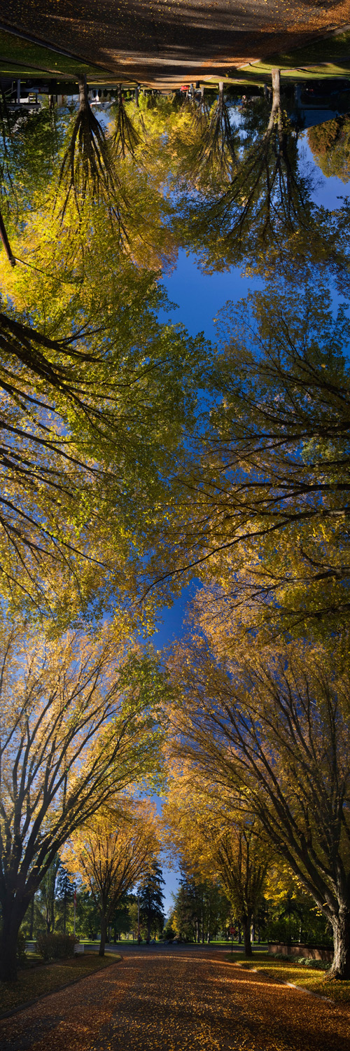
C&C on the composition etc is fine too!
From Prince George to in and around Jasper, a few were taken at non optimal lighting times, but I could only be at one place at a time, so I worked with what I could!


0
Comments
Also it looks like your using a CP filter. This isn't a good idea when stitching. It creates issues with blending the sky.
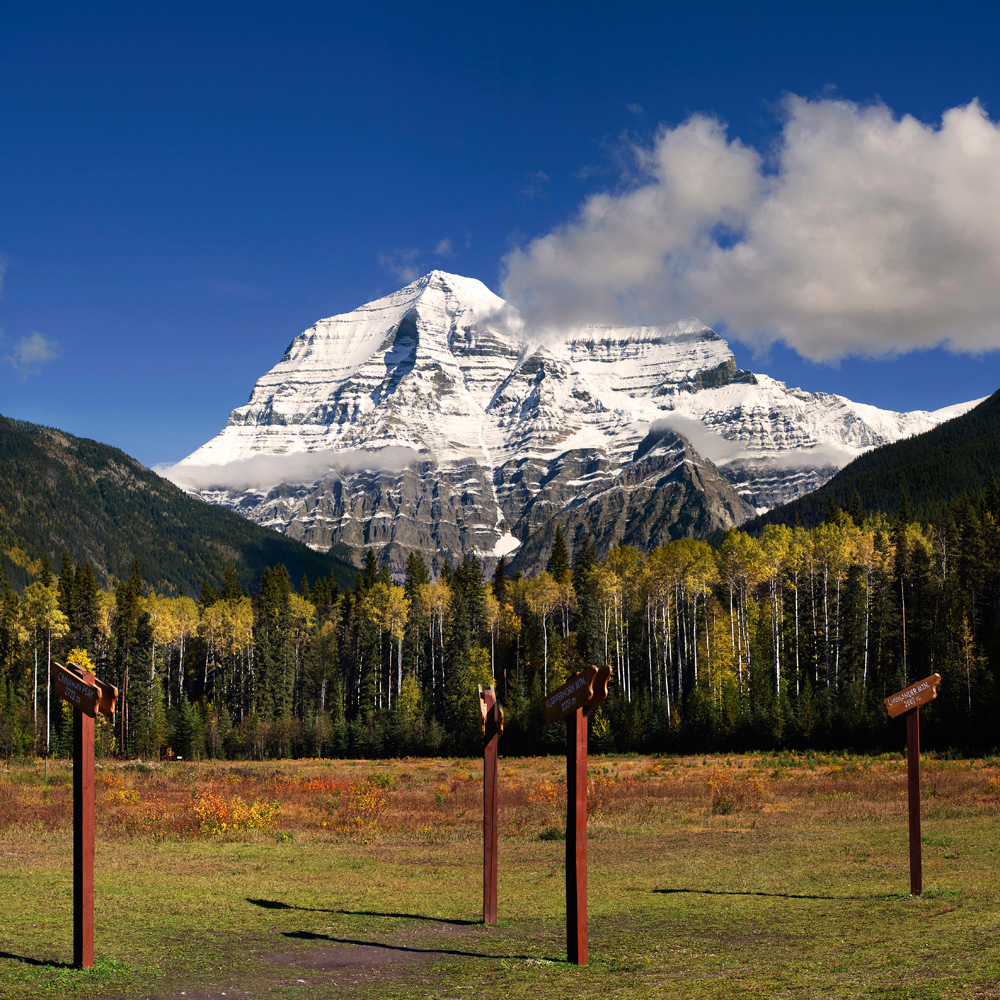
I like #6, but suggest you clone or crop out the signs.
OT:
In fact I would like to see all signage removed from national Parks. provide a map and inform visitors there will be no signs to spoil the environment, learn to read a darn map, OH and if you want to hang out over the edge of an overhang or feed the bears, it's your problem.
Sam
The gradient in the sky from the CPL is IMO not a negative thing, hence why I continue to use it
The sign's I used for foreground, and I don't find these ones that obtrusive. Personally I find the area quite free from signage, trailmarkers are few and far between, and the trailheads have some pretty handy quides to determine distance / return trip time etc.
Other parks not soo much.... But Jasper, Banff and Yoho seem to be pretty minimal
Do you have a ND grad filter? Maybe try that instead, making sure it's at the same height through all the shots.
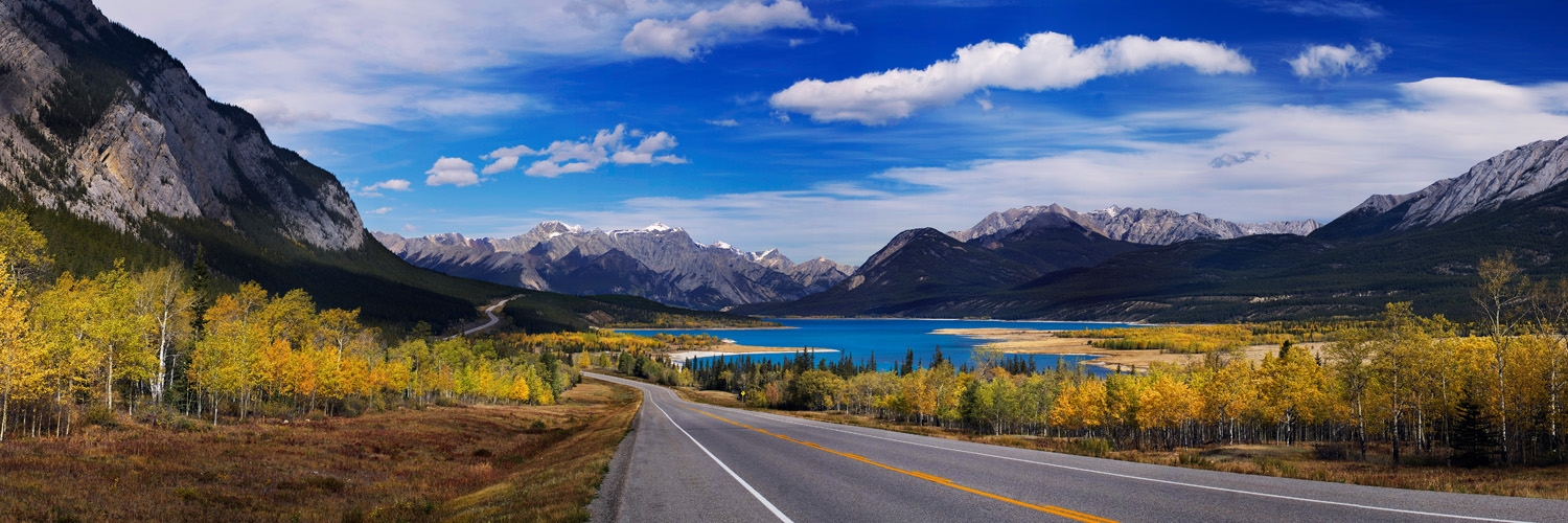
#2 I really like.
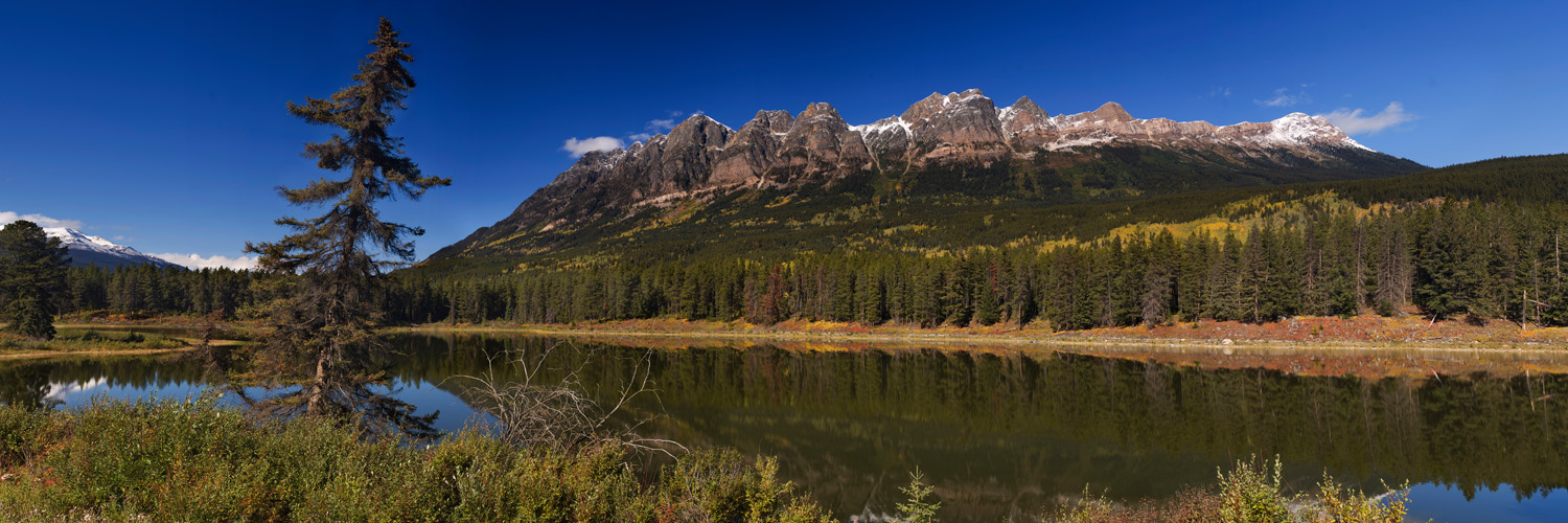
#3 has sky issues as well. Just to the left of the tree, half-way to the left border of the image, there's vertical banding in the sky there. What SW did you use to stitch?
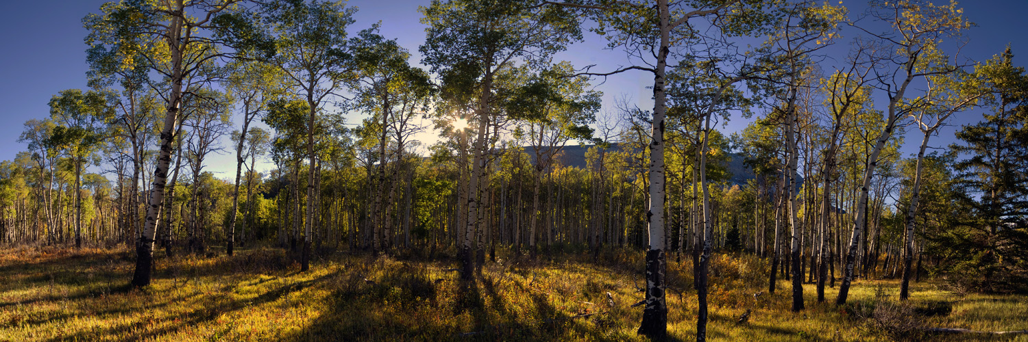
#4 Nothing really grabs my attention there. Different lighting would make a difference here.
The vertical panos are interesting, it might be worth printing them and mounting them around a doorway or archway for effect.
I also find the signs distracting on the last shot. IMHO without the signs and with most of the grass cropped out at the bottom, it might be improved, although the mountain is still dead center.
Cheers!
<o:p></o:p>
The signs in the last one don't particularly bother me; they give this image a sense of place. If you had the opportunity to reshoot the last one you might also consider a different point of view, get in front of the signs, go low and wide using some of the colorful low brush as a lead-in.<o:p></o:p>
<o:p></o:p>
#4 I like the backlighting, but feel it would be much stronger if the trees hadn't been topped.<o:p></o:p>
<o:p></o:p>
#3 works pretty well but I would have liked to see just a little more shoreline in the foreground.<o:p></o:p>
<o:p></o:p>
#2 works for me and I like the road leading into and thru the image. Great color and dramatic sky.<o:p></o:p>
<o:p></o:p>
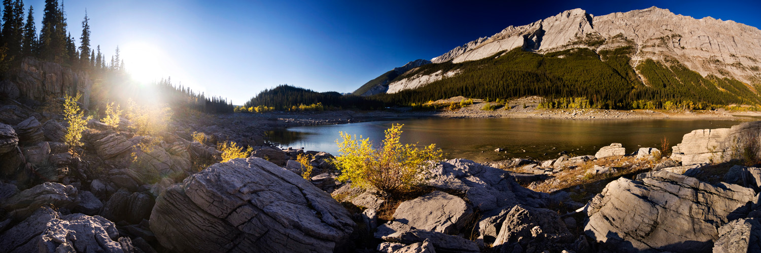
#1 not a big fan, to bright on the left and chopped on the right and not very clear what the main focal point is. I don't know what is to the right, but I would have been tempted to compose right thru the center of the large boulder on the left, up the edge of the lake and more to the right.<o:p></o:p>
Phil
The vertical pano shots are really interesting but a little confusing when you see land at the top. However, when I was scrolling down and the land at both ends was cropped off they really looked good. It may be worth playing with the crops a little, there is definitely something to be had there!
Duncan
Photo Blog