My First Senior Session
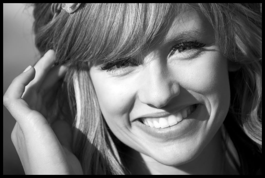
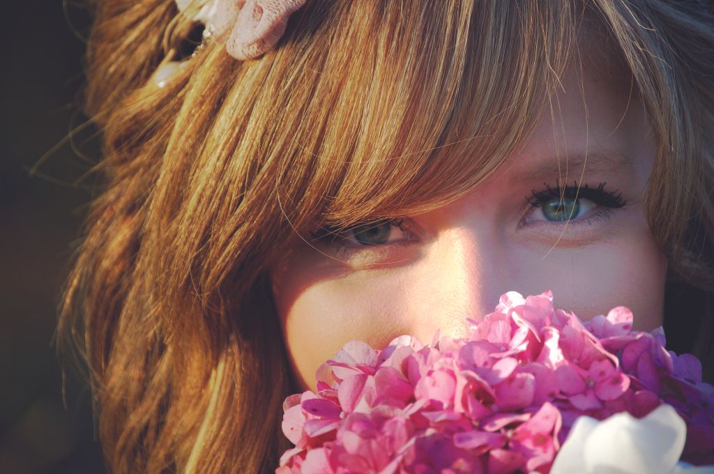
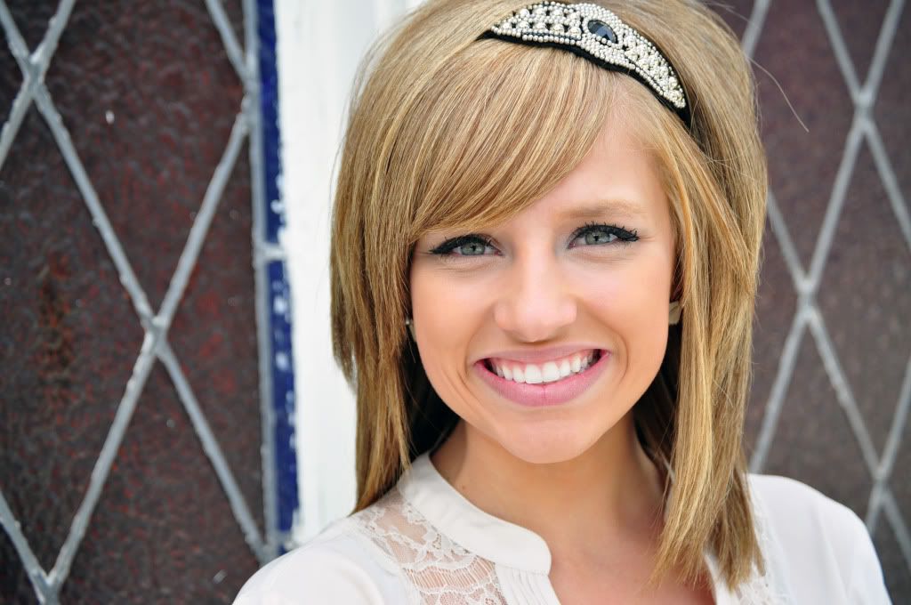
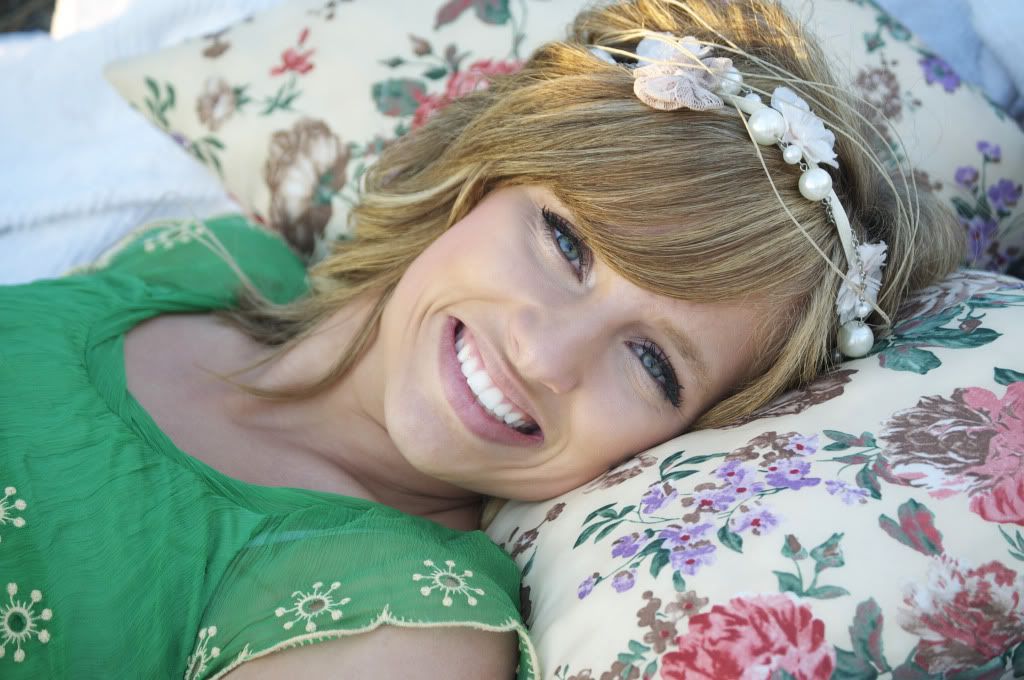
I had the privilege of photographing one of my beautiful friends. She is graduating early, but will be walking with her class in May. This was my first senior shoot, & I had such a great time! On the first day, the location was in an empty field near our homes. We love random places like this! The second day, we shot at an old church down the street from where we live. Here are some of my (& her) favorite shots from the day! I would love some C & C. Thanks!
#1
#2
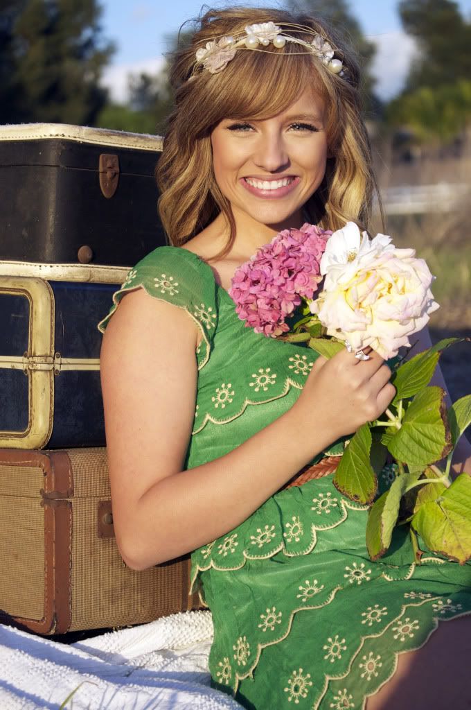
#3
#4
#5
#1
#2
#3
#4
#5
0
Comments
It is about how that thing looks photographed." Garry Winogrand
Avatar credit: photograph by Duane Michals- picture of me, 'Smash Palace' album
Thanks so much for the feedback. I definitely agree that the shadow is a bit distracting in the bottom corner of #5. I could crop it, like you said. And, yea, in these pictures she has the same smile. Lol. However, I did get a lot of non-smiling ones too!
#3 is teh standout for me. great color, focus, etc except the very top of her head is cut off. Either cut it off more to look it is on purpose or get it all in the frame.
#4 the lying down pose is not working for me
#5 I like the light here..but I would go wider or tighter. The left arm is just gone and make the awkward pose even more awkward.
14-24 24-70 70-200mm (vr2)
85 and 50 1.4
45 PC and sb910 x2
http://www.danielkimphotography.com
Is it just me or are all these soft on her eyes and sharp on her hair?
#5 is my fave but the composition is off in my opinion....
Natural selection is responsible for every living thing that exists.
D3s, D500, D5300, and way more glass than the wife knows about.
Comments and constructive criticism always welcome.
www.mikejulianaphotography.com
Facebook
www.cameraone.biz