Old bridge, looking for C&C
Old bridge...
Looking for C&C mainly, included are the orignal and the crop/B&W conversion.
Yes, I have thick skin, be brutal.
Oh, and hi everyone, I'm new... :huh:rofl
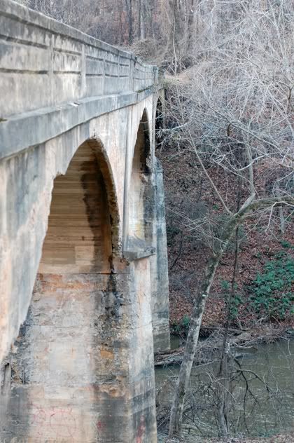
1. Original
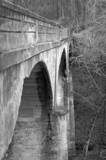
2. Crop/Conversion
Looking for C&C mainly, included are the orignal and the crop/B&W conversion.
Yes, I have thick skin, be brutal.
Oh, and hi everyone, I'm new... :huh:rofl
1. Original
2. Crop/Conversion
0
Comments
I think your cropped version looks better. I also think that you can still crop it tighter and add some more contrast and structure to the image to bring out the details of the bridge.
http://imagesbyjirobau.blogspot.com/
Oh, and welcome to Dgrin
I do however prefer the B+W , adds to the Grit of this old Gem..
here it is with more contrast.
Thoughts?
Check out billseye photos on SmugMug