E-session at Arrington Vineyards, TN
I'm pretty happy with these, and we had some nice cloud cover, making for excellent natural lighting. The couple was fun and easy to work with.
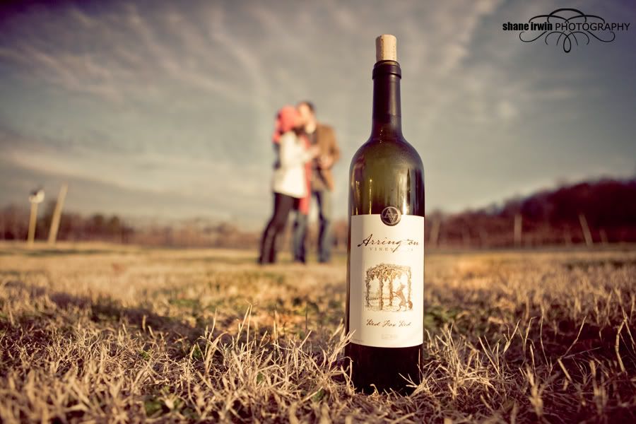
Arrington Vineyards is owned by Kix Brooks, who is half of the (now retired) monster country music duo "Brooks & Dunn".
I would really like some C&C on this set if you can spare a moment. Is my processing too much? Too trendy? I totally love it, but would like to hear from others. Not just about processing, but anything.
Thanks in advance. :wave
1)
2)
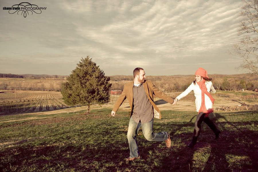
3)
4)
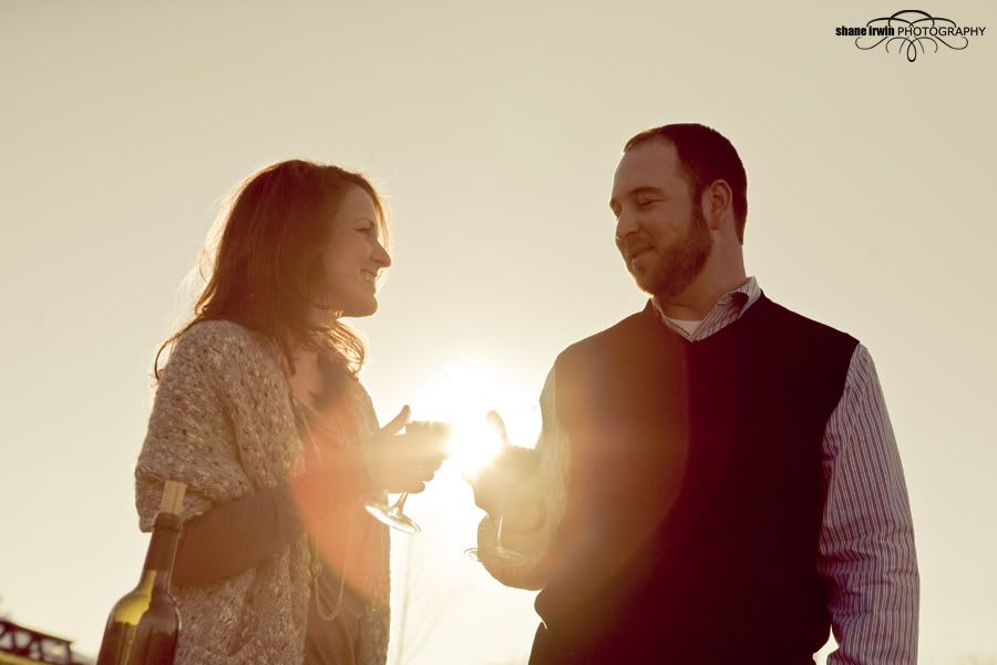
5)
6)
7)
8)
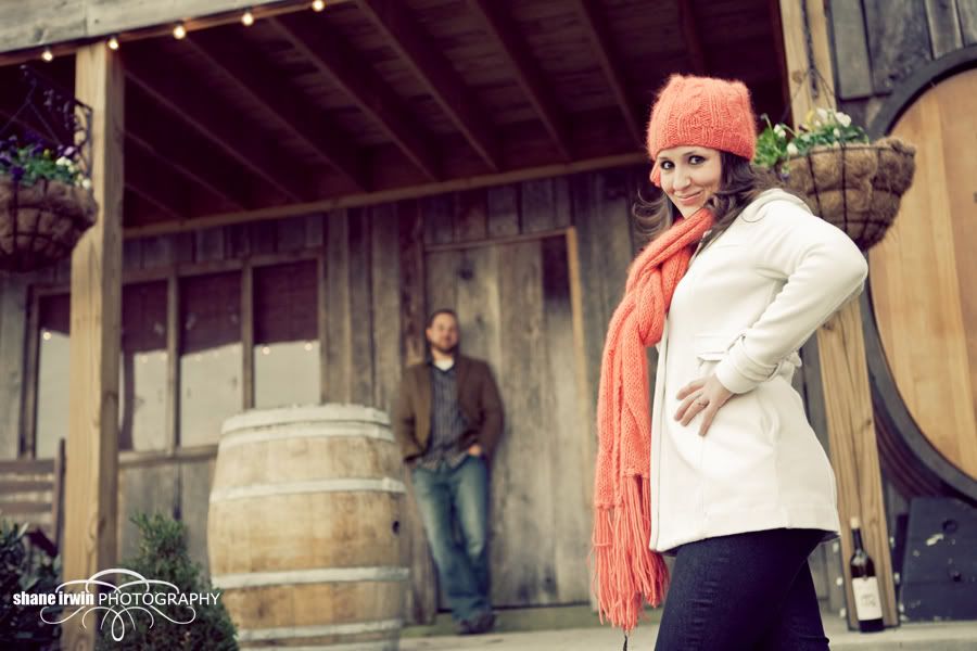
9)
10)
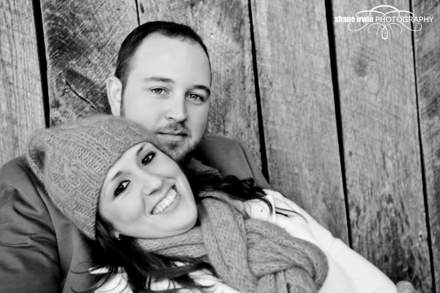
11)
12)
Arrington Vineyards is owned by Kix Brooks, who is half of the (now retired) monster country music duo "Brooks & Dunn".
I would really like some C&C on this set if you can spare a moment. Is my processing too much? Too trendy? I totally love it, but would like to hear from others. Not just about processing, but anything.
Thanks in advance. :wave
1)

2)

3)

4)

5)

6)

7)

8)

9)

10)

11)

12)

Canon 5D MK IV | 24-70 2.8L USM | 50mm F1.4 USM | 70-200mm F2.8L | AB 800 light | 430EXII speedlight (x2) | Lowel iLight | Cybersync remotes | bag of trail mix |
My Weddings Website • Blog •
My Weddings Website • Blog •
0

Comments
A few thoughts:
1. Watch he right hand on the edge of the frame - it's too close to the edge. I would probably crop in and remove it - also the little bit of shirt at the bottom of his sweater.
2. Next time have him pull his feet way back if you are shooting low with a wide angle, it really exaggerates his feet.
3. Watch the shadows behind you and where they fall in your frame.
4. Feet? I think this might look better cropped tighter on the couple, more emotional. Also, the tilt here kinda works for me. Well played.
6. The bottle looks too far away and not tall enough in the frame.
7. This feels a little too centered.
9. I like that you went for a strong pose with her, but she doesn't pull it off. Maybe it's the fingers or the look on her face...
11. It's a bit soft so add some grain - grain fixes everything
Next, for Tenoverthenose, I'm posting a less centered bottle photo. Frankly, I was a bit concerned about the centering, but sometimes it works, sometimes not. Here's my crop. I think these are both improvements. : )
My Weddings Website • Blog •