6 recent street activities (6 images)
I'm new here but I like DGrin because it has a darker skin better for showing photographs and also easier on the eyes. Also because I know a lot of members are Smugmugians and make up a more serious crowd. After the feedback received on my first image (Crazy 8), I felt like sharing a few more. All C&C are welcomed, and if you feel like it you are also welcomed to comment anything in my small flickr stream. Here are six very different recent activities on my busy streets:
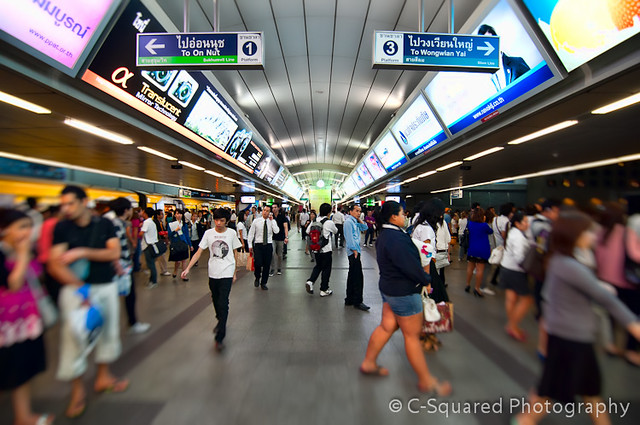
Reorient by triangular, on Flickr
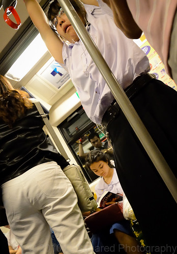
Candid Rail Car by triangular, on Flickr
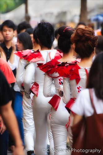
Summer In The City by triangular, on Flickr
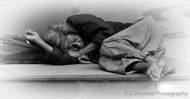
Social Security by triangular, on Flickr
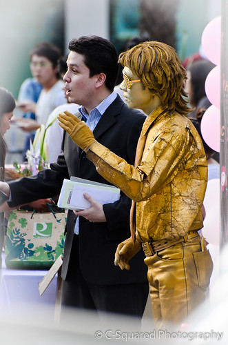
Politician Day by triangular, on Flickr
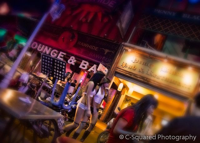
Penny Lane by triangular, on Flickr

Reorient by triangular, on Flickr

Candid Rail Car by triangular, on Flickr

Summer In The City by triangular, on Flickr

Social Security by triangular, on Flickr

Politician Day by triangular, on Flickr

Penny Lane by triangular, on Flickr
0
Comments
Thanks Richard. Yeah I kind of slipped that one in there between the fun ones. I think #4 is one of the best I've done lately, and its also very simple. I'm really happy about that one. If I could keep everything on par with that, I suppose I could make a pretty good living.
http://imagesbyjirobau.blogspot.com/
I appreciate your comments, but I am not new to pp. The whole image is actually very dark and after having cropped it, I felt it needed better framing, so it is partially a matter of composition but the truth is I just couldn't get as physically close as I wanted to. I did try a darker vignette but this made the scene appear too flat overall. After playing around with the soft white vignette, I really thought it lended a more traditional soft portrait look, and even a touch of beauty to what is usually a very harsh image. I liked that kind of irony and contrast and I think it works.
However you are not the only one who has made reference to the white vignette, so I guess I'll go back and look at other choices. Perhaps just a different border would work. Thanks for the feedback.
Check out billseye photos on SmugMug
Thanks I appreciate that, I tend to feel the same about it. It is unexpected, and maybe that is what unsettles some people. I think it works.