portraits, looking for cc
Hello, I wanted to post a couple of my portraits from the summer/fall that I really liked to get some CC on. I want to practice with what needs improving in the coming year! any CC is appreciated!
1.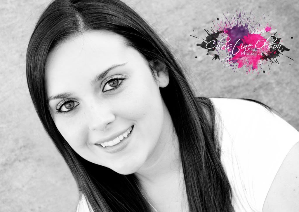
(1/160 f/6.3) (edited in LR)
2.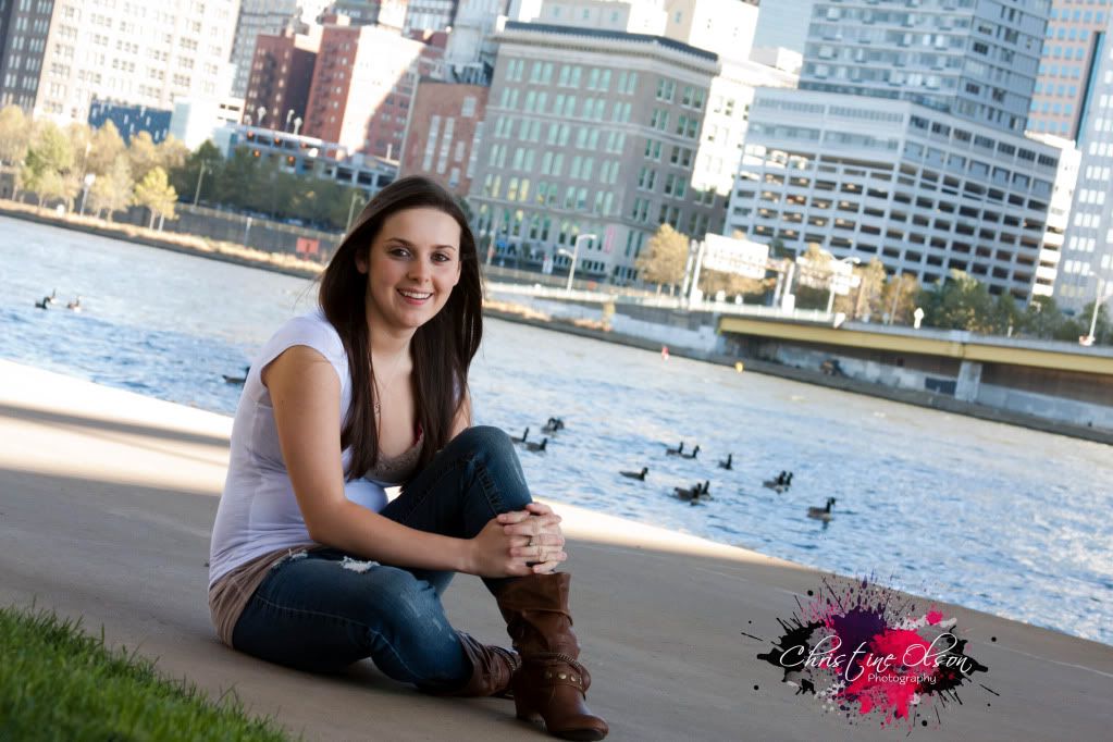
(1/160 f/7.1) (edited in LR)
3.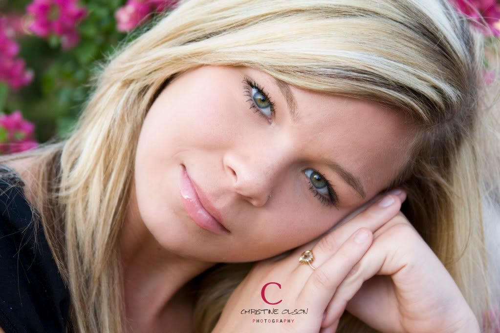
(1/250 f5.6)
1.
(1/160 f/6.3) (edited in LR)
2.
(1/160 f/7.1) (edited in LR)
3.
(1/250 f5.6)
In My Bag:
Canon Rebel XSi. Canon 50mm f/1.4. Canon 28-135mm f/3.5-5.6. Speedlite 430exII
Coming Soon
Canon 5DmkII. Canon 24-70mm f/2.8L
Canon Rebel XSi. Canon 50mm f/1.4. Canon 28-135mm f/3.5-5.6. Speedlite 430exII
Coming Soon
Canon 5DmkII. Canon 24-70mm f/2.8L
0
Comments
1-Her shoulder is blown out.
3-Edit out whatever it is on her lip and on the left side of her nose.
14-24 24-70 70-200mm (vr2)
85 and 50 1.4
45 PC and sb910 x2
http://www.danielkimphotography.com
would you use the burn tool to fix that up?
and for 3 do you mean her lip gloss?
Canon Rebel XSi. Canon 50mm f/1.4. Canon 28-135mm f/3.5-5.6. Speedlite 430exII
Coming Soon
Canon 5DmkII. Canon 24-70mm f/2.8L
thank you! I was trying to play with different angles and stuff, thanks for your input!
Canon Rebel XSi. Canon 50mm f/1.4. Canon 28-135mm f/3.5-5.6. Speedlite 430exII
Coming Soon
Canon 5DmkII. Canon 24-70mm f/2.8L
Lip gloss or whatever it is...to me, it looks like frosting
Not sure how I'd go about fixing the shoulder burn out...
Don't take me wrong, the photos are good but just need some little adjustments.
no no, i really appreciate it! lol it kinda does look like frosting
Canon Rebel XSi. Canon 50mm f/1.4. Canon 28-135mm f/3.5-5.6. Speedlite 430exII
Coming Soon
Canon 5DmkII. Canon 24-70mm f/2.8L
EF 2.0x II extender BG-E6
Things to remember for the year to come in photo-shoots:
Be different, be you and be original....
You've done some of it already....keep doing it
Question on #2, if you don't mind. It looks like you used extra light in given she's in the shade, correct?
Also, is that shot from the northside of Pittsburgh?
Who is wise? He who learns from everyone.
My SmugMug Site
thanks maybe i'll crop it in a bit and see how it looks.
On 2, i shot it a little brighter than normal (& used my flash bc the city was so bright in comparison & i wanted the light to look pretty evenly distributed it that makes sense, and i did some editing in
lightroom. I feel i would have done better to have used the bouncer to achieve what i was going for.
and yes that is right by PNC Park. Its called "North Shore ParK"
Canon Rebel XSi. Canon 50mm f/1.4. Canon 28-135mm f/3.5-5.6. Speedlite 430exII
Coming Soon
Canon 5DmkII. Canon 24-70mm f/2.8L
Bummer I can't see your pics at work...but for fixing blown skin.
I use the clone tool set at about 15%. Grab a piece of skin that is the same color as what you believe the skin should be (it should be a very bright un-blown section) that is roughly 50% of the size of the section you want to fix. Use a soft edge tool and stay away from the edges or they will blur. Only do just enough to cover the obviously blown looking sections...less is more. Just takes a minute.
If necessary touch up with the dodge and burn tools after.
http://www.flickr.com/photos/21695902@N06/
http://500px.com/Shockey
alloutdoor.smugmug.com
http://aoboudoirboise.smugmug.com/
Looking at these for a little while here. Nose rings -watermarks-blowouts etc. even lipgloss . keep it all . This is "you" follow your imagination,take information use what works and don't forget about the stuff that doesn't - some day it might !
And don't forget these images are the subject not me not you but "them" keep that in mind taking C/C
Personally, the crops are working for me sure they can be altered and changed here and there but were talking what is at hand, all I would focus on is what you got going and what you want to achieve and that sounds like balancing light .
#1 for me !
I love her smile not forced - looks natural . The brightness is a trend right now with many and she will probably love this - So I would not worry about the blow out ,but would in the future try to control this at least for the originals sake , then do what you feel for the final image.
#2 for me !
If I was to crop this I would lower the horizon as to raise the subject a little- the tilt with water can mess with some people but if the subject likes it that is what matters most of all here.
#3 for me !
Very well !
For me
#1 was a little to blown out for me.
#3 to me the lip gloss in the one spot looks a little like a blister.
Over all they are all great shots.
http://www.realphotoman.com/
Work in progress
http://www.realphotoman.net/ Zenfolio 10% off Referral Code: 1KH-5HX-5HU
Critique for competition....#1 your whites have lost detail and the frontal light makes her face broad, a no no with the women.
#2. the horizon line is tilted, your background is over exposed, the pose is awkard with her fingers held in that entertwined hold and the lean gives her a tummy.
#3, is the best of the lot, the crop might be alittle too tight and the hands should not be cropped as they are. The specular highlight on the lower lip is distracting. Lastly the flowers are taking attention away from the subject.
These are some general comments a judge might bring up that would bring your score down.
You have a great start so have a thick skin and post away and take the cc with a grain of salt a nd apply that which you like. This is how I started out as a dad with a camera also.
PS Go Steelers!
www.cameraone.biz
ed: thank you for all your critiques! and what was funny is that #1 was her fave, b/c of the hi-contrast (she's my cousin and says thats in lol) the original is not that bright. I just really like it bc her eyes really pop.
dbveto & Hackbone: They both really do like their photos, but t
Hackbone: thanks for your input. I also agree with what you were saying about taking every shot as is if it were a competition print & i will keep that in mind. I definitely have a love for photography, i am always up to learning and improving! so i will keep posting for cc and feedback.
and yes Steelers all the way
thanks everyone.
Canon Rebel XSi. Canon 50mm f/1.4. Canon 28-135mm f/3.5-5.6. Speedlite 430exII
Coming Soon
Canon 5DmkII. Canon 24-70mm f/2.8L
Otherwise, I think you are very good and have a natural developing eye :-)
Lol! i did not notice that, but after you mentioned it i was like It Really Does!!!!! and you're not the only one i asked my hubby if he saw anything wrong and he said he saw the same thing.
but thanks, I have always loved taking photos and I'm very excited to get my new equipment and get into my classes to play around and see what i come up with
Canon Rebel XSi. Canon 50mm f/1.4. Canon 28-135mm f/3.5-5.6. Speedlite 430exII
Coming Soon
Canon 5DmkII. Canon 24-70mm f/2.8L
First let me say that when you ask any group on the internet to pick a photo apart, ANY photo, they will find things to pick apart.
These are pretty good portraits.
The only suggestion I would make is to maybe use a larger f stop to blur your backgrounds more so your subjects will pop out more. Don't go crazy with the tilts....one or two here or there is plenty.
Looks like you are on the right track....work on some of the small issues mention in the other responses....but overall, good stuff.
http://www.flickr.com/photos/21695902@N06/
http://500px.com/Shockey
alloutdoor.smugmug.com
http://aoboudoirboise.smugmug.com/
I think it good policy sometimes when asking for critique to talk yourself about how you feel about the shots, how you react to them. It helps people to focus rather than search around for technical faults mainly. You're more likely to change the way you see your own shots from getting other people's reactions, rather than technical analyses.
So, my reactions are that these shots are relaxed, natural, unforced, intimate and direct. I feel I am looking at friends in an everyday kind of way, up close, the way that you know your friends. So to me they are superior snapshots. How does that gel with the way you see them? Or what you wanted of them? If you wanted people to notice style eg arty impact, edginess, doco grittiness, studio polish, glamour sheen, whatever, then that is not part of my reaction, whatever I think of the technicalities of them.
It's a lengthy, hard, necessary but straightforward process to take care of technicalities, but technicalities are delivered in different "languages". What do you want from feedback, a technical checklist (which can be of great value), of an indication that you have been understood or not?
Neil
http://www.behance.net/brosepix