headshots 1st shoot since november.. cc welcome!
I'm so excited to get back in picture mode. I was pretty proud of the results of my friends headshots. CC is welcome
1.
2.
3.
1.

2.

3.

In My Bag:
Canon Rebel XSi. Canon 50mm f/1.4. Canon 28-135mm f/3.5-5.6. Speedlite 430exII
Coming Soon
Canon 5DmkII. Canon 24-70mm f/2.8L
Canon Rebel XSi. Canon 50mm f/1.4. Canon 28-135mm f/3.5-5.6. Speedlite 430exII
Coming Soon
Canon 5DmkII. Canon 24-70mm f/2.8L
0
Comments
Regards,
-joel
Link to my Smugmug site
http://aliceswonderland.smugmug.com/
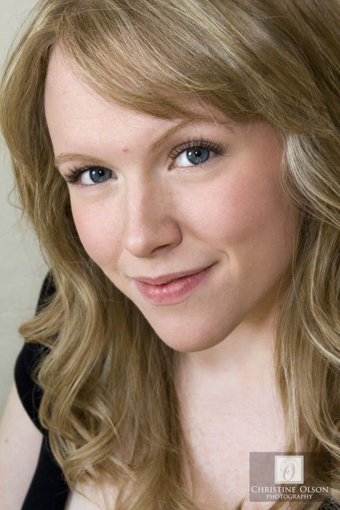
Of these, I like the first one best - just a little more "airspace", and a great expression. If you can sharpen/pop the eyes a little more, it will go further to grab attention. Also you might want to add a little colour to her lips (either using LR red slider or PS HSL, possibly even the "colorize" feature in HSL) - as it is it looks like she put foundation on them and then forgot lipstick/gloss.
ETA: "but I'm wondering if the lighting looks a little flat or too even on them. A little more shadow detail might have been more flattering?"
Flat-ish lighting is typical for headshots these days. They want to see faces rather than modelling shadows. Sure, you do need some modelling (of course!), but in general preferred shots tend towards a bright, somewhat flat look unless it's going for a very dramatic feel. There's no reason one can't break the "rule", but flat lighting is definitely not unusual within the style. That said, these might benefit from a contrast bump
I too think I see a slight green cast in the shadows (there seems to be a magenta vs green thing happening).
I would like to see the eyes brightened a touch, and the sharpness on them improved (try USM at 180 and 0.3% radius, and mask). You can get more modeling in the face with very judicious use of USM, try 10-15 @ 40-60. Set blending mode to Luminosity. I think the hair detail needs to be brought out more.
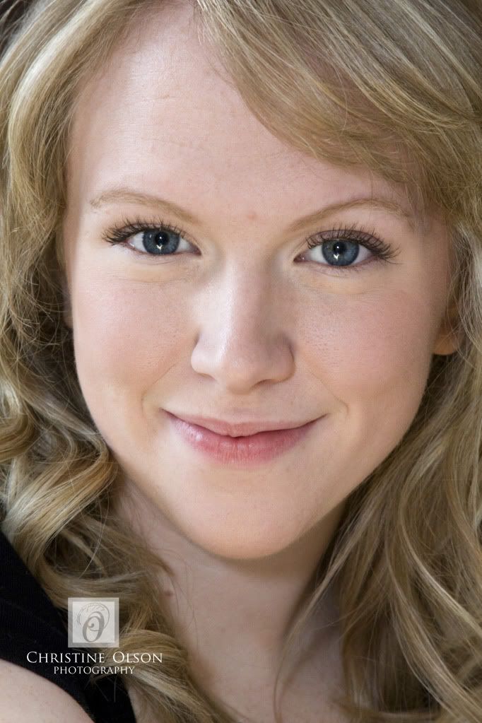
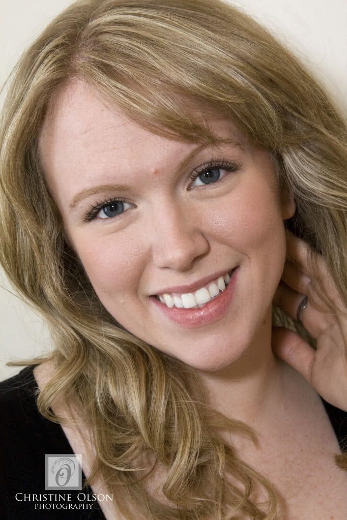
With adult women, makeup is a tough decision. Sometimes it just shouts MAKEUP. In glamour et al that's fine and that's what it's all about. I really do like the overall understated features here, though I find the heavy and very black upper lashes are incongruous and draw attention to themselves. I think the skin texture is great in #1 & 2, but a little too "digital" in #3.
I like the lighting in #1 & 3, but in #2 the highlights on the nose proclaim, 'Hey there's a flash burst on me'. (A little the same for the teeth in #2.) In #3 also the lighting is too low I think and there's a very very tiny Halloween look in the catchlights.
Who would have thought portraits could be so complex!
Neil
http://www.behance.net/brosepix
I like to use control points in NX2 to only sharpen eyes and leave skin alone. This can easily be done in CS5 with layers as well......
That's one thing that I am always weary of and with the MP count climbing all the time it's only going to get worse. The amount of detail that can be seen...wow!
Nice job lighting these....
Three is my fave