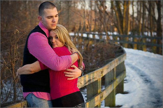
RJ and Andrea (engagement shots, feel free to C&C)
Thoughts? I need to know what I could have done better :scratch
1

2

3

4

5

Some things I learned this time out:
a) The sun is still stupid powerful at 5pm right now. lol
b) It's difficult to find poses that are comfortable for a 5'4" girl and a 6'4" guy.
c) I am in love with this stupid vintage action I found.
d) When you tell the couple to get lovey dovey or make out, expect it to continue beyond the time you say "okay, you can stop now".
1

2

3

4

5

Some things I learned this time out:
a) The sun is still stupid powerful at 5pm right now. lol
b) It's difficult to find poses that are comfortable for a 5'4" girl and a 6'4" guy.
c) I am in love with this stupid vintage action I found.
d) When you tell the couple to get lovey dovey or make out, expect it to continue beyond the time you say "okay, you can stop now".
Hi! I'm Wally: website | blog | facebook | IG | scotchNsniff
Nikon addict. D610, Tok 11-16, Sig 24-35, Nik 24-70/70-200vr
0
Comments
Hi! I'm Wally: website | blog | facebook | IG | scotchNsniff
Nikon addict. D610, Tok 11-16, Sig 24-35, Nik 24-70/70-200vr
I am not a pro by any strech of the imagination - just a viewer enjoying what I see. I don't even do People portraits, only Flower ones. I think what applies to people portraits follows for flower portraits and vice versa. Have a look if you are so inclined. www.photoman74.smugmug.com
Here goes my C&C.
#1. Great capture of therir expression. Square crop to his elbow would keep the viewer's eye from wandering.
#2. Beautiful portrait - wish she showed more of the ring.
#3. Another great shot - why isn't she showing off the ring?
#4. Beautiful - great light capture - nicely done in B&W.
#5. I would drop it from the series.
My overall comment is that if this shoot is billed as an Engagement shoot - need to show off the ring more - more relative purchase.
EDD
Photoman74.smugmug.com
#2-3: Rings are overrated, love is in
#4: Thank you. I really didn't like it as much in color.
#5: It's just a jokey joke picture but it makes me laugh. I'll ask the couple what they think but you're probably right.
Directly above the heads was the nasty metal of a gazebo.
I actually did process it once with the sun toned down some (I shot it and needed almost no recovery in raw but the vintage processing action bumps stuff).
Number 5 has the same lighting as two but again, the highlights get bumped in the vintage action. I'll try to tone it down and maybe post later with the highlights a little more controlled.
Gratzi!
Hi! I'm Wally: website | blog | facebook | IG | scotchNsniff
Nikon addict. D610, Tok 11-16, Sig 24-35, Nik 24-70/70-200vr
2 - I'd prefer a shallow depth of field on this one personally I find everything (all the branches behind them etc) in focus to be a bit distracting from them as the subject of the photo
3 - Like it but I think it might be a touch over-saturated.
5 - Cute but again a little too much overall in focus, would prefer more shallow depth of field here again.
I agree on previous statements that the ring should be shown off a bit more since it is an engagement session.
Facebook: Friend / Fan || Twitter: @shimamizu || Google Plus
I would have loved to have cranked the aperture open even further but I haven't been able to figure out high speed syncing at all. It makes me feel retarded. I just shoot @ 1/200, otherwise, yes, I'd open it up and crank the speed down to bring the background in bokehland.
Hi! I'm Wally: website | blog | facebook | IG | scotchNsniff
Nikon addict. D610, Tok 11-16, Sig 24-35, Nik 24-70/70-200vr
14-24 24-70 70-200mm (vr2)
85 and 50 1.4
45 PC and sb910 x2
http://www.danielkimphotography.com
Maybe I'll give it another shot. Does it work with manual flash?
Hi! I'm Wally: website | blog | facebook | IG | scotchNsniff
Nikon addict. D610, Tok 11-16, Sig 24-35, Nik 24-70/70-200vr
CAMERA MOUNTED FLASH: Yes, works great. Just tried it. Very cool.
YONGNUO RF602 MOUNTED FLASH: Nope. Same as the way I tried it before. I even had the camera already set for auto FP too.
Hi! I'm Wally: website | blog | facebook | IG | scotchNsniff
Nikon addict. D610, Tok 11-16, Sig 24-35, Nik 24-70/70-200vr
Website
My Smugmug
My Canon Gear:
5DMII | 24-105mm f/4L | 45mm TS/E | 135mm f/2.0L | 70-200mm f/2.8L IS | 50mm f/1.4 | 580EX II & 430EX
where did you get that action by the way?
580 EX II - 430 EX II