Which One, What Size?

briandelionbriandelion Registered Users Posts: 512 Major grins
edited February 18, 2011 in People
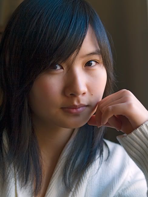
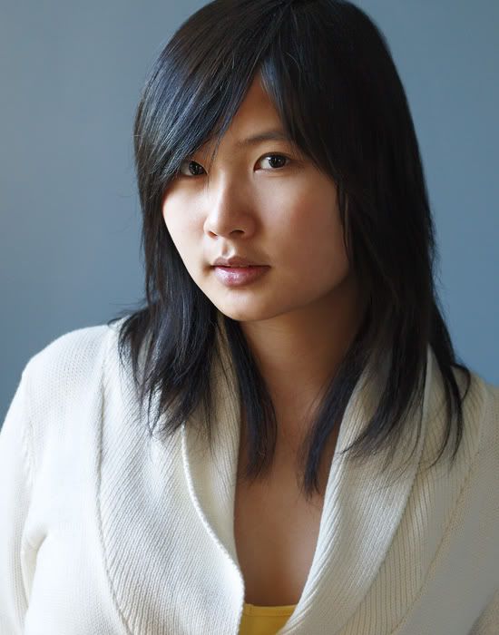
These are some of my favorite shots taken of my stepdaughter. I would appreciate comments on your favorites as well as what is a good size to print when going beyond the standard 5x7 8x10.

The originals are high enough resolution to stand up to 16x20 or so. I just want to know if there is a good rule of thumb to follow for what size translates best for portraiture.

1.
_C281244web.jpg

2.
_3179116web.jpg

3.
_C292900web.jpg

4.
_C292877web.jpg

5.
_2031005web.jpg
"Photography is not about the thing photographed.
It is about how that thing looks photographed." Garry Winogrand


Avatar credit: photograph by Duane Michals- picture of me, 'Smash Palace' album

Comments

  • heatherfeatherheatherfeather Registered Users Posts: 2,738 Major grins
    edited February 17, 2011
    3 & 4 are the best and most natural looking. (And 4 is the best of those two.) I am not digging your lighting on the others as well. 5 is an "almost" but your light is just too low and too hot for my taste.

    Does she have some blue streaks in her hair? Or is it just a cast as a result of mixed lighting in 3 & 4?

    What a beautiful girl you have there!
  • briandelionbriandelion Registered Users Posts: 512 Major grins
    edited February 18, 2011

    Does she have some blue streaks in her hair? Or is it just a cast as a result of mixed lighting in 3 & 4?

    What a beautiful girl you have there!

    No blue streaks other than cast. Not sure of the cause since it was not mixed, only natural window light. I'm leaning toward #3 myself although I've always liked #2.

    Thanks for your comments and compliment. Maybe it will encourage her to have her picture taken more! She never believes it when we tell her. ne_nau.gif

    Any thoughts on print size?
    "Photography is not about the thing photographed.
    It is about how that thing looks photographed." Garry Winogrand


    Avatar credit: photograph by Duane Michals- picture of me, 'Smash Palace' album
  • chrisjohnsonchrisjohnson Registered Users Posts: 772 Major grins
    edited February 18, 2011

    Any thoughts on print size?

    I think she would like 1) best. The crop is so tight that I think you have few options when printing other than to take a straight multiple of the original.
  • briandelionbriandelion Registered Users Posts: 512 Major grins
    edited February 18, 2011
    I think she would like 1) best. The crop is so tight that I think you have few options when printing other than to take a straight multiple of the original.

    Thanks for your input. Yes, straight multiple would be fine. I can always compensate with size of matte. My question is, what big sizes work best with portraits?
    "Photography is not about the thing photographed.
    It is about how that thing looks photographed." Garry Winogrand


    Avatar credit: photograph by Duane Michals- picture of me, 'Smash Palace' album
  • anonymouscubananonymouscuban Registered Users, Retired Mod Posts: 4,586 Major grins
    edited February 18, 2011
    I love 2 and 3. The hand is a bit hot in 2 but I don't mind it too much. I connect with her in this photo. #3 is also nice... she looks a little more wholesome in it than in 2. I'd print both of those. Not sure what size to print though.
    "I'm not yelling. I'm Cuban. That's how we talk."

    Moderator of the People and Go Figure forums

    My Smug Site
  • HackboneHackbone Registered Users Posts: 4,027 Major grins
    edited February 18, 2011
    #2 & #4 catch my eye the most. Size seems to be determined by where it is going to be. Obviously a wall portrait would look silly on a desk and a small desk top print would look silly on the wall. If your thinking large it becomes odd when the subject image becomes larger than life.
  • briandelionbriandelion Registered Users Posts: 512 Major grins
    edited February 18, 2011
    The hand is a bit hot in 2 but I don't mind it too much. I connect with her in this photo.

    My thoughts exactlly on #2. Thanks for commenting.
    "Photography is not about the thing photographed.
    It is about how that thing looks photographed." Garry Winogrand


    Avatar credit: photograph by Duane Michals- picture of me, 'Smash Palace' album
  • NeilLNeilL Registered Users Posts: 4,201 Major grins
    edited February 18, 2011
    I like #1 & 2 most. The B&W (sepia) is very sympathetic to the subject. In the coloured, there is less tonal excitement, and the impression is overall muted and static. On top of that I really do respond more strongly to intimate portraits (= closeups).

    The cheek R in #1 I think is too hot, as is the hand in #2 as mentioned. However this problem is very simply fixed, and I encourage you to do it. In shooting, perhaps a little more distance from the key (window) and some added fill might have avoided the problem. Whenever natural light is involved in my experience it is best to use as low an ISO as possible (but not necessarily the lowest possible).

    I agree with Charles that lifesize would be the most effective.

    Neil
    "Snow. Ice. Slow!" "Half-winter. Half-moon. Half-asleep!"

    http://www.behance.net/brosepix
  • briandelionbriandelion Registered Users Posts: 512 Major grins
    edited February 18, 2011
    Charles & Neil: Thanks. Some very useful advice. I have to watch the subject being too close to the window. As I recall, #1 was taken by an open window and next to a closet mirror, so a lot of light was bouncing around. There is some kind of weird banding going on with that right cheek in this jpeg that fortunately isn't in the original.
    "Photography is not about the thing photographed.
    It is about how that thing looks photographed." Garry Winogrand


    Avatar credit: photograph by Duane Michals- picture of me, 'Smash Palace' album
  • NeilLNeilL Registered Users Posts: 4,201 Major grins
    edited February 18, 2011
    It might have significant implications for exposure that sensors respond to ultraviolet light (in natural light), even though this light isn't visible in the image.

    Neil
    "Snow. Ice. Slow!" "Half-winter. Half-moon. Half-asleep!"

    http://www.behance.net/brosepix
Sign In or Register to comment.