Options

Publicity Shots

briandelionbriandelion Registered Users Posts: 512 Major grins
edited March 25, 2011 in People
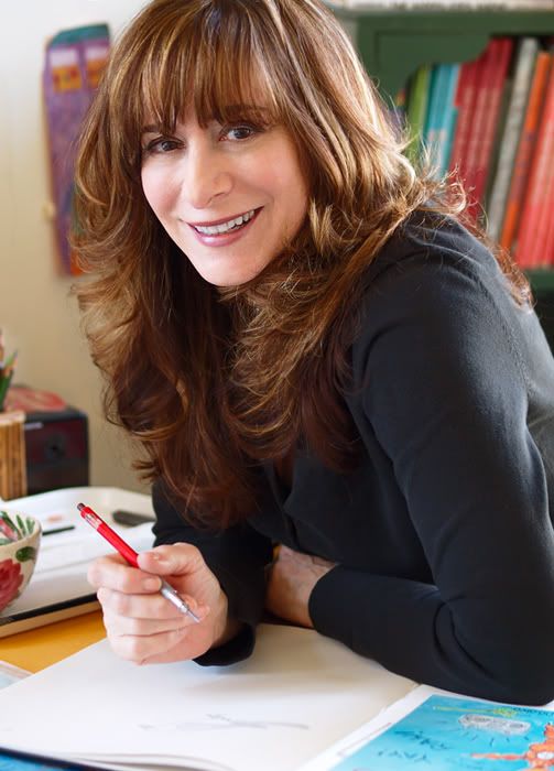
I wanted to share some pictures from a recent session with my sister-in-law. She is an author and illustrator of childrens books and wanted to update her publicity shots. Headshots will be used for book jackets, others multi purpose. Which are your favorites?

1.
_1011233web1.jpg

2.
_1011254web1.jpg

3.
_3086032web1.jpg

4._3086028web1.jpg

5.
3085930altweb1.jpg

6.
_3085947web1.jpg
"Photography is not about the thing photographed.
It is about how that thing looks photographed." Garry Winogrand


Avatar credit: photograph by Duane Michals- picture of me, 'Smash Palace' album

Comments

  • Options
    heatherfeatherheatherfeather Registered Users Posts: 2,738 Major grins
    edited March 24, 2011
    Love 6. All the rest seem just too posey... She is beautiful!
  • Options
    divamumdivamum Registered Users Posts: 9,021 Major grins
    edited March 24, 2011
    I love the way you use available light, Brian! thumb.gif

    You just KNOW my favorite shot is #3 - shallow DOF, pretty light, nice assymetrical crop. My kind of shot.

    THat said, I'm not sure it's the best for the purpose intended. While I like the inclusion of the background to "set the scene" for what she does, they're a bit cluttered for me, and the angle on 2 isn't as flattering as some of the others in the set. I think of the "Desk and pic in the bg" ones, I like #6 the best. She also has a warm, appealing smile in that one which is probably more in keeping with expectations for the juvenile market (think of kids' TV hosts - super-smiley, bouncy, friendly etc etc etc)

    #6 might also work as a landscape crop which cuts the desk clutter, but still keeps a bit of the picture on the wall.

    Overally, nice job! thumb.gif
  • Options
    lilmommalilmomma Registered Users Posts: 1,060 Major grins
    edited March 24, 2011
    Love 6. All the rest seem just too posey... She is beautiful!


    +1

    6 is good.

    in the first one the way she is holding the pen is very unnatural looking.
  • Options
    FlyNavyFlyNavy Registered Users Posts: 1,350 Major grins
    edited March 24, 2011
  • Options
    briandelionbriandelion Registered Users Posts: 512 Major grins
    edited March 24, 2011
    Love 6. All the rest seem just too posey... She is beautiful!

    Thanks for the input. She loved 1 & 4- go figure. headscratch.gif
    "Photography is not about the thing photographed.
    It is about how that thing looks photographed." Garry Winogrand


    Avatar credit: photograph by Duane Michals- picture of me, 'Smash Palace' album
  • Options
    briandelionbriandelion Registered Users Posts: 512 Major grins
    edited March 24, 2011
    divamum wrote: »
    I love the way you use available light, Brian! thumb.gif

    While I like the inclusion of the background to "set the scene" for what she does, they're a bit cluttered for me

    Thanks for the helpful comments, divamum. You should have seen it before I got her to clean up her desk! rolleyes1.gif
    There weren't many bkgd options. She wanted it in her studio which is small and cluttered. To the right two big windows for light and to the left a big potted plant and a turtle tank! rolleyes1.gif
    "Photography is not about the thing photographed.
    It is about how that thing looks photographed." Garry Winogrand


    Avatar credit: photograph by Duane Michals- picture of me, 'Smash Palace' album
  • Options
    briandelionbriandelion Registered Users Posts: 512 Major grins
    edited March 24, 2011
    Thanks for commenting lilmomma and FlyNavy. Looks like #6 is the clear winner. I agree with the choice. It's funny how people see themselves and what they perceive as their "natural" expression. I'll try to persuade her to change her mind but she's pretty strong willed.
    "Photography is not about the thing photographed.
    It is about how that thing looks photographed." Garry Winogrand


    Avatar credit: photograph by Duane Michals- picture of me, 'Smash Palace' album
  • Options
    IcebearIcebear Registered Users Posts: 4,015 Major grins
    edited March 24, 2011
    Am I the only one (other than the model) who likes #4? She really looks like an author of juvenile literature to me in that one.
    John :
    Natural selection is responsible for every living thing that exists.
    D3s, D500, D5300, and way more glass than the wife knows about.
  • Options
    reyvee61reyvee61 Registered Users Posts: 1,877 Major grins
    edited March 24, 2011
    Brian you did well capturing the available light but on one the way she is holding the pen looks a bit odd. I agree that the poses look too contrived on most of these but six is definitely the best of the wider shots and three is the better of the tighter ones.
    She is lovely by the way...
    Yo soy Reynaldo
  • Options
    briandelionbriandelion Registered Users Posts: 512 Major grins
    edited March 24, 2011
    Thanks guys. Of the headshots #4 was many of her friend's favorite too, so Icebear you are not alone. Rey, thanks for those observations. I must say it was a good learning experience.
    "Photography is not about the thing photographed.
    It is about how that thing looks photographed." Garry Winogrand


    Avatar credit: photograph by Duane Michals- picture of me, 'Smash Palace' album
  • Options
    sara505sara505 Registered Users Posts: 1,684 Major grins
    edited March 25, 2011
    Icebear wrote: »
    Am I the only one (other than the model) who likes #4? She really looks like an author of juvenile literature to me in that one.
    nope - I like #4 - it's the most professional.
  • Options
    divamumdivamum Registered Users Posts: 9,021 Major grins
    edited March 25, 2011
    I think #4 has the best eye connection of the set - I can see why people like it and, if I'm honest, it's probably better than 3 where here eyes are a bit closed. I just like the DOF and negative space in 3, which is very little to do with the subject of the shot :D
Sign In or Register to comment.