My portraits are too flat.
Hi there!
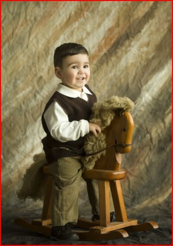
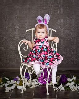
I have trouble with getting my portraits to look 3 dimensional. The first shot is an example of what I would like my portraits to look more like. The second is an example of my work.
Currently my light setup is strobes. My main light is equipped with a large softbox, I use a light with a honeycomb grid as a hair light, and I use a light with an umbrella reflector for fill when needed.
I feel like my photos are getting to "flooded with light" if that makes any sense. I can't seem to get this soft, diffused look no matter what I try. I don't use a hand held light meter (but will if needed!) and have always just used a grey card.
Suggestions?


0
Comments
The image you posted as your goal has nice soft light, but it has some direction to it as well. Try some shots with just your softbox off to one side and no other source of light. If you need some fill on the other side either use a reflector or let in more ambient light.
90% of it is just experimentation.
Move your softbox farther off to one side, and then only add light or a reflector if needed. Not farther away, but farther to the subjects right or left. You MAY even need to move your softbox in closer, for more directional light.
Dial back your fill lights for more shadows.
Moderator of the Technique Forum and Finishing School on Dgrin
The images are not the same degree of proximity, but the color in the first one is funky,yellow too.
I think the 2 nd image of the child needed to fill the frame more, or be cropped more closely, but the lighting is flat and frontal- ish, which I think is what the OP was referring to.
I think shadows add drama.
Moderator of the Technique Forum and Finishing School on Dgrin
www.warris.nl/blog
You might want to
1- get closer to the subject
2- shoot with more angled lighting relative to the camera (shoot off camera from the side)
3- use a narrower depth of field (to blur the background)
There you have it...
http://www.youtube.com/user/NYCFilmmakersGroup
http://www.meetup.com/NYC-Filmmakers-and-Actors-Meetup-Group/
My photo was taken at f10 1/160. Suggestions about that? I would like to blur the background out a bit, but when I stop down, I tend to lose my sharp focus. Once I get a model in here, I'll post my new result.
Do you have a light meter? If not, get one.
For me, my studio flash photography was hit or miss until I wised up and started metering every scene. Now I can get my lights set just about right without meter, and then fine tune with meter. I try to shoot at f5.6 1/125, which gives me sharp eyes and soft around the edges. Don't forget to put plenty of separation between your subject and the background to enhance depth. Also, my suggestion is to crop much tighter on your photo of the child. I realize that the chair is a prop and part of the scene with the flowers, etc. but personally I want to see the child, not the props, so a much tighter framing of the subject will go a long way.
I think the point of starting with a reflector is to go as minimal with light as you can and slowly add light until you get your desired results. I often don't have anyone to hold my reflector, so I stick with a large softbox and umbrellas.
Here is an example taken on Saturday of my daughter (she's upset because I told her that her smile looked fake...) The setup is a large softbox camera left at about 45 degrees, very close to the subject (just out of the frame). On camera right I had an umbrella to provide fill light. The main light softbox is set at about 1/4 power, and the umbrella strobe at 1/16. I metered it to get the lights set to the settings that I prefer to shoot at: f5.6 1/125.