Ch. 48 FINAL FOUR

Osprey WhispererOsprey Whisperer Registered Users Posts: 3,803 Major grins
edited October 3, 2005 in The Dgrin Challenges
Hello folks. I've not had much success narrowing down my selections for challenge 48. I appreciate all the previous comments and would be greatful for some additional help in reducing my 4 favorite choices. Please let me know which photo you like and feel is most appropriate for the challenge. Any tweeks that might improve them would also be appreciated. I'm getting ready to flip a coin. eek7.gificon10.gif

Many thanks.

MM

1) GRAY PHONE


50157257.jpg


2) CROSSED SIGNALS


50157259.jpg


3) FUN CALL


50157258.jpg


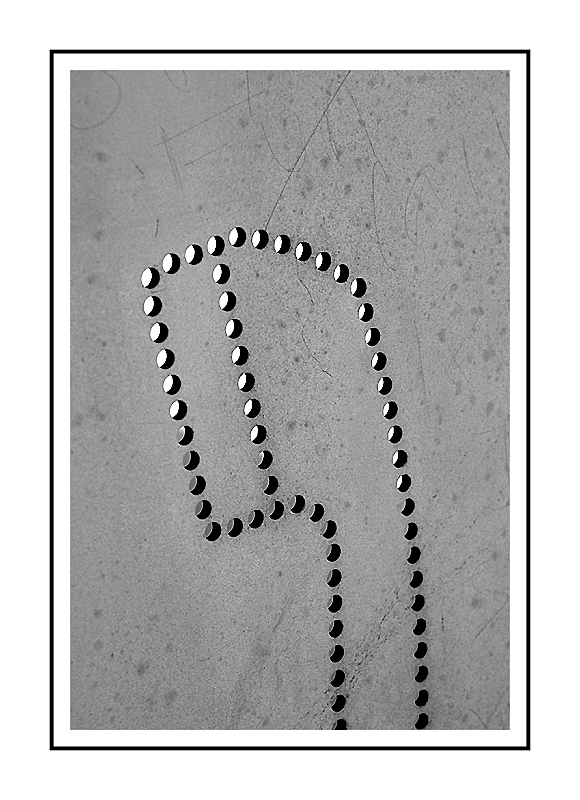
4) "TALK"


50157260.jpg


Don't forget to call in your vote for the challenge finalists. thumb.gif


50157261.jpg
Mike McCarthy

"Osprey Whisperer"

OspreyWhisperer.com

Comments

  • ruttrutt Registered Users Posts: 6,511 Major grins
    edited October 2, 2005
    I vote for "Crossed Signals". I like the diagonal lines a lot. I like the title. I like the textures.
    If not now, when?
  • Osprey WhispererOsprey Whisperer Registered Users Posts: 3,803 Major grins
    edited October 2, 2005
    rutt wrote:
    I vote for "Crossed Signals". I like the diagonal lines a lot. I like the title. I like the textures.
    Thanks for your comments, Rutt. I like it as a photo goes also. I'm worried that it might be too abstract to convey the "telephone" theme.....taken out of context from the other photos of the pay phone?? ne_nau.gif

    I think the first expresses the theme a bit more appropriately....but isn't as textural or interesting as the "crossed signals" image. I do like the two-dimensional/graphic feel of the shot. The angle/perspective of the shot...really flattens out the image (lack of color doesn't hurt either). I liked the way it almost "didn't" look like a photo.

    I sort of feel the "fun call" also relays this "telephone" theme a little better than the crossed chrome handset cable/cord?? headscratch.gif This image also has the graphic feel to it. It like the first image (gray phone) are very "flat" and two dimensional in their look/feel. It is simple ..yet bold , depsite the lack of any color.

    The "talk" image of the chipboard is interesting and colorful...but seems a bit gimicky to me. Sure ..it's an unusual look/angle at the "telephone"...but using a macro lens is sort of a "crutch" to hide good composition in some cases. Again...don't know if this conveys the theme very well. I know these images are of a telephone....but would others realize this without the context of the challenge?

    Thanks again.

    MM
    Mike McCarthy

    "Osprey Whisperer"

    OspreyWhisperer.com
  • FlyingginaFlyinggina Registered Users Posts: 2,639 Major grins
    edited October 2, 2005
    Well, I like ##s 2 and 4. I find them both interesting and very esthetically pleasing. I guess it doesn't bother me that the viewer may not identify them as showing components of a telephone. They are photographs of telephones and that seems to me to satisfy the challenge theme. But then I entered a gimmicky macro, so what do I know. rolleyes1.gif Of ## 1 and 3, I definitely prefer #1 for its composition. If I were you, I would enter the one I liked best. There really is no way to second guess the judges as far as I can tell, so it seems best to please yourself above all. :D

    Good luck with whichever one you chose to enter. thumb.gif
    Va
    _______________________________________________
    "A photograph is a secret about a secret. The more it tells you, the less you know." Diane Arbus

    Email
  • Osprey WhispererOsprey Whisperer Registered Users Posts: 3,803 Major grins
    edited October 2, 2005
    Thanks Gina the Flyer. Not to knock the macro lens....as ALL my phone shots were taken with the Canon EF 50mm 2.5 compact macro. (not a true macro..actually). I just meant...often times the macro is over used and composition can be over looked in place of super close up interesting/unusual vues and pretty colors. If one was to turn many macro shots into B&W...they don't hold up compositionaly. **key word...sometimes**. It just seems a bit gimicky to me ...most of the time. **runs and hides under a microscopic bed**


    If I had a favorite.....I wouldn't be asking for help. If I shoot it....I kind of like it. :D If I don't.....it's deleted and nobody ever gets to see it.....and I pretend I never took such a horrible shot. :uhoh rolleyes1.gif I'm leaning towards the first 3..more than the last couple. The "TALK" has somewhat of a literal tone to it (bad pun..eh?). It's also a bit corny (along with gimicky). I know many friends really like that chipboard shot. I'm kind of getting the feeling it may be the "macro" effect...or the "color blinding them"? ne_nau.gifeek7.gif:D

    I'll have to make a choice soon. headscratch.gif

    Thanks again. I do like your entry....but even knowing it's a "telephone" theme....what are those things? ne_nau.gifheadscratch.gif . SOme kind of memory chips/cards.....or ring tones. ** only guy in the US without a cell phone** I don't like the darn things. It's bad enough to be bothered at my house....let alone when I'm out doing something important...like taking pictures. :):

    Cheers

    MM
    Mike McCarthy

    "Osprey Whisperer"

    OspreyWhisperer.com
  • Wizard1929Wizard1929 Registered Users Posts: 34 Big grins
    edited October 2, 2005
    Sorry
    Sorry, I can't make a choice. Since I've entered the challenge, I might be prejudiced against picking the best one. I'm afraid you're on your own now.

    Wiz
  • Osprey WhispererOsprey Whisperer Registered Users Posts: 3,803 Major grins
    edited October 2, 2005
    Wizard1929 wrote:
    Sorry, I can't make a choice. Since I've entered the challenge, I might be prejudiced against picking the best one. I'm afraid you're on your own now.

    Wiz
    No problem. Respect your honesty. I'm sure nobody would give false information to improve their chances in the challenge. thumb.gif

    **starts looking for that quarter to flip**

    MM
    Mike McCarthy

    "Osprey Whisperer"

    OspreyWhisperer.com
  • skufukuskufuku Registered Users Posts: 51 Big grins
    edited October 2, 2005
    They are all great, no wonder to me, your having trouble choosing. Can I enter one you don't choose? Just kidding!! Any way number 2 is your strongest I think. You may be over thinking it a bit, the subject is telephone so people will know what it is. The fact that it is not actually a telephone and you have to think about it is what appeals to me not to mention composition, exposure, and the color. Hope this helps.
  • Osprey WhispererOsprey Whisperer Registered Users Posts: 3,803 Major grins
    edited October 2, 2005
    skufuku wrote:
    They are all great, no wonder to me, your having trouble choosing. Can I enter one you don't choose? Just kidding!! Any way number 2 is your strongest I think. You may be over thinking it a bit, the subject is telephone so people will know what it is. The fact that it is not actually a telephone and you have to think about it is what appeals to me not to mention composition, exposure, and the color. Hope this helps.
    Thanks for the input, Sku. I'm starting to lean towards #1 :uhoh or:uhoh #2. .

    Popular opinion is leaning towards 2. mwink.gif

    MM
    Mike McCarthy

    "Osprey Whisperer"

    OspreyWhisperer.com
  • FlyingginaFlyinggina Registered Users Posts: 2,639 Major grins
    edited October 2, 2005
    My photo was also taken with the 50 mm. I love that lens. iloveyou.gif

    SIMMs are the memory chips of cell phones. Without them, no service!! Each cell phone provider has its own SIMMs so if you change providers and want to use your same cell phone, you need to change the SIMM card. Since I use my cell phone here and abroad, I use different service providers, hence I have more than one SIMM card. (It is physically easy to switch out SIMM cards but can be tricky to get your phone unblocked so you can use multiple services. That, however, is a whole other story. :D )

    As for Talk, I do like it. What draws me to it are architectural aspects which I find pleasing to my eye and, I must confess, the colors. Do a quickie desaturate and see if your friends still like it.

    Whatever. You shouldn't enter a picture that you feel apologetic about and, while I have to assume you like Talk or we never woud have seen it mwink.gif , you seem to have too many doubts about it for you to feel good about entering it. :cry

    Good luck making your choice!

    Va

    P.S. I don't like cell phones either, but every once in a while you having one handy can save the day.
    _______________________________________________
    "A photograph is a secret about a secret. The more it tells you, the less you know." Diane Arbus

    Email
  • muddykneesmuddyknees Registered Users Posts: 181 Major grins
    edited October 2, 2005
    #1
    I didn't notice your #1 first time I looked at your thread - when I ran across it this time I thought it was a really great graphic!


    Thanks for the input, Sku. I'm starting to lean towards #1 :uhoh or:uhoh #2. .

    Popular opinion is leaning towards 2. mwink.gif

    MM
  • Osprey WhispererOsprey Whisperer Registered Users Posts: 3,803 Major grins
    edited October 3, 2005
    Thanks Muddy. I am still second guessing myself about my choice. I went with the "Crossed Signals" pic....but who knows...may change my mind tomorrow moring. (heck..might even find another shot on the way out in the a.m.)


    Thanks again to all that took a look and especially the vocal ones. thumb.gif

    MM
    Mike McCarthy

    "Osprey Whisperer"

    OspreyWhisperer.com
  • erich6erich6 Registered Users Posts: 1,638 Major grins
    edited October 3, 2005
    I like "crossed signals" and the last one the best. Great entries!
  • Osprey WhispererOsprey Whisperer Registered Users Posts: 3,803 Major grins
    edited October 3, 2005
    Thank for taking a looksee and commenting, Erich. You've got a solid entry. Best of luck.


    MM
    Mike McCarthy

    "Osprey Whisperer"

    OspreyWhisperer.com
Sign In or Register to comment.