#75 My idea...missing prop but need advice
Well...I listed this under the actual thread...but here is my dilema...
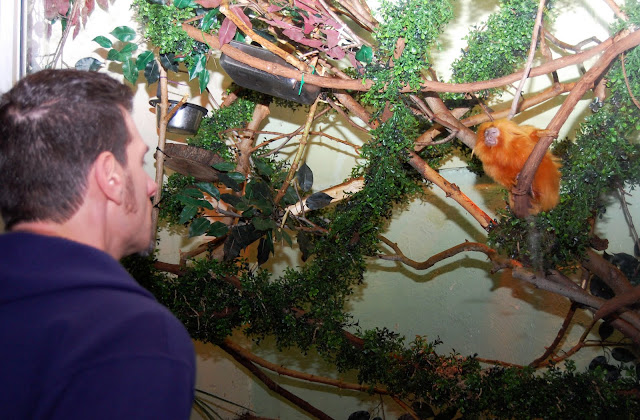
I went to the Monkey house at the local zoo to get some shots. The lady would not let my husband bring in the Apple :dunno bummer...anyway..so I got this shot and uploaded it (I'm not great at photoshop just yet) so it is what it is for now...

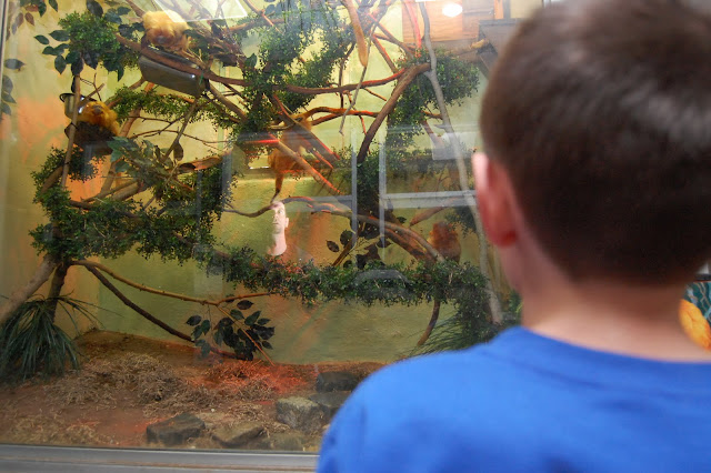
BUT...then I saw this one...
and I thought it was better, because it's got my son, his father in the refelction and the Monkeys (ancestors ...if you will)

I would crop it and play with coloring etc...
but which one would you use? I think I would call it...looking through time
I went to the Monkey house at the local zoo to get some shots. The lady would not let my husband bring in the Apple :dunno bummer...anyway..so I got this shot and uploaded it (I'm not great at photoshop just yet) so it is what it is for now...

BUT...then I saw this one...
and I thought it was better, because it's got my son, his father in the refelction and the Monkeys (ancestors ...if you will)

I would crop it and play with coloring etc...
but which one would you use? I think I would call it...looking through time
Know the rules well, so you can break them effectively. - Dalai Lama XIV
It is vain to do with more what can be done with less. - William of Occam (c. 1288-1348)
It is vain to do with more what can be done with less. - William of Occam (c. 1288-1348)
0
Comments
Did this one with a glow, to insinuate a dreamy kinda feel...
It is vain to do with more what can be done with less. - William of Occam (c. 1288-1348)
*You could do this several different ways, here are a couple: Using layers, you could put the glow on the top layer & then selectively erase the monkeys off that layer so they would show through on the darker layer; or if you don't use layers but have a burn tool, you could use that on the monkeys, or play with some filters. Kinda depends on what pp software you are using.
A photograph is an artistic expression of life, captured one moment at a time . . .
http://bartlettphotoart.smugmug.com/
Thank you soooo soooo much for that help!!! I only wish I saw it before the deadline :cry
I had to go and cook and iron and wash for that MONKEY in the reflection!!
It is vain to do with more what can be done with less. - William of Occam (c. 1288-1348)