Product composition - three legged stool
Greetings,
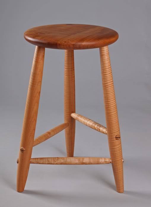
This is a recent acquisition of mine, a curly maple stool made by Michael Hosaluk.
Here lies my conundrum
Frequently I am asked to provide one shot of a piece and what usually works best is a 3/4 profile.
As a woodworker I feel this profile doesn't necessarily show off the woods beauty to best advantage. And in this case the composition is complicated by the fact there are three rungs on the stool.
With any other view converging lines come into play, ie., the bottom rungs may criss cross each other. Something that may work but I try to avoid if possible.
This higher angle does show the character of the wood of the seat better but I feel the image isn't quite as attractive or successful.
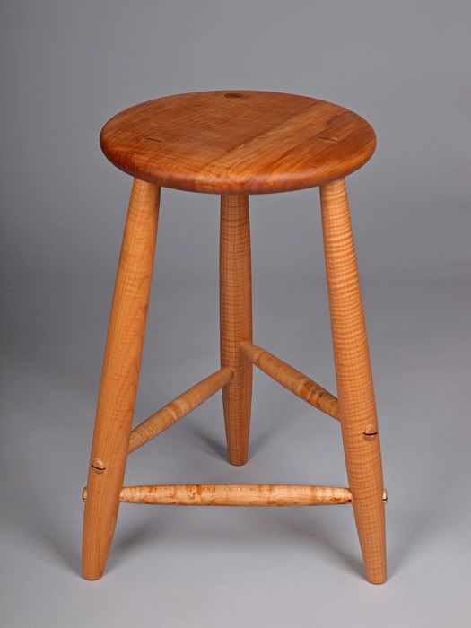
I feel I've allowed myself to be handicapped by the technical aspects of the shape of the piece and need to explore other angles.
FYI - the lighting on these is preliminary, I haven't added a boom/bg yet.
Thoughts ?
Cheers, Don
This is a recent acquisition of mine, a curly maple stool made by Michael Hosaluk.
Here lies my conundrum
Frequently I am asked to provide one shot of a piece and what usually works best is a 3/4 profile.
As a woodworker I feel this profile doesn't necessarily show off the woods beauty to best advantage. And in this case the composition is complicated by the fact there are three rungs on the stool.
With any other view converging lines come into play, ie., the bottom rungs may criss cross each other. Something that may work but I try to avoid if possible.
This higher angle does show the character of the wood of the seat better but I feel the image isn't quite as attractive or successful.
I feel I've allowed myself to be handicapped by the technical aspects of the shape of the piece and need to explore other angles.
FYI - the lighting on these is preliminary, I haven't added a boom/bg yet.
Thoughts ?
Cheers, Don
0
Comments
People selling tripods (on fleabay) have similar issues, too.
Might it be worth considering a pic (or pics) within the main pic - where the smaller image(s) just show a part of the most highly figured part(s) - to give the viewer a 'flavour' of the whole?
(and if they show sufficent interest, you'd then be able to show them a larger pic of said area?)
I'd vote for the first pic too, btw.
Just shows the problem of getting across the sheer beauty of a well-made and finished piece of woodwork via a pic when other aspects like feel / smell etc play such a large part
pp
Flickr
Nice acquisition, by the way. As a woodturner and fan of Michael's work this piece is a pleasure to view. Elegant simplicity.
Photo Gallery: http://nealaddy.smugmug.com/
http://www.facebook.com/profile.php?id=100003085685580
I'm not a fan of montages but will have to consider something along those lines. Maybe two close ups and a full view in order to balance the image...
Thanks Neal,
I feel placing something on the work is distracting. It may make for a interesting "still life" but for a product shot the stool then becomes a store fixture.
Thanks John,
I agree that the second shot does show the top much better but I think the perspective makes the stool look slightly squat instead of elegant.
Somewhere in the middle perhaps
Say take the first shot and raise the camera just enough not to clip the back leg, he, he..
Cheers, Don
Product Photography
My Acreage Bird Photographs
ciao!
Nick.
Nick.
my equipment: Canon 5D2, 7D, full list here
my Smugmug site: here
Quick snaps at 7mm..
Cheers, Don
Product Photography
My Acreage Bird Photographs
Whilst it could be argued there's less colour info in pic 1 (esp. top @ 8 o'clock) - to me, that bit's just asking to have a hand run over it to check its surface texture / surface finish
pp
Flickr
ciao!
Nick.
Nick.
my equipment: Canon 5D2, 7D, full list here
my Smugmug site: here
Cheers, Don
Product Photography
My Acreage Bird Photographs
Lauren
Lauren Blackwell
www.redleashphoto.com
Maybe a darker background would help define the piece?
Funny thing is I've never considered shooting furniture on black, hmmm...
Cheers, Don
Product Photography
My Acreage Bird Photographs
Lighting was quick and dirty with two Alien Bee B1600 with softboxes, I was more concerned about working on the composition and plan to reshoot adding a boom light.
Cheers, Don
Product Photography
My Acreage Bird Photographs