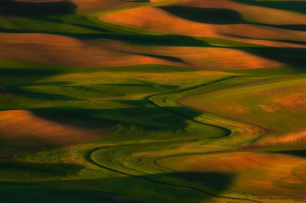
Last Palouse Images

Doug SolisDoug Solis Registered Users Posts: 1,190 Major grins
edited July 13, 2011 in Landscapes
Here is the last of my Palouse images. Really loved this trip and this area is a very special place.

All C&C is appreciated.

#1 This was an unusually windless sunset on Steptoe Butte.
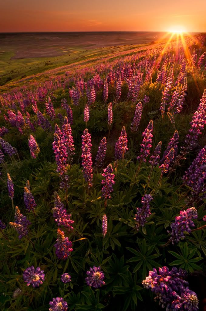
LupusHillsideWeb.jpg

#2 Some of the many vignettes of Palouse
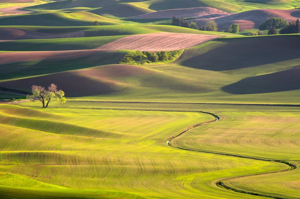
TreeandCreekWeb.jpg

#3 I know you've seen this perspective many times but now I've got it.
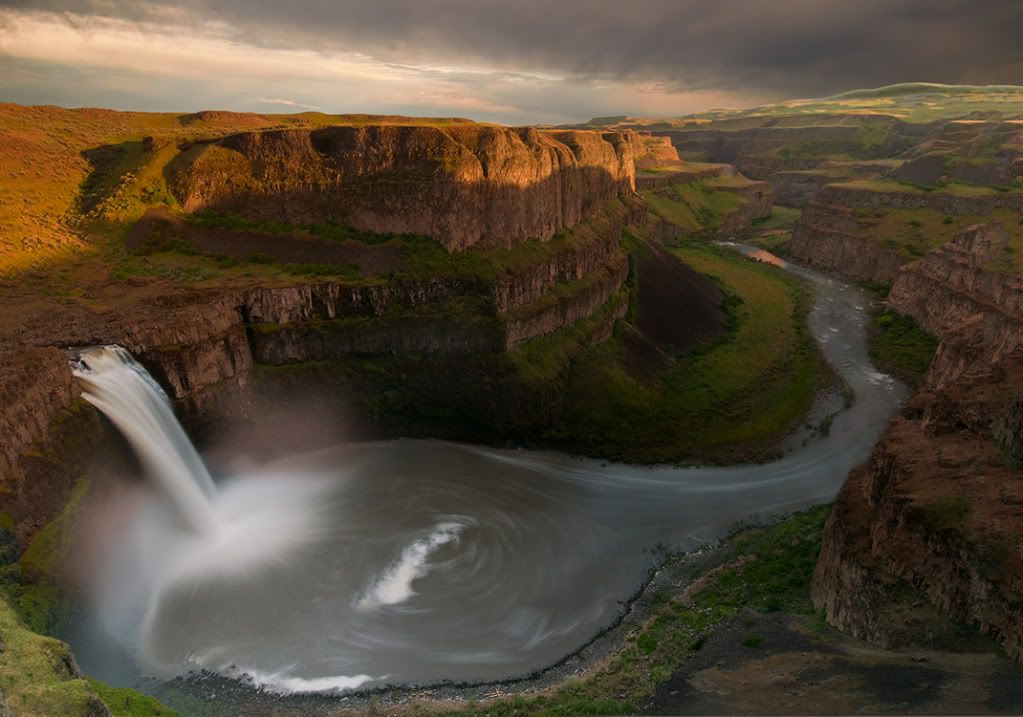
PalouseFallsWeb.jpg

#4 Early morning curves of Palouse
PalouseSCenterCurveWeb.jpg

Comments

  • nazquelnazquel Registered Users Posts: 181 Major grins
    edited July 9, 2011
    doug - i really love all 4 of them.

    the first one didnt catch my eye until i scrolled down a bit further. very unique angle, and i think resourceful given the lack of subjects in the distance. the sun is an interesting shape; had it sunk below the horizon?

    the tree in the middle of the frame totally makes the second shot.

    third is probably my favorite. nice job of capturing the textures of the falls. was this a single exposure? i might look at brightening some of the shadowed river/cliff.

    the fourth is similar in your other palouse shots in that the layers seem endless.

    very nice work!
    Navin Sarma

    Washington, D.C., based landscape and fine art photographer

    http://navinsarmaphotography.com/
  • coscorrosacoscorrosa Registered Users Posts: 2,284 Major grins
    edited July 9, 2011
    I really like #2 and #4. #2 would also work as a panoramic crop with the tree at the top left. The palouse is a wonderful place for these types of abstract landscapes.

    Did you see any rattlesnakes at Palouse Falls? I remember one trip there was a baby rattlesnake right on that ledge you (and I, and everyone else!) photographs from. I came back 20 minutes later and it was gone.
  • Sublim3Sublim3 Registered Users Posts: 70 Big grins
    edited July 9, 2011
    I love the first one, I'd put that on my wall. Great job!
    Mitch
    mitcht.smugmug.com
  • bryanj87bryanj87 Registered Users Posts: 859 Major grins
    edited July 9, 2011
    1 and 4 for me. I absolutely love the light on the lupines. Awesome job.
  • Doug SolisDoug Solis Registered Users Posts: 1,190 Major grins
    edited July 10, 2011
    nazquel wrote: »
    doug - i really love all 4 of them.

    the first one didnt catch my eye until i scrolled down a bit further. very unique angle, and i think resourceful given the lack of subjects in the distance. the sun is an interesting shape; had it sunk below the horizon?

    the tree in the middle of the frame totally makes the second shot.

    third is probably my favorite. nice job of capturing the textures of the falls. was this a single exposure? i might look at brightening some of the shadowed river/cliff.

    the fourth is similar in your other palouse shots in that the layers seem endless.

    very nice work!
    Thanks Navin, The sun in the first one had actually just begun to set, those first few seconds or minute had the most flare.
    Image 3 was a hand blend of 3 exposures, the land, water and sky. I masked and used areas of all three to come up with the final version. Good point on the brightening in the shadows, I'll lighten them up.
    coscorrosa wrote: »
    I really like #2 and #4. #2 would also work as a panoramic crop with the tree at the top left. The palouse is a wonderful place for these types of abstract landscapes.

    Did you see any rattlesnakes at Palouse Falls? I remember one trip there was a baby rattlesnake right on that ledge you (and I, and everyone else!) photographs from. I came back 20 minutes later and it was gone.
    Thanks Ron, I found one of the problems I was having on this first trip to Palouse was what to omit from the composition. It is all so beautiful. In a strange it reminded me of trying to pick a composition in a rain forest, where everything is so breathtaking but it may not always translate that way in print.
    Rattlesnakes!! Thank God I didn't see any or did I know they were even around. If I had seen one on that small precipice I would have probably pooped myself.....
    Sublim3 wrote: »
    I love the first one, I'd put that on my wall. Great job!
    Thank you Mitch.
    bryanj87 wrote: »
    1 and 4 for me. I absolutely love the light on the lupines. Awesome job.
    I do as well, thanks Bryan. I have always wanted to find a composition like it.
  • AndyAndy Registered Users Posts: 50,016 Major grins
    edited July 10, 2011
    /me jealous bowdown.gifbowdown.gifbowdown.gif
  • karlabbottkarlabbott Registered Users Posts: 401 Major grins
    edited July 10, 2011
    #1 and #2 are just exceptional, Doug. No two ways about it! :Dthumb.gif
  • wolf911wolf911 Registered Users Posts: 273 Major grins
    edited July 10, 2011
    excellent work! breath taking view on #3
  • schmooschmoo Registered Users Posts: 8,468 Major grins
    edited July 11, 2011
    Amazing set. You too have great light wherever you go!
  • hawkeye978hawkeye978 Registered Users Posts: 1,218 Major grins
    edited July 11, 2011
    Great set, beautiful light. To me #4 is quite striking. Almost like an abstract.
  • Doug SolisDoug Solis Registered Users Posts: 1,190 Major grins
    edited July 11, 2011
    Andy wrote: »
    /me jealous bowdown.gifbowdown.gifbowdown.gif
    Thanks Andy!
    karlabbott wrote: »
    #1 and #2 are just exceptional, Doug. No two ways about it! :Dthumb.gif
    I appreciate your comments Karla
    wolf911 wrote: »
    excellent work! breath taking view on #3
    Thanks KJS, its a great place to shoot, just a bit precarious, especially now that Ron said there are rattlesnakes close by. lol
    schmoo wrote: »
    Amazing set. You too have great light wherever you go!
    Thanks Steph, the light is the part we just hope Mother Nature provides us.
    hawkeye978 wrote: »
    Great set, beautiful light. To me #4 is quite striking. Almost like an abstract.
    Thanks Tom, much of Palouse is an abstract, especially if you telephoto in for tight shots.
  • eoren1eoren1 Registered Users Posts: 2,391 Major grins
    edited July 11, 2011
    Awesome work Doug. Really like all 4. Fantastic compositions and control of light thumb.gif
  • Mathieu05Mathieu05 Registered Users Posts: 203 Major grins
    edited July 11, 2011
    Outstanding work! i'm drooling... A+++++ composition.
    Chris Odchigue | Photography

    “There is only you and your camera. The limitations in your photography are in yourself, for what we see is what we are.”
  • rontront Registered Users Posts: 1,473 Major grins
    edited July 11, 2011
    Very nice Doug!! I think that I like this set even better than the other!! #1 is just beautiful and a very appealing perspective and I love the photo of Palouse Falls. I really need to get back out there!

    Ron
    "The question is not what you look at, but what you see". Henry David Thoreau

    http://ront.smugmug.com/
    Nikon D600, Nikon 85 f/1.8G, Nikon 24-120mm f/4, Nikon 70-300, Nikon SB-700, Canon S95
  • joe-bobjoe-bob Registered Users Posts: 368 Major grins
    edited July 12, 2011
    As nice as your first set, Doug. My favorites are 1 and 4.
  • Doug SolisDoug Solis Registered Users Posts: 1,190 Major grins
    edited July 12, 2011
    eoren1 wrote: »
    Awesome work Doug. Really like all 4. Fantastic compositions and control of light thumb.gif
    Thank you Eyal,
    Mathieu05 wrote: »
    Outstanding work! i'm drooling... A+++++ composition.
    I appreciate your comments Mathieu.
    ront wrote: »
    Very nice Doug!! I think that I like this set even better than the other!! #1 is just beautiful and a very appealing perspective and I love the photo of Palouse Falls. I really need to get back out there!

    Ron
    Thanks Ron, this was my first visit to Palouse Falls and it is a very memorable place. Such a huge scene that it just amazes me it can be captured so well even with a wide angle lens, although you do need to get that lens almost hanging off a 200' wall to get it.
    joe-bob wrote: »
    As nice as your first set, Doug. My favorites are 1 and 4.
    Thanks much Joe Bob.
  • PrevailingConditionsPrevailingConditions Registered Users Posts: 178 Major grins
    edited July 13, 2011
    Very different feel (although all very nice) to all four. Two and Four have a more abstract feel to me, and I really like the way you've balanced the light and shadow in three. I also like how you've balanced the sunlight and foreground in the first. It seems like every time I try to include the sun in a shot it messes up everything. The sun either ends up a gross blob or everything is in silhouette. Any special tricks to accomplish this?

    Mike
    flickr
    I welcome your feedback, but leave the editing to me - thanks!
Sign In or Register to comment.