Newbie Here... :) Critique welcome!
Hi, I've been working at this for about a year part time. Let me know your thoughts. Just a few of my shots from this summer. ")
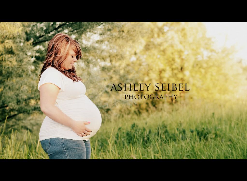
1.
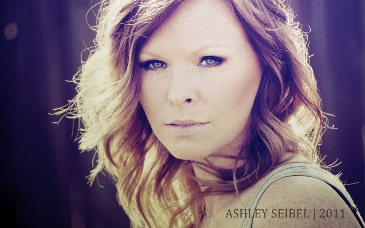
2.
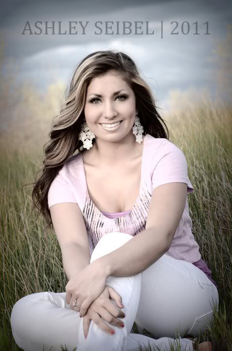
3.
1.
2.
3.
0
Comments
2) I am neutral on this one.
3) the pose and smile are very nice in this shot as well as overall tonality. you need to shoot this kind of shot wider though to keep all her body parts. Also it is tilted to the left and I vignette is a bit strong
14-24 24-70 70-200mm (vr2)
85 and 50 1.4
45 PC and sb910 x2
http://www.danielkimphotography.com
The pose in #1 she does look uncomfortable, but she probably WAS since she looks incredibly pregnant! lol
#3 is cute, but like Qarik said, it would be better without such a tight crop.
All in all, very pleasant, good job! :-)
Smugmug: http://photosbykathie.com
Blog: http://www.dandenong-ranges-photography.com.au/blog/
Facebook: http://www.facebook.com/KathiesPhotos
Don't be shy...post more...your work is solid.
http://www.flickr.com/photos/21695902@N06/
http://500px.com/Shockey
alloutdoor.smugmug.com
http://aoboudoirboise.smugmug.com/
Thanks for the help everyone. A few more If you feel like commenting....
1.
2.
3.
Love #1 ... agree on the slightly unflattering angle, but I love the processing and I think it's a nice photo overall
#2 is pretty cool, I'd definitely give her a choice of processing though
#3. Oh .. I'd stay sooo far way from the slightly desaturated look! Don't understand why gray skin would look nice to anybody (hmmmm .. kinda reminds me of dead people). Don't get me wrong, I like the photo, but really dislike the processing + it will look "old" in a few years (same counts for the last few photos) ... my 2 cents
In photo 1, she was incredibly uncomfortable. In every photo actually. If anyone has any tips on how to make those uncomfortable shots look a little more natural, I am all ears. I like the processing too. The photo just pops to me.
Photo 2, I was playing with Photoshop and the model and I came up with this... Its not my typical editing style, but she liked it.
And 3, That makes sense. I'll be careful of those things! Thank you!
But...I have one overall nitpick which no one has yet mentioned. I may be way off base here but here's what I see. The face of the girl in all 3 looks overly "healed" and smoothed to the point of appearing mask like. In #2 I see what looks like freckles on her shoulders and neck which dissapear entirely on her face. In #1 second set the boys face looks normal but the girl's looks like marble and unnatural especially where it meets the hair.
That being said, everyone has their own taste. I'm not opposed to retouching but believe that a little goes a long way and is ultimately more natural and flattering when applied with restraint.
It is about how that thing looks photographed." Garry Winogrand
Avatar credit: photograph by Duane Michals- picture of me, 'Smash Palace' album
I think you have done a good job!
But I will have to agree with briandelion, her face in #3 does not look natural. Looks like it has been edited a little too much maybe?
Canon 5D MARK II, Canon EOS 450D
Canon 24-70mm f/2.8L, Canon 18-55mm
Canon 50mm 1.8, Canon 75-300mm, Tokina 10-24mm, Sigma 18-200mm
About the face looking oversmoothed... I did not retouch a single thing on her face. I don't know if it appears that way because of the lighiting?Or if the camera was not as focused? But I can say that she has amazing skin to begin with. Is there a reason this may have happened? I did use my old camera at that session which was not as good as the one I have now and the new lenses I have. I have been recently shooting with a 50mm 1.4 and the detail is so much better.
It is about how that thing looks photographed." Garry Winogrand
Avatar credit: photograph by Duane Michals- picture of me, 'Smash Palace' album