Crop Question
 evanlavine
Registered Users Posts: 72 Big grins
evanlavine
Registered Users Posts: 72 Big grins
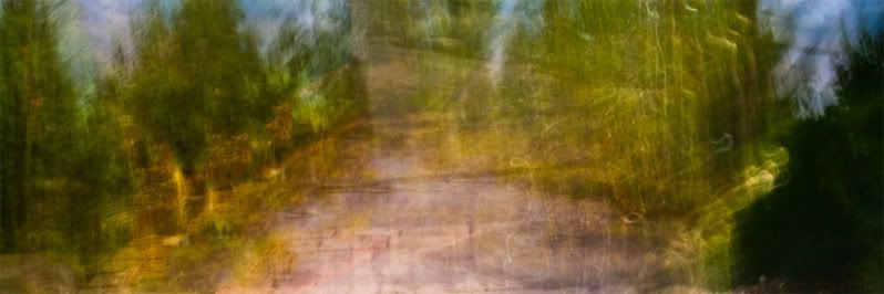
Wondering which works better here, the panoramic or the regular crop?
Thanks,
Evan
0
evanlavine
Registered Users Posts: 72 Big grins
Comments
·Facebook·
In this case its not about which comp is better as the non crop comp is perfect. It is about color balance.
As the sky has no color it throws the image out of balance. Brush tools in pp can add a splash
of color to areas of your choice.
Once some color is added to the sky the balance of the image is restored. I think you
where trying to get the same results with pano crop at the expense of the comp if that
makes sense. Also I dodge (lightened) the dark area in the bottom right to add some
balance to the light. Hope this helps and thanks for posting !
http://dwayne-oakes.artistwebsites.com/
Take care,
Dwayne Oakes
cheers,
evan