A Very Willing Subject (formal)

briandelionbriandelion Registered Users Posts: 512 Major grins
edited September 24, 2011 in People
The last round for this series. As always, comments are welcome.

1.
_8206339web.jpg

2.
_8206340web.jpg

3.
_8206349web.jpg

4.
_8206411web.jpg

5.
_8206415web.jpg

6.
_8206449web.jpg

7.
_8206467web.jpg
"Photography is not about the thing photographed.
It is about how that thing looks photographed." Garry Winogrand


Avatar credit: photograph by Duane Michals- picture of me, 'Smash Palace' album

Comments

  • RyanSRyanS Registered Users Posts: 507 Major grins
    edited September 21, 2011
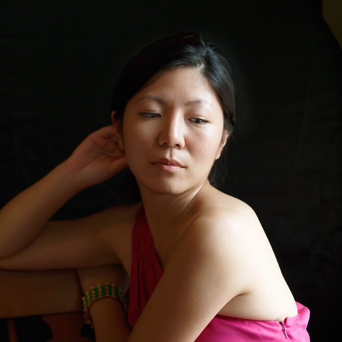
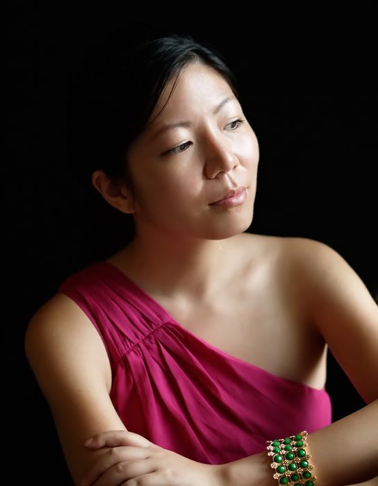
    1 2 & 5 - Seeing a lot of noise in the black background around the head. Did you try to dodge around the head? If so, you may want to desaturate those areas with the sponge tool to help reduce some of the noise.

    I like 3, 4 & 6 the best.
    Please feel free to post any reworks you do of my images. Crop, skew, munge, edit, share.
    Website | Galleries | Utah PJs
  • briandelionbriandelion Registered Users Posts: 512 Major grins
    edited September 21, 2011
    RyanS wrote: »
    1 2 & 5 - Seeing a lot of noise in the black background around the head. Did you try to dodge around the head? If so, you may want to desaturate those areas with the sponge tool to help reduce some of the noise.

    Yes, you've got that right. I noticed after posting it was too much dodging. I think the problem is (at least on my monitor)the default gray surrounding the image in Photoshop is a lot lighter which makes the dark in the image appear much darker. After I changed it to more closely match this site I can see the dark areas of the image more clearly. I think I'll use that customized setting in the future when working on images dominated by dark bkgds. Thanks for your comments.
    "Photography is not about the thing photographed.
    It is about how that thing looks photographed." Garry Winogrand


    Avatar credit: photograph by Duane Michals- picture of me, 'Smash Palace' album
  • QarikQarik Registered Users Posts: 4,959 Major grins
    edited September 23, 2011
    oh man..you need to shoot just a touch wider. In just about every shot you are chopping off bit and peices of her arm. I love the pose and tones in the 1st shot the best. though her arm is getting krinkled from reating on the chair and on the edge of focus plane.
    D700, D600
    14-24 24-70 70-200mm (vr2)
    85 and 50 1.4
    45 PC and sb910 x2
    http://www.danielkimphotography.com
  • briandelionbriandelion Registered Users Posts: 512 Major grins
    edited September 24, 2011
    Qarik wrote: »
    oh man..you need to shoot just a touch wider. In just about every shot you are chopping off bit and peices of her arm. I love the pose and tones in the 1st shot the best. though her arm is getting krinkled from reating on the chair and on the edge of focus plane.

    I work very fast to get into a rhythm (but I'm also a bit paranoid that the subject will get bored). I have to sloooow down and consider things more deliberately since I sometimes hyper focus on what I'm immediately excited about and end up neglecting the obvious. Tight headshots are easier for me- cropping limbs gets tricky. I try to avoid tangents and cropping at the joints but still...
    "Photography is not about the thing photographed.
    It is about how that thing looks photographed." Garry Winogrand


    Avatar credit: photograph by Duane Michals- picture of me, 'Smash Palace' album
  • jirojiro Registered Users Posts: 1,865 Major grins
    edited September 24, 2011
    I think with her looking at the camera to the right works pretty well since her right eye is smaller than her left. The difference in the distance from the lens gives the illusion that they are of the same size. For me, #1 works great though I have to agree that the crop is a bit tight. Nice work if I may say.
    Sitting quietly, doing nothing. Spring comes and the grass grows by itself.

    http://imagesbyjirobau.blogspot.com/
Sign In or Register to comment.