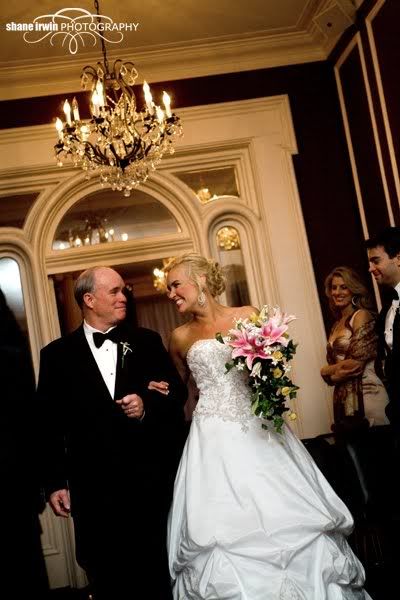
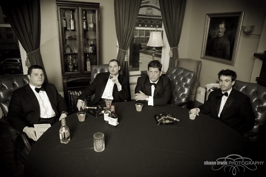
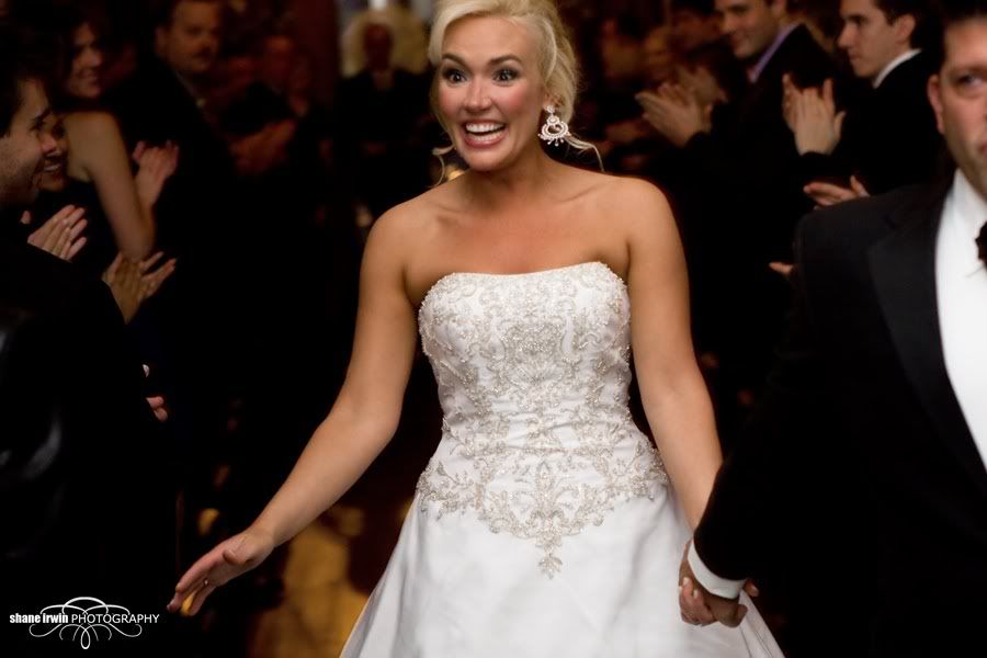
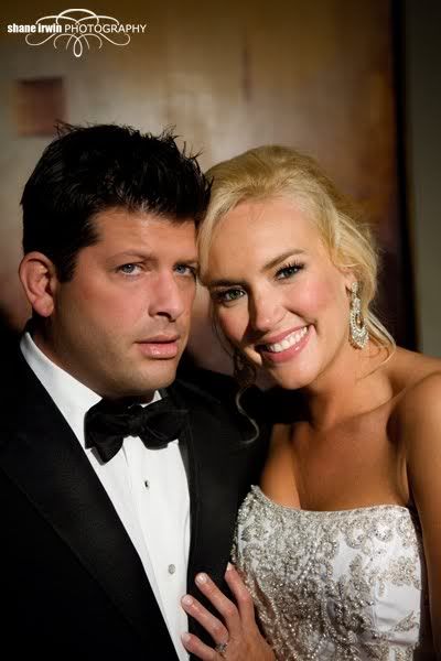
Sam and Amber's wedding at The Standard

I LOVE this venue here in Nashville. The wedding party and guests were all dressed as classy as the venue is, and it all made for a lot of good looking photos.
C&C is very welcome, and it only makes me better to be told what needs help.
I hope I get more weddings at this location. The B/G were totally stoked about their wedding photos.
1)
2)
3)
4)
5)
6)
7)
8)
9)
10)
11)
12)
13)
14)
15)
C&C is very welcome, and it only makes me better to be told what needs help.
I hope I get more weddings at this location. The B/G were totally stoked about their wedding photos.
1)
2)
3)
4)
5)
6)
7)
8)
9)
10)
11)
12)
13)
14)
15)
Canon 5D MK IV | 24-70 2.8L USM | 50mm F1.4 USM | 70-200mm F2.8L | AB 800 light | 430EXII speedlight (x2) | Lowel iLight | Cybersync remotes | bag of trail mix |
My Weddings Website • Blog •
My Weddings Website • Blog •
0
Comments
Here are a few comments for you.
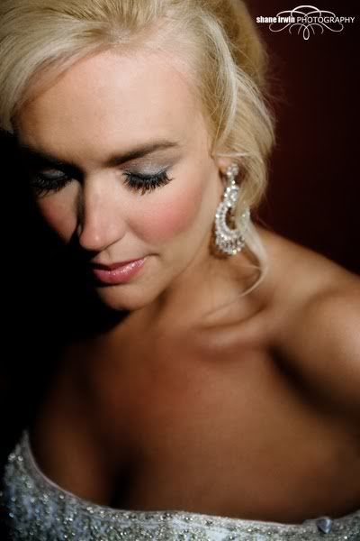
1 lighting is harsh. Try reprocessing in raw by reducing black levels and/or pushing brightness. I like the comp and expression though.
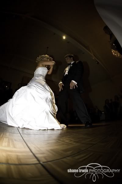
2. I love her expression but it would be a better images if you had stooped down to her level. When shooting wide angle things tend to get exaggerated when your lens isn't level and/or your subject is on the outside of the frame. Wide angle distortion. This isn't bad though and you got her awesome expression which I'm sure was a fleeting moment.
3. Nice
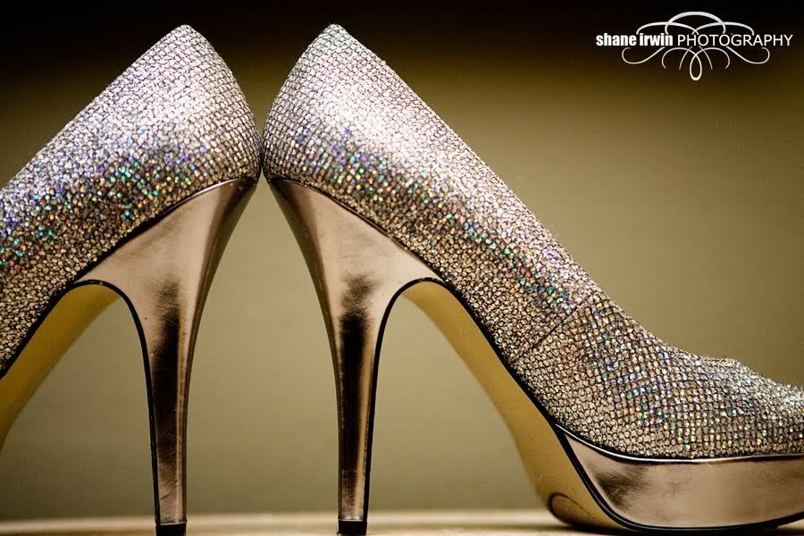
4. I don't like that the toes are cut off. Pretty shoes and I like the perspective but cutting off like you did doesn't appeal to me a bit.
5. I don't care for the tilt and again the black and brightness levels seem to be out of whack.
6. Again I would prefer a more even perspective by bending down for this type of shot. I also don't really care for the processing. It looks like b&w in a layer and then reduced opacity to let some of the color through.
7. 7 is soft on her face and eyes and I would have culled this one personally, but I see a nice expression and her dress seems sharp so I assume that is why you didn't.
8. Nice shot but light is again really harsh
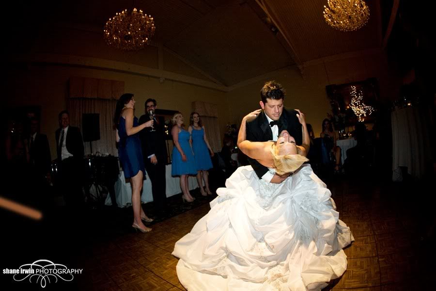
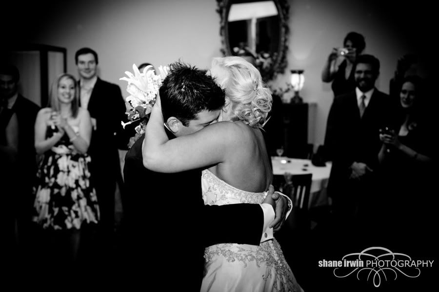
9. I like the balance you got between your light and the ambient. I like that you got the shot because I'm sure most of us have far more "almost got it" first dance dip shots than ones where we got it, but in a perfect world her dress wouldn't be cut off. Nice catch though, and certainly a keeper.
10. I'm not getting into this one at all. Just a lit floor to me.
11. Nice catch
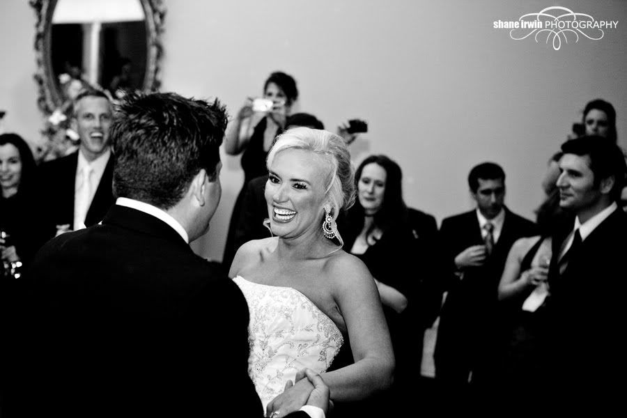
12. great expression but blacks are still a little heavy. I do like the processing except for I think a little more detail in the blacks would be better.
13.good follow up to 12
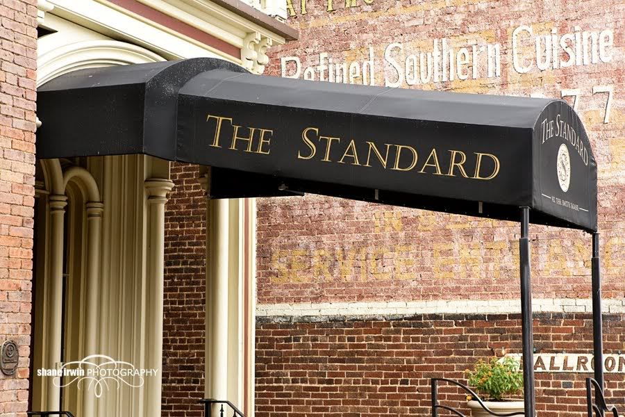
14. Nice picture of an awning but a picture to the entrance to the venue would have been far better.
15. is ok but I'm not sure what is going on. I assume this is a candid and it is an interesting perspective.
My .02
Matt
Bodies: Canon 5d mkII, 5d, 40d
Lenses: 24-70 f2.8L, 70-200 f4.0L, 135 f2L, 85 f1.8, 50 1.8, 100 f2.8 macro, Tamron 28-105 f2.8
Flash: 2x 580 exII, Canon ST-E2, 2x Pocket Wizard flexTT5, and some lower end studio strobes
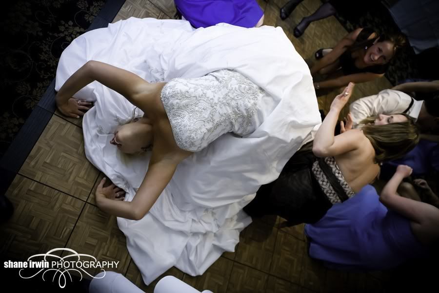
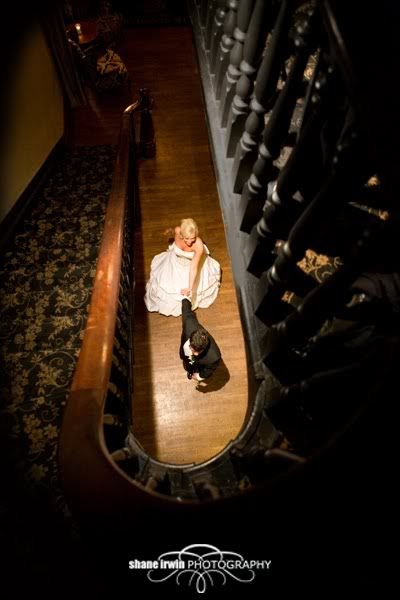
#15 is just a great grab... by being high above it creates a wonderful feeling: calm, quiet, escape
Spread the love! Go comment on something!
Matt, the harsh lighting on 1 and 8 are my video light. I'm still getting used to it, but sometimes it's going to be a bit "harsh", as compared to almost any standard wedding style lighting. It's the Lowell iLight, used frequently by Jerry Ghionis, Yervant, and Martin Schembri. Of course, I haven't mastered it like them yet, but several of their photos have the same look. It's a matter of taste. But yeah, it's probably a tad hot on those 2 pics. But at the same time, it's the look I wanted.
The awning photo is pretty much one I just tossed in here for all you non Nashvillians, to show the venue's name. I'm pretty sure they got a photo of the entrance in their wedding collection.
Thanks for the words so far, both of ya. Other perspectives always make me think about things.
My Weddings Website • Blog •
Your shoe shot is killer.
I am one for consistency, so using the same editing processes (or maybe two different kinds) is ok, but I feel like you had a to many different looking images for a "set".
But, i really like the creativity in your work.
D3, and other Nikon goodies
Shilliday Photography
Blog
Facebook