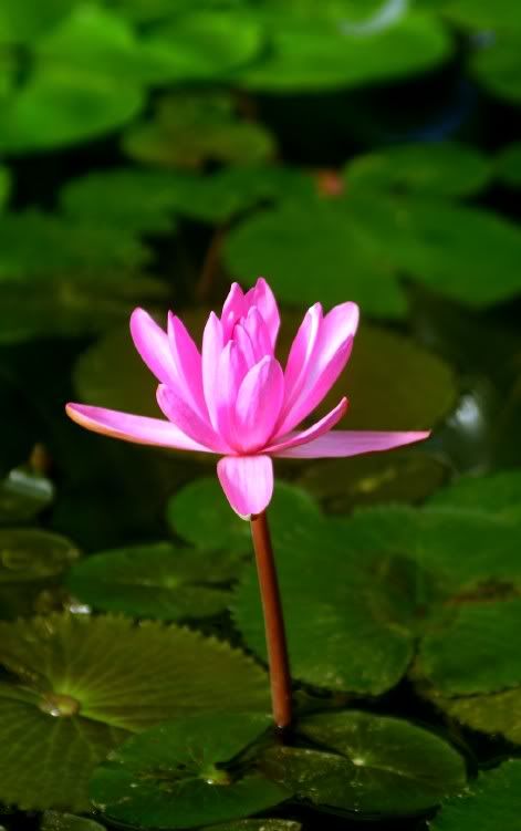
Ch:50 Colour selection??

SnapHappySnapHappy Registered Users Posts: 328 Major grins
edited October 24, 2005 in The Dgrin Challenges
"Water Colour"
IMG_1219.jpg

Took both of these yesterday, any comments welcome.

EDIT:
slightly larger.
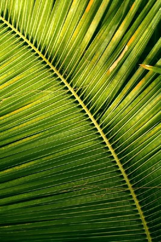
IMG_1341-2.jpg

Comments

  • SnapHappySnapHappy Registered Users Posts: 328 Major grins
    edited October 22, 2005
    another:
    "electric fish"
    fish1.jpg
    or a splash of Autumn Gold?
    autumnleaves.jpg
  • rckmtlrckmtl Registered Users Posts: 29 Big grins
    edited October 22, 2005
    While I really enjoy the first two shots, for me, the fourth one seem to fit the challenge best. You've got rich contrasting colors that catch my attention right away. Also the pic gives me a nice peaceful feeling, like I am laying on my back, enjoying great weather and just staring up at the sky through the leaves.

    The second one would do a lot more for me if thoses little stringy plant bits weren't on the leaf. They keep distracting me. Otherwise I like the way the light brighting from the bottom to the top, and curve, leads me along the path of the leaf.

    As far as the fish goes, you could get a lot more color out of it if you caught it from a diffrent angle, so the irridescent colors on it came out better. With fish scales being so reflective, any bit of overexposure washes out the colors a lot. Also the fish would look a lot nicer if you fed him right before you took the pic so his stomach doesn't have that curved in look.

    Good luck in the challenge.
  • SnapHappySnapHappy Registered Users Posts: 328 Major grins
    edited October 22, 2005
    rckmtl wrote:
    While I really enjoy the first two shots, for me, the fourth one seem to fit the challenge best. You've got rich contrasting colors that catch my attention right away. Also the pic gives me a nice peaceful feeling, like I am laying on my back, enjoying great weather and just staring up at the sky through the leaves.

    The second one would do a lot more for me if thoses little stringy plant bits weren't on the leaf. They keep distracting me. Otherwise I like the way the light brighting from the bottom to the top, and curve, leads me along the path of the leaf.

    As far as the fish goes, you could get a lot more color out of it if you caught it from a diffrent angle, so the irridescent colors on it came out better. With fish scales being so reflective, any bit of overexposure washes out the colors a lot. Also the fish would look a lot nicer if you fed him right before you took the pic so his stomach doesn't have that curved in look.

    Good luck in the challenge.

    Thanks, I like the colours in the last one a lot but seem to prefer the leaf shot for it's abstract/detail but you are right the colours are far more striking in the yellow & blue. However in the leaf shot I have picked one of nature's colours to concentrate on.
    The string things on the leaves were there and I didn't want to start pulling things off the plants in case I was thrown out. :D the leaf is around 6ft tall and could be an African species. (can't recall which part it was in?!).
    I would have gladly fed the little fish but this was also at Kew and was taken through the aQuarium, de-saturated the colours a little to concentrate the colour on the fish but it was just an after thought for the challenge.

    Thanks for taking the time to comment. thumb.gif

    I've entered the leaf shot for now, does anyone else like it? headscratch.gif
  • GREAPERGREAPER Registered Users Posts: 3,113 Major grins
    edited October 22, 2005
    I think the leaves are the best of the bunch.

    There is nothing wrong with any of them, but I dont think they will be strong enough to make the cut. I think I would keep looking. (not trying to be harsh, just helpful. )
  • SnapHappySnapHappy Registered Users Posts: 328 Major grins
    edited October 24, 2005
    I was really pleased with this shot but now I am not so sure.
    Am I barking up the wrong tree rolleyes1.gif with this leaf shot then? headscratch.gif

    IMG_1341-2.jpg
Sign In or Register to comment.