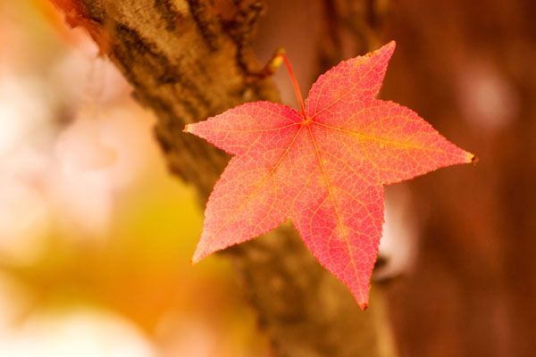
Challenge 50--The Lone Leaf

Eric&SusanEric&Susan Registered Users Posts: 1,280 Major grins
edited October 23, 2005 in The Dgrin Challenges
Taken 10-21-05
300d, 70-200 F4
200mm
ISO 200
1/500
F4

Feel free to give it to me straight. The only way I can learn is by having my mistakes pointed out and then working on them.

CRW_7917aresize.jpg

Thanks for taking the time to critique,

Eric
"My dad taught me everything I know, unfortunately he didn't teach me everything he knows" Dale Earnhardt Jr

It's better to be hated for who you are than to be loved for who you're not.

http://photosbyeric.smugmug.com

Comments

  • mwgricemwgrice Registered Users Posts: 383 Major grins
    edited October 22, 2005
    Nice shot! Could you try it with the background darker? It's so light it almost seems to me to wash out the colors of the leaf. Also, the area on the right side of the leaf looks funny to me. Is that just more tree trunk?
  • Eric&SusanEric&Susan Registered Users Posts: 1,280 Major grins
    edited October 23, 2005
    Thanks for the critique. Yes the area on the right is more tree trunk. I kinda like the way it added more brown to help out the color theme.

    I reworked this by: desaturating the background and then bumping the contrast on the entire image. Any better than the first?

    CRW_7917aresizea.jpg
    "My dad taught me everything I know, unfortunately he didn't teach me everything he knows" Dale Earnhardt Jr

    It's better to be hated for who you are than to be loved for who you're not.

    http://photosbyeric.smugmug.com
  • erich6erich6 Registered Users Posts: 1,638 Major grins
    edited October 23, 2005
    Eric&Susan wrote:
    Thanks for the critique. Yes the area on the right is more tree trunk. I kinda like the way it added more brown to help out the color theme.

    I reworked this by: desaturating the background and then bumping the contrast on the entire image. Any better than the first?
    I like this version better, it isolates the subject more. The single tone prevalent in the image works in this composition. I'd try darkening the left side a bit more though. Good job! thumb.gif

    Erich
Sign In or Register to comment.