Challenge 50--new ideas

Eric&SusanEric&Susan Registered Users Posts: 1,280 Major grins
edited October 26, 2005 in The Dgrin Challenges
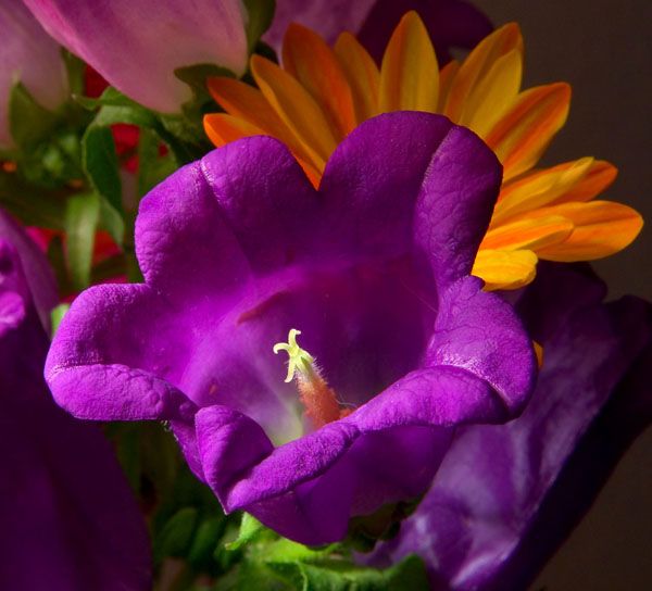
Went to the local flower store today to try and find some interesting flowers for the color challenge. How did I do?

Taken today 10-25-05 with my new tamron 28-75 2.8
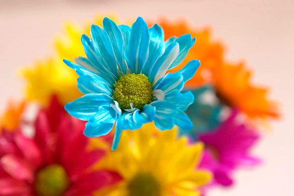
CRW_8033aresize.jpg


My favorite of the two:

CRW_8055aresize.jpg

As I bought these flowers so re shoots are possible so any and all ideas and critique are more then welcome.

Thanks for looking,

Eric
"My dad taught me everything I know, unfortunately he didn't teach me everything he knows" Dale Earnhardt Jr

It's better to be hated for who you are than to be loved for who you're not.

http://photosbyeric.smugmug.com

Comments

  • GREAPERGREAPER Registered Users Posts: 3,113 Major grins
    edited October 26, 2005
    I love the colors in that first one. It really has something. I think I would move the blue flower out of the middle, It pulls my eye ot it and I think it would be a strong com on a third.
  • SandySandy Registered Users Posts: 762 Major grins
    edited October 26, 2005
    I really like photo #2, the blue flower is not a natural color.
  • dimmdimm Registered Users Posts: 47 Big grins
    edited October 26, 2005
    Just re-shot first oone, with equal Depth of Field for all flowers and move blue flower in the middle of bouquet. IMHO.

    Regards.
  • Sask2005Sask2005 Registered Users Posts: 140 Major grins
    edited October 26, 2005
    blue flower
    This top photo is cool. Two thumbs up.
    Eric&Susan wrote:
    Went to the local flower store today to try and find some interesting flowers for the color challenge. How did I do?

    Taken today 10-25-05 with my new tamron 28-75 2.8

    CRW_8033aresize.jpg


    My favorite of the two:

    CRW_8055aresize.jpg

    As I bought these flowers so re shoots are possible so any and all ideas and critique are more then welcome.

    Thanks for looking,

    Eric
  • Phil U.Phil U. Registered Users Posts: 1,330 Major grins
    edited October 26, 2005
    I really like the blue in the first because it is rather unusual. The second is a more pleasing composition though. Perhaps a different crop could help the first.
  • Eric&SusanEric&Susan Registered Users Posts: 1,280 Major grins
    edited October 26, 2005
    GREAPER wrote:
    I love the colors in that first one. It really has something. I think I would move the blue flower out of the middle, It pulls my eye ot it and I think it would be a strong com on a third.
    How about this:

    CRW_8032aresize.jpg
    "My dad taught me everything I know, unfortunately he didn't teach me everything he knows" Dale Earnhardt Jr

    It's better to be hated for who you are than to be loved for who you're not.

    http://photosbyeric.smugmug.com
  • GREAPERGREAPER Registered Users Posts: 3,113 Major grins
    edited October 26, 2005
    I like the position of the blue flowere better in this one, and the colors are all still great.

    I dont know about the empty area on the right side. Part of me thinks it needs a tighter crop, but cropping it will move the blue flower closer to center. I plyed with it a little and it helps if you crop some off of the right, and a little off the top. The comes closer to filling the frame with color while still keeping the blue flower out of the center.
  • mereimagemereimage Registered Users Posts: 448 Major grins
    edited October 26, 2005
    I agree with Greaper(though i like the 1st shot)
    A tight crop like this(very low res. here)is interesting:

    41721906-M.jpg

    ................................Mereimage
Sign In or Register to comment.