You can't see me!

Bend The LightBend The Light Registered Users Posts: 1,887 Major grins
edited January 27, 2012 in Other Cool Shots
I have been playing again with the hands and face idea I saw one of my Flickr Contacts do...

I wondered how you saw these versions. All based on the same inages, but processed differently.

1.6691908053_6427388121_b.jpg
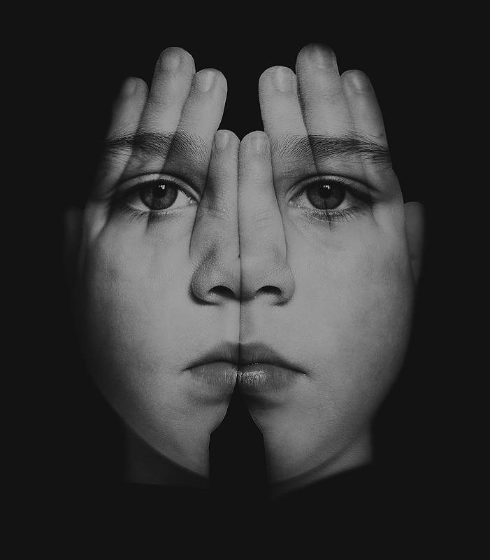
Ruby Hands New Version mono triste by http://bendthelight.me.uk, on Flickr

2.6691907465_dba460eda6_b.jpg
Ruby Hands New Version mono yellow by http://bendthelight.me.uk, on Flickr

3.6691908897_ce943f642d_b.jpg
Ruby Hands New Version colour by http://bendthelight.me.uk, on Flickr

4.6691909553_0e1de2cdd4_b.jpg
Ruby Hands New Version mono horror by http://bendthelight.me.uk, on Flickr

Honest critique is welcome. I think I still need to soften a couple of edges around the hands on some of these...but anything else?

Comments

  • EiaEia Registered Users Posts: 3,627 Major grins
    edited January 13, 2012
    Geeesh that really struck me! That is sooo weird & cool! I liked the first one but then I saw the last and it is -- IMHO the BEST! clap.gif HOW DID YOU DO THAT?
  • Bend The LightBend The Light Registered Users Posts: 1,887 Major grins
    edited January 13, 2012
    Eia wrote: »
    Geeesh that really struck me! That is sooo weird & cool! I liked the first one but then I saw the last and it is -- IMHO the BEST! clap.gif HOW DID YOU DO THAT?

    Thank you.

    The construction of the original is fairly straightforward...cut out the hands and use the same selection to cut out the face. Have each on a separate layer, and change the blen ode to suit. I did some different things on each layer to make colour, or mono versions. I applied some Nik Efex filters and so on.
    A black background later to set it off, and a little brushing up here and there. I need to take more time at that stage to make it really tidy. :)

    Cheers
  • JuanoJuano Registered Users Posts: 4,890 Major grins
    edited January 13, 2012
    I like #2 and #4 although that one is a bit too creepy for me. Lighter tones maybe?
  • RichardRichard Administrators, Vanilla Admin Posts: 19,955 moderator
    edited January 14, 2012
    Very cool concept. Each one is a little different. Of these, I like the color version best. I tried giving #1 a serious contrast boost and liked the results better than the other monotones--you might want to give it a try. thumb.gif
  • Bend The LightBend The Light Registered Users Posts: 1,887 Major grins
    edited January 14, 2012
    Eia wrote: »
    Geeesh that really struck me! That is sooo weird & cool! I liked the first one but then I saw the last and it is -- IMHO the BEST! clap.gif HOW DID YOU DO THAT?
    Juano wrote: »
    I like #2 and #4 although that one is a bit too creepy for me. Lighter tones maybe?

    Ha ha...I liked the creepy one...In some ways these reflect Ruby's character at different times! :)
    Richard wrote: »
    Very cool concept. Each one is a little different. Of these, I like the color version best. I tried giving #1 a serious contrast boost and liked the results better than the other monotones--you might want to give it a try. thumb.gif

    I will try that...I did like the "subdued" look of that one, but as a different version I will try the contrast. Many thanks.

    BTW...not my original idea...I saw this on Kyle Simpson's photostream and had to have a go, so "Nice one, Simpson Brothers". thumb.gif
  • toragstorags Registered Users Posts: 4,615 Major grins
    edited January 14, 2012
    Wow... great composite.

    I like the treatment of the creepy one (seems to be the one that got the most response).
    Rags
  • Bend The LightBend The Light Registered Users Posts: 1,887 Major grins
    edited January 14, 2012
    torags wrote: »
    Wow... great composite.

    I like the treatment of the creepy one (seems to be the one that got the most response).

    Thank you. :)
  • SamSam Registered Users Posts: 7,419 Major grins
    edited January 14, 2012
    Cool creative concept. My favorite is #1.

    Sam
  • Bend The LightBend The Light Registered Users Posts: 1,887 Major grins
    edited January 14, 2012
    Sam wrote: »
    Cool creative concept. My favorite is #1.

    Sam

    Thank you. :)
  • FrochFroch Registered Users Posts: 571 Major grins
    edited January 14, 2012
    I had seen something similar in CommuncationsArts that I loved.....your idea and execution is better. Wonderful idea and process.
  • Bend The LightBend The Light Registered Users Posts: 1,887 Major grins
    edited January 14, 2012
    Froch wrote: »
    I had seen something similar in CommuncationsArts that I loved.....your idea and execution is better. Wonderful idea and process.

    Thank you. :)
  • DogdotsDogdots Registered Users Posts: 8,795 Major grins
    edited January 14, 2012
    Very interesting. I like the 1st one the best. Last one .. that's kinda scary looking :D
  • Bend The LightBend The Light Registered Users Posts: 1,887 Major grins
    edited January 15, 2012
    Dogdots wrote: »
    Very interesting. I like the 1st one the best. Last one .. that's kinda scary looking :D

    Thanks. Yes, the first one is more subdued, I think.
    The last is my favourite, but the wife hates it. She says ruby looks dead. The again, she dislikes any images where I play around with the daughters faces. :)

    Incidentally, I plan to enter one of these in my club mono competition. It may be the scary one...people in my club won't have seen anything quite like that, and I plan to enter some more interesting images this year, not necessarily geared towards winning. ;)
  • DogdotsDogdots Registered Users Posts: 8,795 Major grins
    edited January 15, 2012
    Thanks. Yes, the first one is more subdued, I think.
    The last is my favourite, but the wife hates it. She says ruby looks dead. The again, she dislikes any images where I play around with the daughters faces. :)

    Incidentally, I plan to enter one of these in my club mono competition. It may be the scary one...people in my club won't have seen anything quite like that, and I plan to enter some more interesting images this year, not necessarily geared towards winning. ;)

    If I were to enter one in a club competition I would pick the one you picked. It certainly has something different to offer. Can understand your wife's view :D
  • baileyjsbaileyjs Registered Users Posts: 2 Beginner grinner
    edited January 26, 2012
    the last one would make a great movie cover!
  • TonyCooperTonyCooper Registered Users Posts: 2,276 Major grins
    edited January 26, 2012
    I like the black and white ones, but the color version jumps out
    at the viewer too much. That's an effect that is served best by
    by minimalizing it.
    Tony Cooper - Orlando, Florida
    http://tonycooper.smugmug.com/
  • Bend The LightBend The Light Registered Users Posts: 1,887 Major grins
    edited January 26, 2012
    baileyjs wrote: »
    the last one would make a great movie cover!

    Yes, I thought that. :)
    Thanks.
    TonyCooper wrote: »
    I like the black and white ones, but the color version jumps out
    at the viewer too much. That's an effect that is served best by
    by minimalizing it.

    Thank you...I think i prefer the monos, too. :)
  • wfellerwfeller Registered Users Posts: 2,625 Major grins
    edited January 26, 2012
    Good ones. I like the first. IMO, a little rough around the edges, very nice tho.
    Anybody can do it.
  • Bend The LightBend The Light Registered Users Posts: 1,887 Major grins
    edited January 27, 2012
    wfeller wrote: »
    Good ones. I like the first. IMO, a little rough around the edges, very nice tho.

    Thank you...I have more work to do to get this exactly how I want it. :)

    Thanks
Sign In or Register to comment.