Little Sisters

Bryce WilsonBryce Wilson Registered Users Posts: 1,586 Major grins
edited February 7, 2012 in People
Kind of got them into a game of "He loves me, he loves me not". The little one was bound and determined to find the penny I placed in the flower.

1
6751698597_6223daacce_b.jpg
He Loves Me, He Loves Me Not by Bryce Wilson, on Flickr

2.
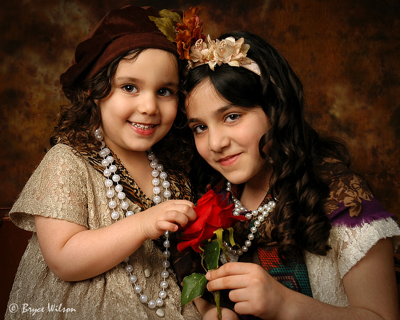
6751699123_27c4fa8a24_b.jpg
Cute Sisters by Bryce Wilson, on Flickr

I would really like to try a Dave Hill type effect on the second one. I haven't found a "how to" that was understandable to me though. Do you think that treatment would look good with this particular shot?

Comments

  • Bryce WilsonBryce Wilson Registered Users Posts: 1,586 Major grins
    edited January 23, 2012
    This is my feeble attempt at "Hillish" look. Opinions most appreciated!
  • adbsgicomadbsgicom Registered Users Posts: 3,615 Major grins
    edited January 23, 2012
    #1 is spectactular and #2 is close on its heels.
    Not a fan of the tonal contrast on the skin in this case. That's personal taste, though.
    - Andrew

    Who is wise? He who learns from everyone.
    My SmugMug Site
  • Bryce WilsonBryce Wilson Registered Users Posts: 1,586 Major grins
    edited January 24, 2012
    Thanks for the input and kind remarks Andrew.

    I hope sometime soon I can find an extra hour or two and spend it playing around on that elusive "Hill Look".
  • BilsenBilsen Registered Users Posts: 2,143 Major grins
    edited January 24, 2012
    I rarely comment on "cute kids" but these are so close to Renaissance art that I have to chime in.

    Just superb!!!!!!thumb.gifthumb
    Bilsen (the artist formerly known as John Galt NY)
    Canon 600D; Canon 1D Mk2;
    24-105 f4L IS; 70-200 f4L IS; 50mm 1.4; 28-75 f2.8; 55-250 IS; 580EX & (2) 430EX Flash,
    Model Galleries: http://bilsen.zenfolio.com/
    Everything Else: www.pbase.com/bilsen
  • DreadnoteDreadnote Registered Users Posts: 634 Major grins
    edited January 24, 2012
    Really cute kids!! Love the first two. On the third one your PP has turned the little girl on the right into a bit of a werewolf. Might want to layer mask the effect and back it off her arms a bit.
    Sports, Dance, Portraits, Events... www.jasonhowardking.com
  • divamumdivamum Registered Users Posts: 9,021 Major grins
    edited January 24, 2012
    adbsgicom wrote: »
    #1 is spectactular and #2 is close on its heels.
    Not a fan of the tonal contrast on the skin in this case. That's personal taste, though.


    Exactly what he said. nod.gif
  • kitkoskitkos Registered Users Posts: 63 Big grins
    edited January 25, 2012
    IMHO - Quite possibly the best work I have seen you post. Fantasic job!
    I do not care for the "HIllish" post.
  • babowcbabowc Registered Users Posts: 510 Major grins
    edited January 25, 2012
    #1 looks great but #2 seems bit overly sharpened.
    what's a hillish look?
    -Mike Jin
    D800
    16/2.8, f1.4G primes, f2.8 trio, 105/200 macro, SB900.
    It never gets easier, you just get better.
  • Bryce WilsonBryce Wilson Registered Users Posts: 1,586 Major grins
    edited January 25, 2012
    I rarely comment on "cute kids" but these are so close to Renaissance art that I have to chime in.

    Just superb!!!!!!thumb.gifthumb

    Why thanks a lot John. I know kids aren't your thing and that comment means a lot.
    Dreadnote wrote: »
    Really cute kids!! Love the first two. On the third one your PP has turned the little girl on the right into a bit of a werewolf. Might want to layer mask the effect and back it off her arms a bit.
    I see that now. Not sure how I missed it during the process. Thanks for taking the time to point it out!
    divamum wrote: »
    Exactly what he said. nod.gif
    Gratzie Diva!
    kitkos wrote: »
    IMHO - Quite possibly the best work I have seen you post. Fantasic job!
    I do not care for the "HIllish" post.
    Wow, thanks a lot. And, FWIW, I don't really care for my "Hillish" look much either, but I had to start somewhere!
    babowc wrote: »
    #1 looks great but #2 seems bit overly sharpened.
    what's a hillish look?
    The "Hillish" look was my feeble attempt to simulate the feel of the work done by a great photographer by the name of Dave Hill.
  • babowcbabowc Registered Users Posts: 510 Major grins
    edited January 25, 2012
    Ah, I see.. It's definitely an interesting PP to the capture..
    -Mike Jin
    D800
    16/2.8, f1.4G primes, f2.8 trio, 105/200 macro, SB900.
    It never gets easier, you just get better.
  • innoinno Registered Users Posts: 4 Beginner grinner
    edited January 25, 2012
    I know Dave Hill personally, and it has more to do with messing with the rgb channels and blend modes. I hope you are also aware he doesn't shoot his scenes, but composites multiple images together.
  • Bryce WilsonBryce Wilson Registered Users Posts: 1,586 Major grins
    edited February 7, 2012
    I have found a preset in Topaz Adjust 5 that gets me REAL close to a look I'm happy with. One click of a button sure beats a half an hour of screwing around in photo shop. As they say, time is money!

    This is straight out of Topaz Adjust.

    6830482099_f373d331d3_b.jpg
    Baby Boy - Little Executive by Bryce Wilson, on Flickr
  • VayCayMomVayCayMom Registered Users Posts: 1,870 Major grins
    edited February 7, 2012
    Gasp, love 1 and 2, wow quite a stretch for you, it's GREAT. Love the penny tip.. note to self.... The 3rd image , no, just plain no, not needed. too gritty looking, just not even pretty anymore. Your image is strong enough on it's own. NICE job !!!
    Trudy
    www.CottageInk.smugmug.com

    NIKON D700
  • novicesnappernovicesnapper Registered Users Posts: 445 Major grins
    edited February 7, 2012
    Thank you Bryce, I felt like I was looking at an exhibition in a museum (Time Immortal comes to mind), The Baby Boy was also super nice, so much so, I shared this thread with a few friends. I hope you sell these and sell a million.
Sign In or Register to comment.