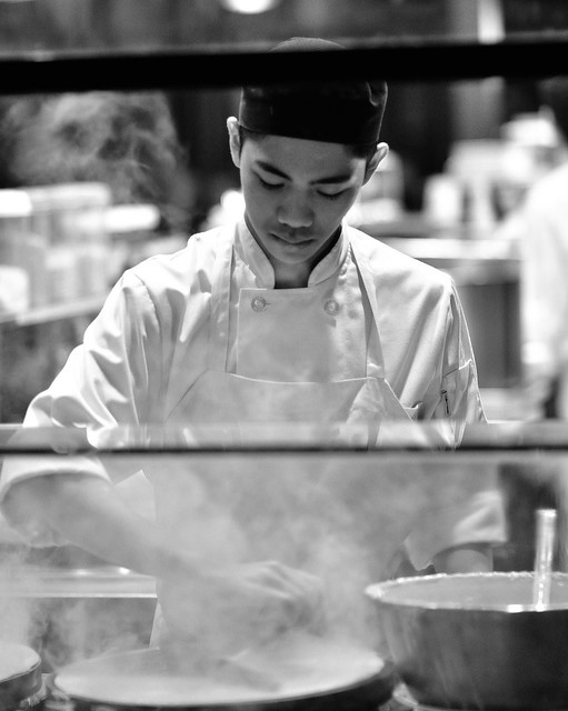
Crêpes, a HorseShoe and a Chair
Hello folks. This is my first post here at DG. I hope that I have placed these photos in the correct forum and that posting more than 1 pic. in a given thread is acceptable.
I am always open to fair minded comments and critiques. I hope you find some merit in these shots I took while I was strolling around downtown Toronto (Queen St. West and Spadina Ave.) a few months ago.
Young man preparing crêpes through an open window along Queen St. W.

Patrons taking a smoke break outside the venerable HorseShoe Tavern - Queen St. W.

An old fashioned barber's chair sits empty late at night in the store front window on Spadina Ave.

What do you think? Good? Bad? or Ugly? Thank you for looking.
Regards,
James
I am always open to fair minded comments and critiques. I hope you find some merit in these shots I took while I was strolling around downtown Toronto (Queen St. West and Spadina Ave.) a few months ago.
Young man preparing crêpes through an open window along Queen St. W.

Patrons taking a smoke break outside the venerable HorseShoe Tavern - Queen St. W.

An old fashioned barber's chair sits empty late at night in the store front window on Spadina Ave.

What do you think? Good? Bad? or Ugly? Thank you for looking.
Regards,
James
0
Comments
#2 isn't particularly interesting.
#3 has a beauty to it, but doesn't fall under the Street/PJ category as it is missing people and/or story.
Thanks for posting, bluenoser, welcome to the forum, and keep on shooting!
www.FineArtSnaps.com
I'm glad you found this image (mostly) appealing!
I was probably more pleased with it due to the fact that the Tavern is quite a landmark in Toronto (many famous bands have played here over the years). I appreciate your take on it though. Thanks.
Ah. I see. I guess I expanded the definition of street a bit too far.
Many thanks for your comments and critique! I really appreciate it!
Hi RSL. Does the "?" next to #1 and #2 indicate that you aren't sure if you like them or not? Or perhaps that they're nothing to write home about!
Regarding #3 - The bottom of the chair was very close to the foot of the chair and I just couldn't seem to get everything in the shot that I wanted (depending on the angle I took another element seemed to suffer) so I choose what I felt was the least of all evils!
Thank you both again.
www.FineArtSnaps.com