Lots of New Gear but only one VANESSA
OK so here's my first day with the seamless white, the Photek Softlighter, a white reflector and 2 grids. Of course, Vanessa as a subject kept me focused.:wink
I played with the light position a bit, essentially using the Softlighter as the Key and a gridded flash as a hairlight. In much of the shoot I didn't worry about leaving the seamless gray since I had enough to play with already. By the way, YES, that is her hair color, brown with red streaks.
The semi-good news is that when I go through the shoot, I recognize many of the flaws I've read about on here.
So without further ado, here are a few from indoors # 2. More to come as I process them but please let me hear from you with suggestions for this Sunday with Cindy.
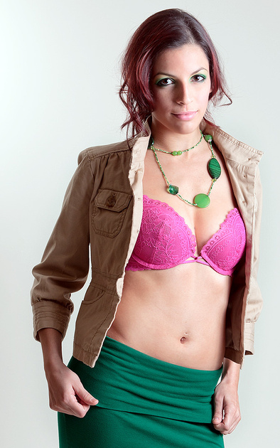
2.
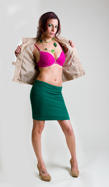
3.
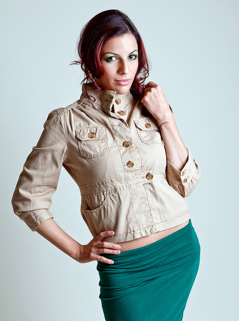
4.

5.
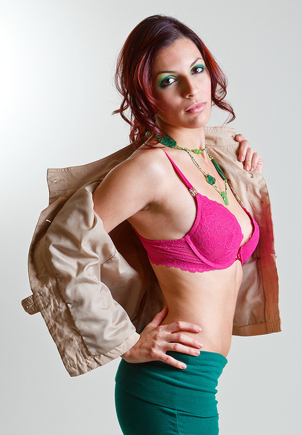
6.
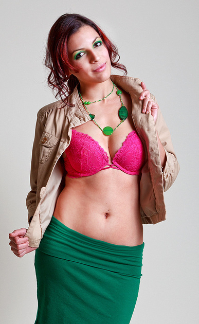
I played with the light position a bit, essentially using the Softlighter as the Key and a gridded flash as a hairlight. In much of the shoot I didn't worry about leaving the seamless gray since I had enough to play with already. By the way, YES, that is her hair color, brown with red streaks.
The semi-good news is that when I go through the shoot, I recognize many of the flaws I've read about on here.
So without further ado, here are a few from indoors # 2. More to come as I process them but please let me hear from you with suggestions for this Sunday with Cindy.

2.

3.

4.

5.

6.

Bilsen (the artist formerly known as John Galt NY)
Canon 600D; Canon 1D Mk2;
24-105 f4L IS; 70-200 f4L IS; 50mm 1.4; 28-75 f2.8; 55-250 IS; 580EX & (2) 430EX Flash,
Model Galleries: http://bilsen.zenfolio.com/
Everything Else: www.pbase.com/bilsen
Canon 600D; Canon 1D Mk2;
24-105 f4L IS; 70-200 f4L IS; 50mm 1.4; 28-75 f2.8; 55-250 IS; 580EX & (2) 430EX Flash,
Model Galleries: http://bilsen.zenfolio.com/
Everything Else: www.pbase.com/bilsen
0
Comments
Camera angle or lens on 2 and 4. Do you see a distortion in what it did to her?
www.cameraone.biz
Comments and constructive criticism always welcome.
www.mikejulianaphotography.com
Facebook
Natural selection is responsible for every living thing that exists.
D3s, D500, D5300, and way more glass than the wife knows about.
Mike, this is the 46" version. It's the largest that will comfortably fit the room. As with Hack, I believe you but I just don't see the distortion. Maybe it's just me.
Icebear, nope-- hairlight was opposite the main. However, these were from early on so I may have missed the aim until later on in the session. I'll be posting more of this shoot during the week so let's see if It get's better when I move the lights around.
Thank you all.
Canon 600D; Canon 1D Mk2;
24-105 f4L IS; 70-200 f4L IS; 50mm 1.4; 28-75 f2.8; 55-250 IS; 580EX & (2) 430EX Flash,
Model Galleries: http://bilsen.zenfolio.com/
Everything Else: www.pbase.com/bilsen
On the other hand, if that was your intent in the first place, ignore my comments!
I like three, but would have preferred to see her fingers by the face rather than the knuckles.
When you explain it that way, I do see it. When I think of distortion I tend to look more at the face, especially the nose. Got it now.
Again, there will be more from this session as I get a bit more comfortable with the lights and their positions. I actually think I got a few intentional Rembrandts correct. We shall see.
Canon 600D; Canon 1D Mk2;
24-105 f4L IS; 70-200 f4L IS; 50mm 1.4; 28-75 f2.8; 55-250 IS; 580EX & (2) 430EX Flash,
Model Galleries: http://bilsen.zenfolio.com/
Everything Else: www.pbase.com/bilsen